
Unravelling the myth
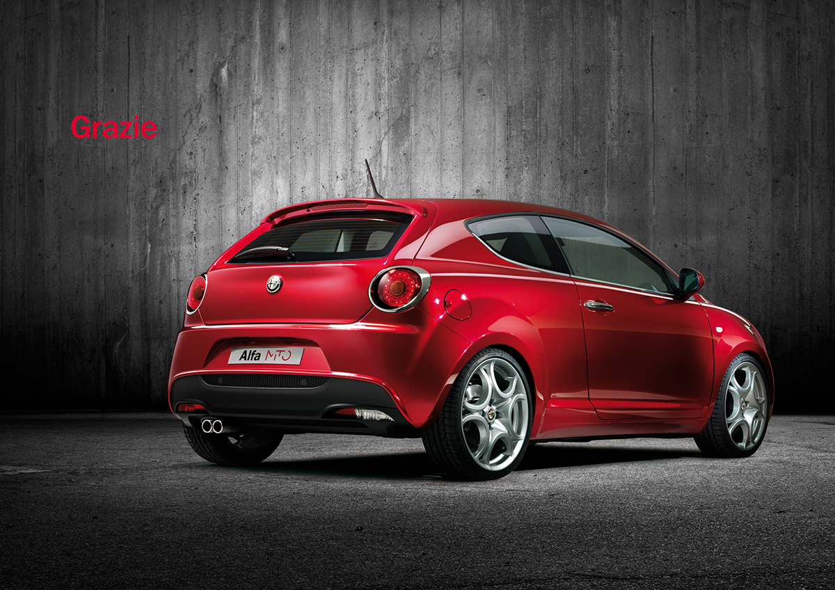
When Alfa Romeo was launching their first new car since 2003, they came to us. Thenew car, Mito (meaning ‘myth’), was aimed at the youth (17–30) market and wouldcompete with similar offerings such as the Mini, the Beetle and the Fiat 500.Our task was to design a logo that would reinvigorate the tradition of AlfaRomeo’s performance and sportiness in the minds of consumers. And so that’swhat we did.
When Alfa Romeo was launching their first new car since 2003, they came to us. Thenew car, Mito (meaning ‘myth’), was aimed at the youth (17–30) market and wouldcompete with similar offerings such as the Mini, the Beetle and the Fiat 500.Our task was to design a logo that would reinvigorate the tradition of AlfaRomeo’s performance and sportiness in the minds of consumers. And so that’swhat we did.

The urban legend
Oursolution was based on reinterpreting the idea of mythology for a contemporaryaudience. We developed the concept ‘Urban Legend’ which explored the idea ofthe viral spread of information, how trends are passed on, often without thewhole story or background being known. From this we developed a logo thatengages the viewer by using typography that does not give the whole picture,but encourages the audience to complete it themselves. We continued thisconcept and developed it into a unique design language that could be carriedthrough to other touchpoints, such as point of sale and merchandisingmaterials. We also used an abstract graphic pattern that we created, which oncloser inspection reveals the logo itself. It was vital to resist the usuallanguage of automotive iconography, and create something relevant and thatembodies the brief of a fusion of style and engineering.
Oursolution was based on reinterpreting the idea of mythology for a contemporaryaudience. We developed the concept ‘Urban Legend’ which explored the idea ofthe viral spread of information, how trends are passed on, often without thewhole story or background being known. From this we developed a logo thatengages the viewer by using typography that does not give the whole picture,but encourages the audience to complete it themselves. We continued thisconcept and developed it into a unique design language that could be carriedthrough to other touchpoints, such as point of sale and merchandisingmaterials. We also used an abstract graphic pattern that we created, which oncloser inspection reveals the logo itself. It was vital to resist the usuallanguage of automotive iconography, and create something relevant and thatembodies the brief of a fusion of style and engineering.
No messing
Aselection of seven logos was initially put to a consumer vote on the Alfa Romeowebsite, and our solution came top. Some of the comments that were receivedincluded: “Wow!”; “Just as stylish as the car it appears on”; “Brilliant,sophisticated and fun logo. Seems to match the car’s personality very well”.Since then feedback from the client has been hugely positive. It was even saidthat this was the first time a logo has been signed off without being “messedaround” with.
Aselection of seven logos was initially put to a consumer vote on the Alfa Romeowebsite, and our solution came top. Some of the comments that were receivedincluded: “Wow!”; “Just as stylish as the car it appears on”; “Brilliant,sophisticated and fun logo. Seems to match the car’s personality very well”.Since then feedback from the client has been hugely positive. It was even saidthat this was the first time a logo has been signed off without being “messedaround” with.
