A successful interactive agency, Popular Front was growing its offering to become a holistically-focused branding agency. The new identity is a bold departure, with a logotype and graphic language that is intelligent and dynamic.

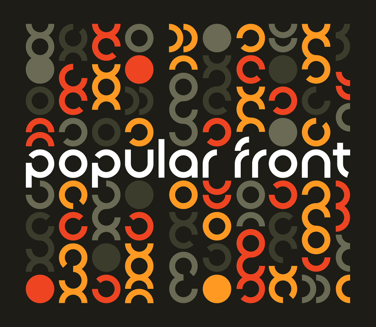
The wordmark has the feeling of confident precision, with breaks in the geometric letterforms that feel active and in motion.

The initial letters 'p' and 'f' become a visual shorthand for the company, allowing a more casual display of the brand while maintaining a proprietary graphic language.


The Popular Front logotype emerges from a graphic pattern that can be interpreted in different ways - varied audiences, social interaction, conneting ideas with consumers. The pattern is scaleable and creates continuity across branding applications.

From laser cut business cards to spot varnished, back-printed letterhead, the stationery makes a bold statement to prospective employees and clients alike.

