

A Deconstructed Donut
Brainstorming for themes to base our magazine, one idea was to showcase decontructed items. Sean and Gus had just completed another project where they had disassembled a milkshake maker and arranged all the pieces beautifully on a wooden bench. This mock up was achived in Photoshop. While it will not be used in the magazine it was an idea I was able to get out of my head and "on paper".


These are some mock-ups Gus produced for our title when throwing around ideas for organised items
The Birth Of XPOSURE
This meeting was focused on choosing which direction we were going to take and what the theme of the magazine would be. We discussed sustainable design, organised descontructed items and student work in QUT. We researched prices for sustainable paper and printing but found the companies who offered this service had a minimum of 250 prints, which was not realistic for us. Sean and I were also not keen on continuing with that idea as we didn't feel inspired enough to run with that theme.
We continued to come back to the student work idea over and over but felt it may not have been enough. We continued to throw ideas around, inspire each other and build on each suggestion. Close to the end of our meeting it was decided to base the theme on different platforms people use to get their work recognised and from there we morphed it into a design student guide that would expose designers to the rest of the design community. This theme gave us the opportunity to use the magazine as our own platform to showcase our portfolios and subsequent issues to be a showcase for other designers too. It was a positive environment we were working in which made this project even more meaningful.
We each shared an equal amount of pages and roughly listed who was assigned to what sections so we could leave the meeting with work to begin with
front cover - EVERYONE
table of contents + Publishing info (2 pages) - ?
editorial (2 pages) - EVERYONE
events (2 pages) - CAITLIN & GUS (tear-out card)
news (2 pages) - SEAN & ASHTON
product (1 page) - GUS
book (1 page) - ASHTON
video (1 page) - CAITLIN
blog (1 page) - SEAN
book (1 page) - ASHTON
video (1 page) - CAITLIN
blog (1 page) - SEAN
feature article trend (8 pages) - SEAN
feature article case (8 pages) - CAITLIN
featured designer interview (8 pages) - ASHTON
featured designer portfolio (8 pages) - GUS
feature article case (8 pages) - CAITLIN
featured designer interview (8 pages) - ASHTON
featured designer portfolio (8 pages) - GUS
personal stories (4 pages) - EVERYONE - 1 EACH
advertisements (4 pages) - EVERYONE - 1 EACH
credits, references, index - ?
back cover - EVERYONE
We created our facebook group to share ideas and progress and organised regular weekly meetings outside of tutorials.
We each brought a selection of magazines that inspired us and decided what style elements we agreed on based on those inspirations, as well as notes from lectures and readings. It was noted that Manuela does not like indents, so that was one styling element we were going to avoid!
We wanted a sophisticated and classic, yet fun and engaging design. It was agreed that whitespace was important to all of us, as well as a consistent border around the spread. We also chose large images and a three column layout.


During tutorials, Caitlin set up some guides based on what we all agreed was our main design features. We especially liked white space around our images and leaving the column closest to the spine empty or just consisting of a quote. We continued to brainstorm over coffee and a table ful of magazines so we could really nut out what rules we wanted to maintain.


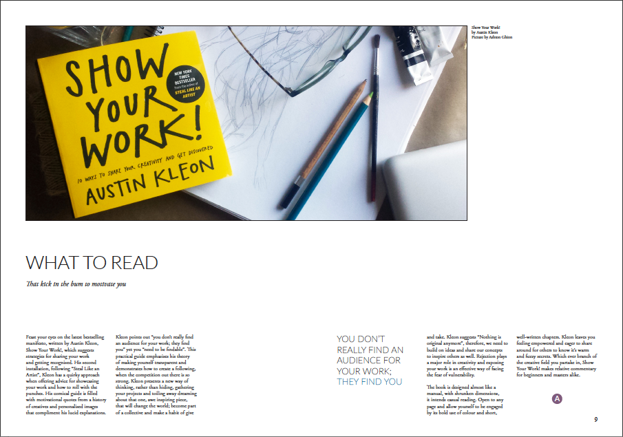
This was my first draft of the book review. (image is a placeholder image, not my own, I do not take credit for the photo of the book)
Although this was based on the master layouts we were all working with, I felt it wasn't enough. It felt stale and boring to me and I needed to personalise the layout whilst keeping within the style and rules we originally set

We still hadn't decided on fonts for our magazine yet. We simply couldn't decide on something we all liked and something that fit well. This is a layout for my 1st interview.

some of Gus's layouts he presented to the group. We all really liked his ad!
I revised my layout for my interview with Nicci-Noo Art and Design and also put together my personal story based on Gus's personal story layout.


The layout for my personal story didn't work with my text so I decided to shrink the image to just one page which gave the text much more breathing space


Examples of Caitlin's layouts posted to our group. Lots of text and bright images. The eye is some of her own work.
The font used is something we were testing as we hadn't yet settled on which exact combination we wanted to use. Fonts such as Cardo, Times New Roman, Raleway, Helvetica, ADAM CG. PRO and MIssion Script were all in the discussion but we had yet to find the winning mix. There was also a lot of discussion around the appropriate use of Caps, Small Caps, Bold, Italic and using colours in headings and quotes to create contrast with the body text.
I came back to my book review and changed the layout. I really liked this layout and felt it was more an expression of my own personal style mixed with the style of the magazine. I don't like sticking within rules and constraints and I wanted to see how far I could take these designs.
I presented this to the group and had some positive feedback. We also decided to add these little icons with our first initial to the articles that we had created which also added some personality to the magazine as a whole.

Photo shoot
After our tutorial and receiving feedback from Manuela, we went to Paddington and took a bunch of pictures to use for our personal stories and the magazine section spreads. We had a lot of fun posing in the antiques shop and taking advantage of street art.
Photo editing
After our "photoshoot" we brought our layouts together and put our new photos into the magazine. This was way too much fun!


This was also the point at which we started to settle on our final type styles and layouts. The entire group agreed the a serif font was the way to go for the body text and that a serif typeface would also be preferable for the headings, but that the contrast of a clean sans-serif was required to make sure the layout was modern and emulated the magazines that we used for inspiration without mimiccing them. Following advice from the lecture and tutorial, we began comparing a number of typefaces and their x-heights to determine what could work well together. Caitlin suggested a Baskerville, Times New Roman and Raleway combination with coloured subheadings and quotes and the group tested the x-height of these fonts, finding that they weren't exactly the same but were extremely similar.
Add to that the proposal of changing the subheadings to a grey and making the headings all Caps with a larger Cap at the beginning of each word and suddenly the fonts were working extremely well together. The group had not put the final word down on it, but it seemed like we were headed in a promising direction. We then transferred these type choices to other elements we were creating such as the Events pages.


Gus and Caitlin's events page

Caitlin's article
Front Cover
We had been throwing ideas around about our front cover. We started with a black circle with xposure cut out of it. We also had some silly, crazy ideas about shaving exposure in the back of someone's head but this had nothing to do with design so that was vetoed.
A lecture about dot printing, the relationship between CMYK and how printers interpret images provided inspiration.

Screenshot of how our cover idea unfolded and how the idea was presented

Caitlin started on the front cover and tried to put this concept into action but photoshop was not cooperating and this is how it interpreted our idea

Front Cover Concept
After another team meeting we decided to get some decent head shots with plain backgrounds to design our cover concept. This was a really long process of trying to turn the images into little dots and then overlapping our faces, Sean took this one home and finished it. We also took this opportunity to print out some pages, as suggested by Manuela, to check the font size was legible and sort out some of the layout order.

our final to do list

Gus sketching out how we will layout the publishing and editorial pages
The final Events page poster by Gus and Caitlin. Caitlin set up the initial document and put all her events into it, and then Gus added in his events and made edits to elements such as the type sizes and discipline tags arrangements, as well as creating more design discipline tags.


Sean finished the front cover concept and it turned out really well. Exactly what was initially invisioned. He also added a camera head on display to finish it off which we all agreed was a great finishing touch


The final layer to the front cover with the magazine title lazer cut from black card. When we discussed our plan for this with Manu, she gave us the advice that the black camera marks and issue number inn the interior front cover were unnecessary and we should aim to include all our information in the laser cut cover.
My final pages
The following 7 images are my layouts ready for our next meeting to print a draft and decide on order of pages


Caitlin's credits and references layout. This layout was altered once the group was consulted and it was determined that an index was unnecessary. The images were changed as the team desired to tie the end of the magazine in with the start and we also desired to have some contect details in the magazine as a promotional tool.


Paper, printing, binding, cutting and perforating
Gus arranged all paper, printing, binding and laser cutting services. Printing began on the Friday, 7 days before submission, and binding was completed on the Monday after each calendar page was perforated manually with a uncooperative knife (4 days before submission).
We chose :
140gsm 50% recycled un-coated semi textured paper for the body pages,
300gsm black card for the cover
100gsm translucent paper for the cover CMYK pages
and 200gsm for our tear out "events" page.
Gus attempted manually cutting the front cover as we weren't sure of time limitations for using the laser cutters in the fabrication labs. However, it was agreed that it did not provide a professional finish and we could at least test one at the labs. Gus set up the files and tested the laser cutting on the already cut cover and found it to be a much cleaner and more effective result. The rest of the covers were cut using this method.
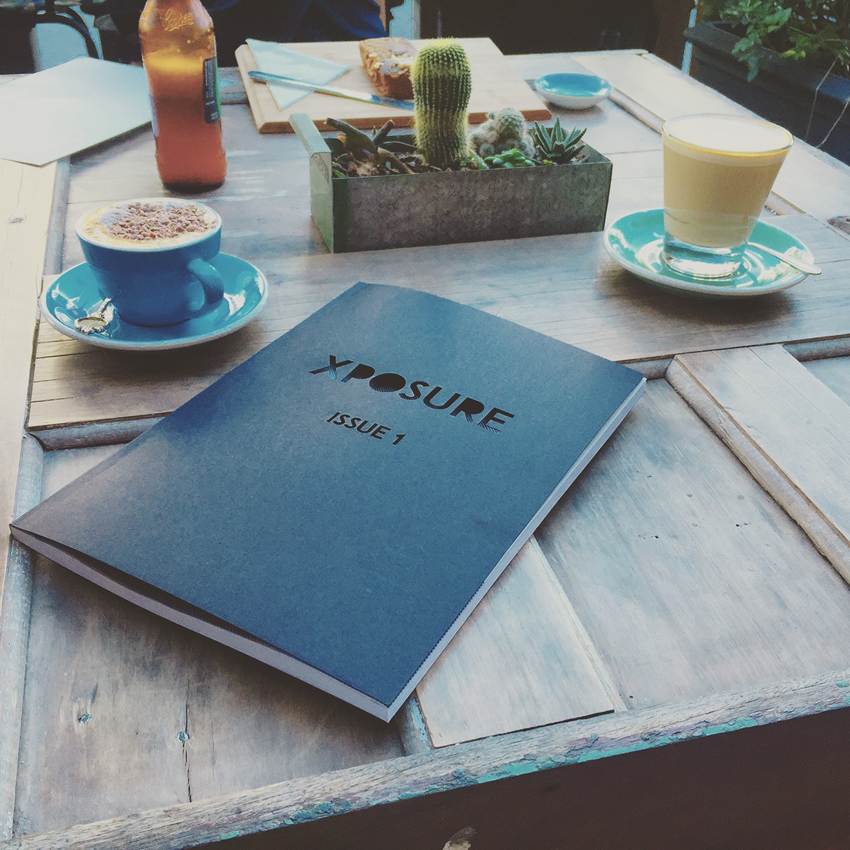
This gave us the opportunity to take some styled photos of the magazine to include in the presentation and process blog.

DPS
Sean set up a DPS file for the magazine. We were initially going to just upload a few pages to show how it worked but Sean ended up putting the whole magazine together and creating some really engaging animations and interactions to the app.
FACEBOOK
XPOSURE is now on Facebook
https://www.facebook.com/xposuremagazinebrisbane


