Reimagining a system-wide transit map
With the addition of a second rail line, Metro Transit took the opportunity to overhaul its System Map. At the start of the process, we gathered various stakeholders to discuss how the map was used both inside and outside the organization to define the audience and purpose. The map was recreated from scratch using a GIS base map that was brought into Illustrator and stylized. Three different designers had a hand in the painstaking process of cleaning up the base map and hand-drawing every route on its own layer. I oversaw the project and provided art direction, as well as doing much of the design work.
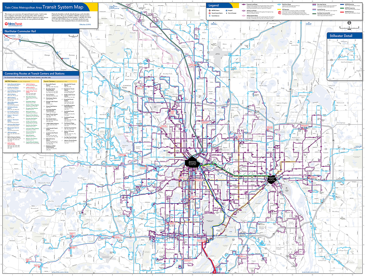

The former map (above left) had every route in a separate color which made it very busy and heavy with lines. Dark boxes calling out transit centers and stations commanded the most attention. The new map (above right) uses a few select colors to indicate type of service and thicker/thinner lines to indicate frequency. The most frequent routes (in thicker purple lines) get the most attention as do the two rail lines. While the map appears less busy, it actually provides layers of information to the customer, rather than simply where the bus goes.
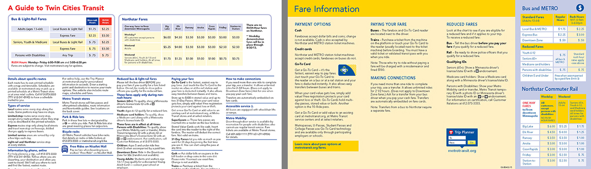
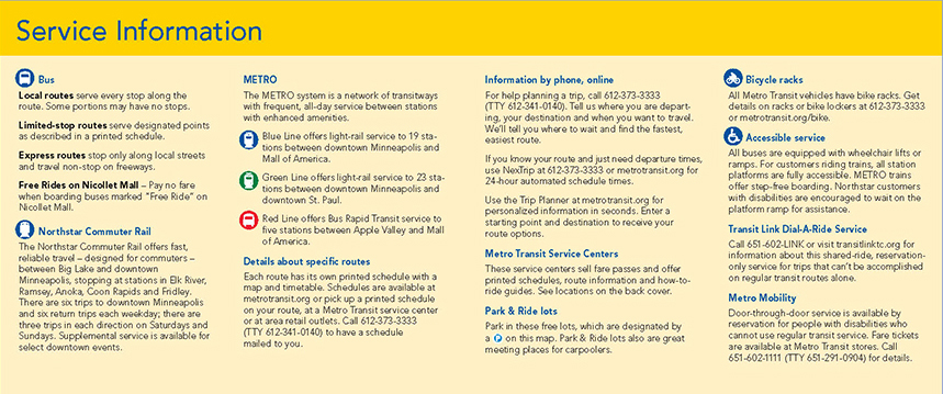
I completely reorganized the informational side of the map to make it more useful to new customers (one of our main audiences). The former brochure (above left) had all the transit information lumped under one heading with no emphasis on anything. The new layout (above right and below) creates distinct sections with large subheads enabling customers to quickly find important information, such as fares, payment options, and services offered.