OSA & The Temp Desk
Branding and Advertising for recruitment industry
Branding and Advertising for recruitment industry
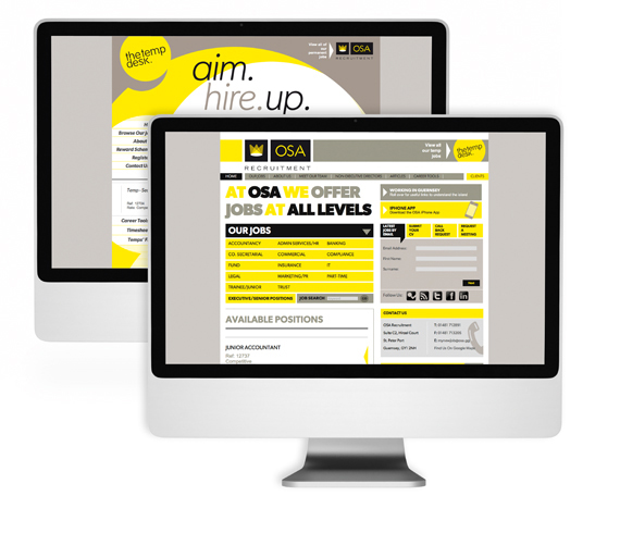
We wanted to create a brand that was vibrant and warm, so yellow was always going to be the starting point. We married this with a direct copy driven approach, talking directly to the client in plain english rather than through abstract imagery or business metaphors. This has been implemented across the board from lightboxes to buses, brochureware to advertising. Both brands employ the same typeface, but at opposite ends of the spectrum. Whereas OSA is big, bold and uppercase, The Temp Desk is Light, italic and lowercase. The Temp desk is playful and mobile, OSA is stoic and structured but both brands share values and consequently sit perfectly alongside each other. It is a brand still in it's infancy and we look forward to helping it grow to properly reflect these excellent companies.