Reflection Assignment
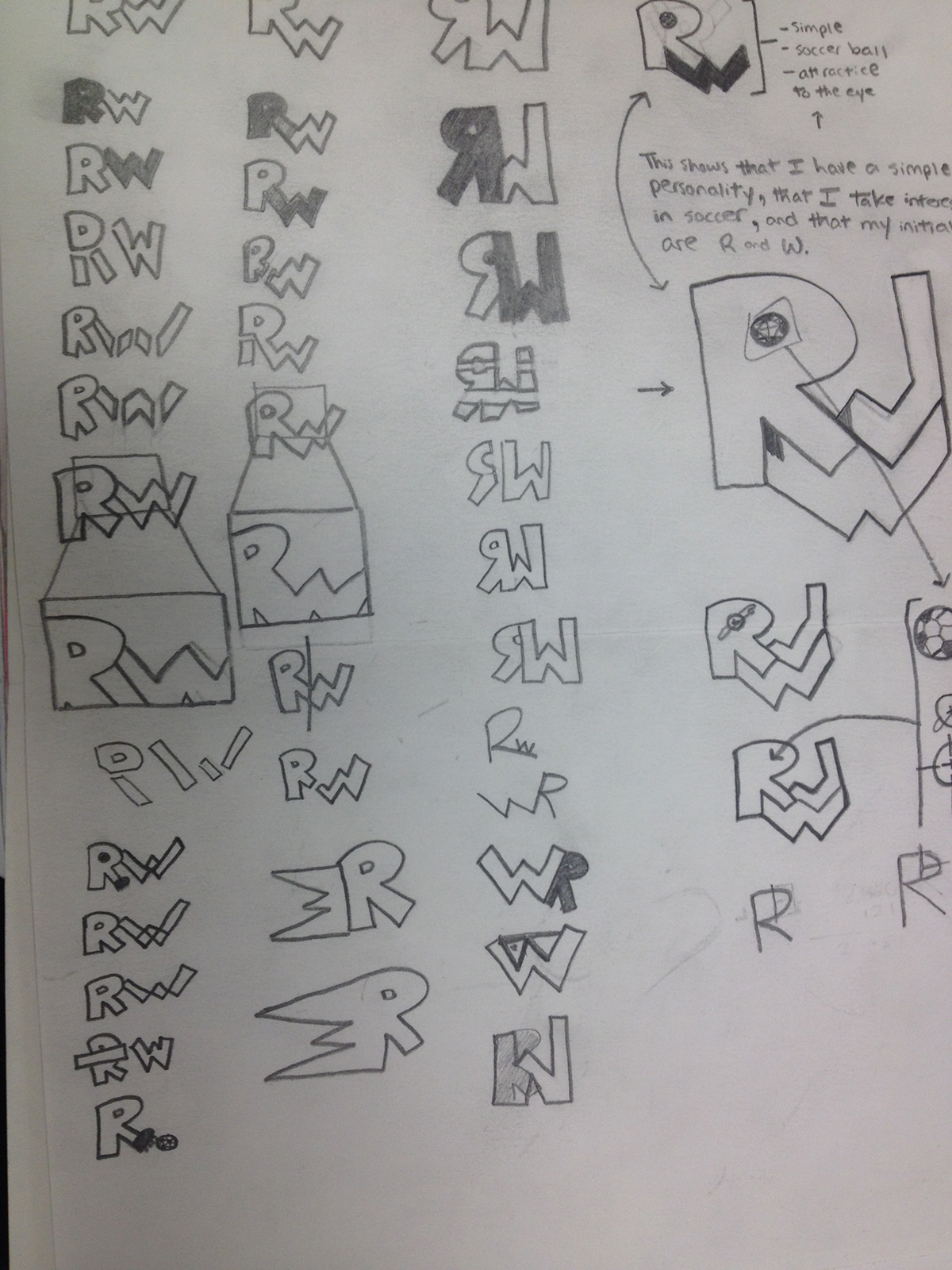
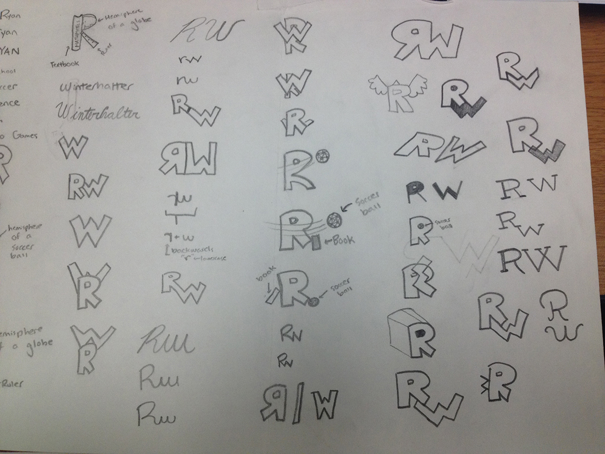
Throughout this project, I have spent a lot of time determining what types of colors and imagery I should include into my logo to reveal the most about my character. I included my initials because they reveal a good bit of information about me. They notify the viewer of my initials. Including my initials made this more of a “personal” logo. I also included guidelines in my logo to make it seem more like a blueprint. We have all seen blueprints and mechanical drawings with extended lines acting as guides. Blueprints and mechanical drawings are typically associated with engineering and mathematics, which I find a strong interest in and am good at. When I included my guidelines in there, I was trying to convey the message that I find an interest in engineering and mathematics, two closely related fields. I would like to pursue a field in engineering or mathematics (or possibly another closely related field), and because I have a very mathematically oriented mind, I decided to include these guidelines to show that I have an interest in engineering and mathematics. I made these guidelines smaller than the lines that form the letters that are my initials for a few reasons. First of all, I made the guidelines smaller so that they would make the bold lines of the letters stand out a little more, but I didn’t make them so much smaller that they weren’t noticed, because they play an important role in the message that my logo conveys. Also, they make it look even more like a mechanical drawing because, on mechanical drawings and blueprints, the extension lines are typically lighter and thinner than the other lines in the drawing. This makes it even more like a mechanical drawing, which makes the message that I find an interest in engineering and mathematics stronger.
I also included a lot of purpose behind the choice of my colors. I chose a deep blue because of the message that it represents. A deep blue color typically represents credible, authoritative, basic, conservative, loyal, confident, and professional qualities, which reveal something about me. I am a very conservative person – not to out-going, a credible individual, loyal to others, and am confident in the majority of things that I do. This color represents qualities that I have, which is one reason why I included it into my drawing. I included white for one of my initials because it represents cleanliness, simplicity, and efficiency, all of which represent me as well. I typically am a clean person, I work very efficiently, and am a simple individual. Additionally, I included a silver color. Silver is one of the first colors that comes to mind when I think of engineering (blue being another one). As you can see, I chose my colors with care, picking ones that represent the most about me. Blue and silver represent (again) the fact that I find an interest in engineering and mathematics, working with the guidelines, while the white and blue represent qualities about my character. I included these where I did to create a contrast in color, and make the logo more appealing to the eye. I put the blue in the middle so that the white and silver wouldn’t be next to each other, and so that they would appear to be right next to the blue, which creates a greater contrast in colors. The white contrasts the blue, and the blue contrasts the silver. I placed them in this way to create the greatest contrast in colors, because both the white and silver are coming into the more contact with the blue letter than they are with the other letter of a similar color. As you can see, I put a lot of thought behind which colors I should include in my logo, and have chosen them based on what colors reveal the most about me. This, in the end, makes this logo more of a personal logo and reveals more about me, which is the ultimate goal of this project.


