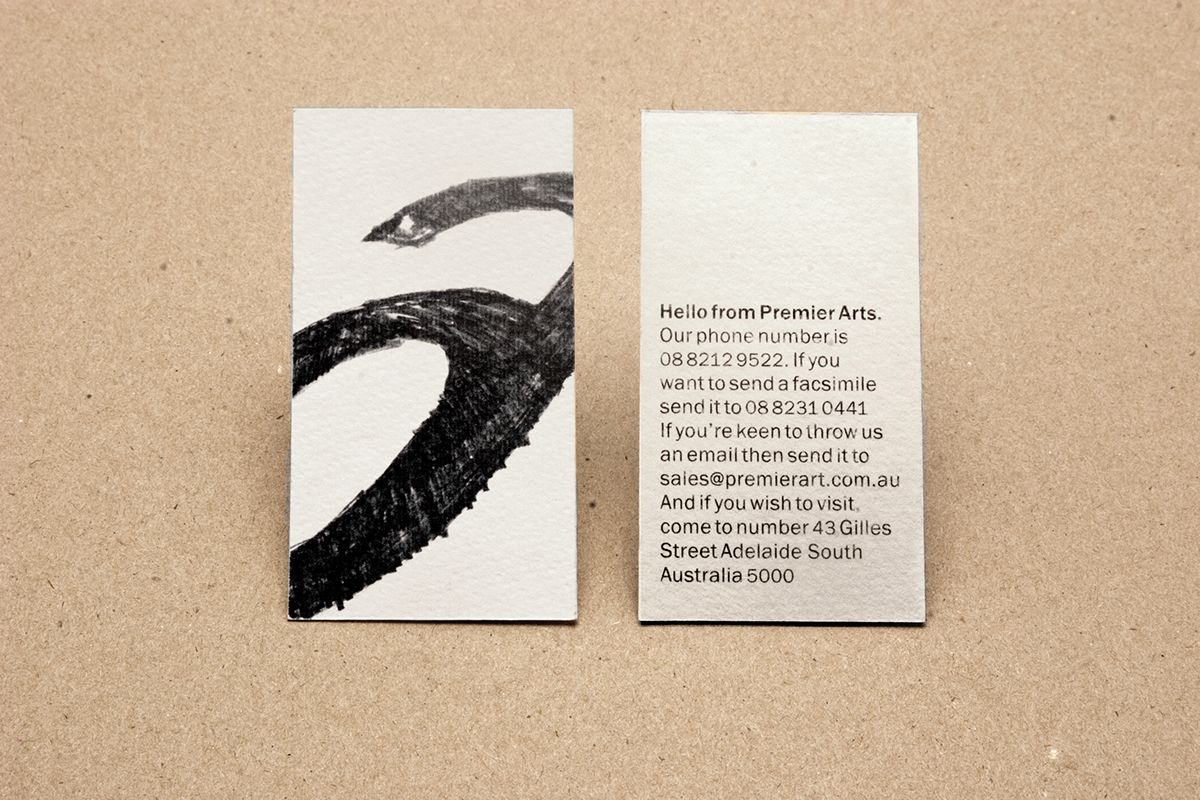
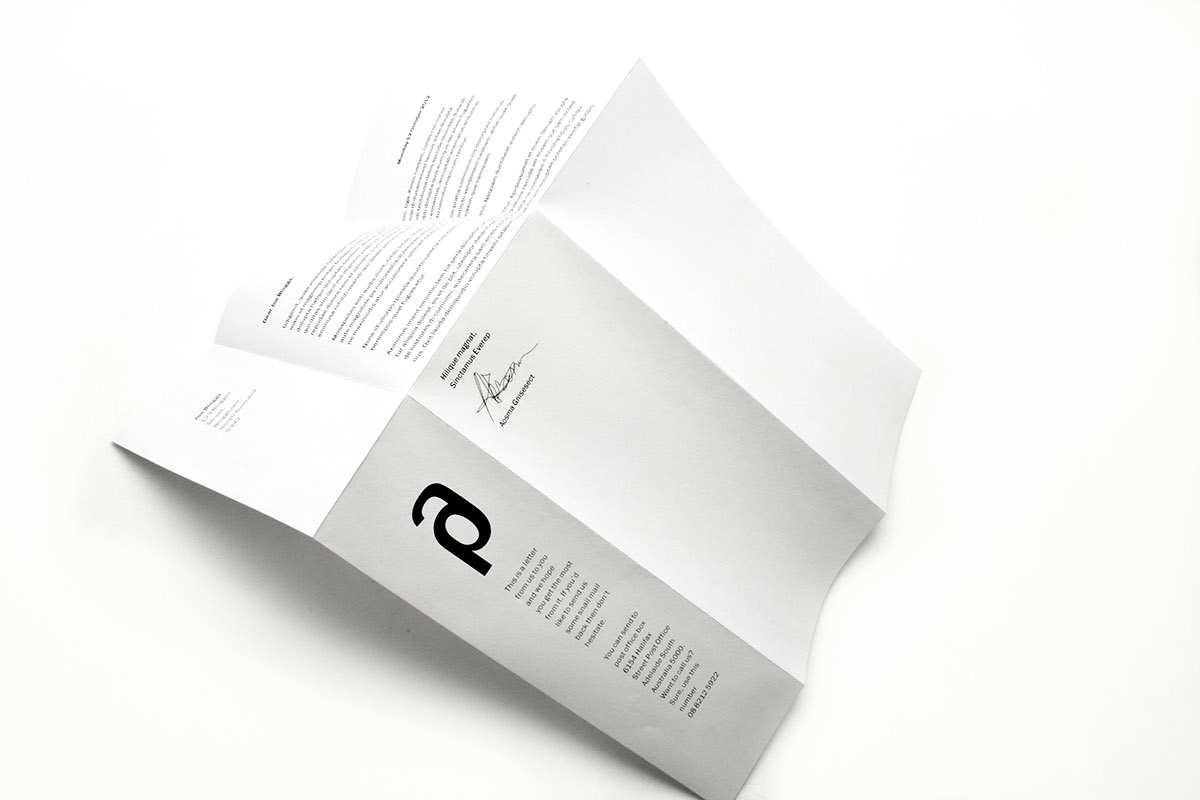
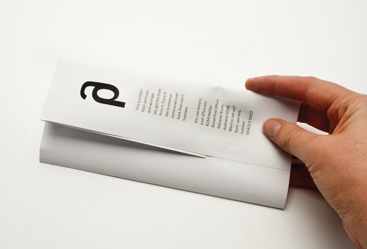
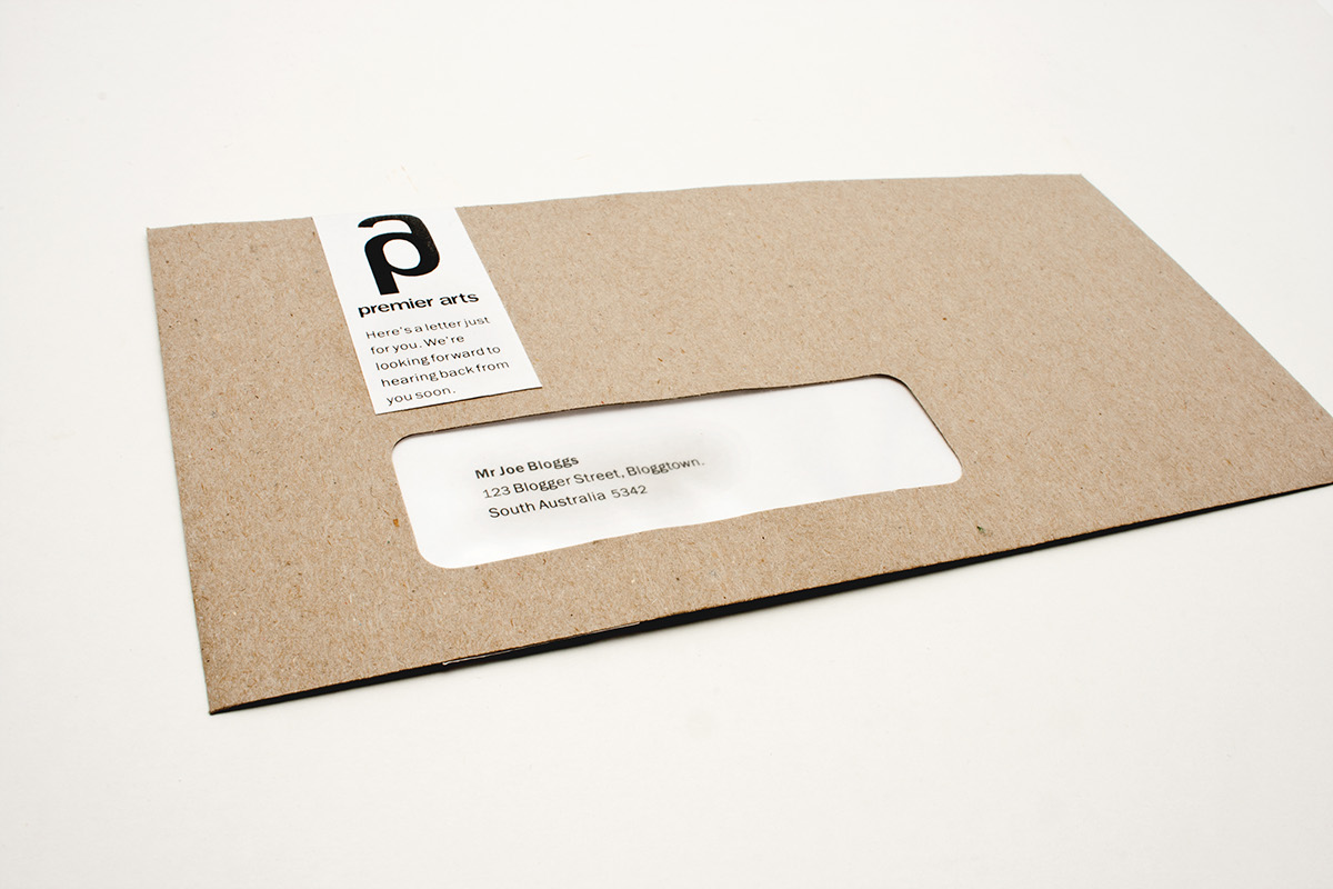
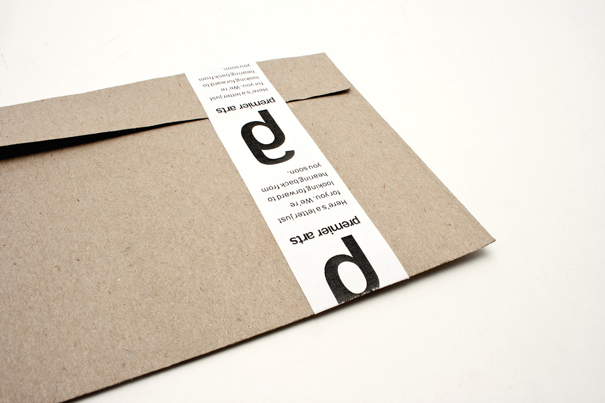
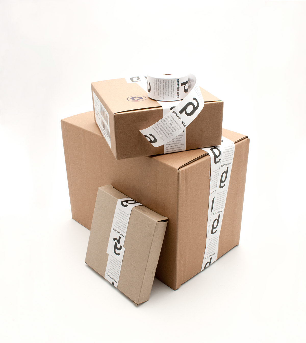
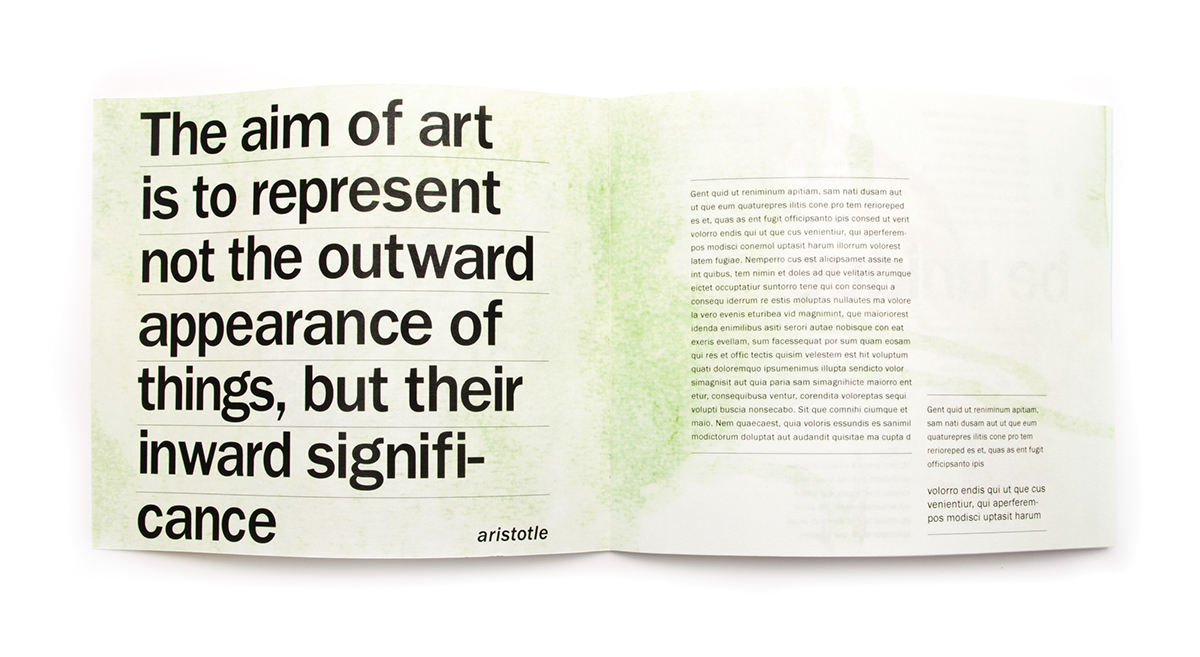
As a designer it’s always an enjoyable task notonly to work on a project where the client gives me near-free reign, but alsoto work on a subject that I, myself, am passionate about. To begin with, I wasgiven the task of designing a new logo for the company. They were looking forsomething that would differentiate themselves from their competition and showoff a striking but somewhat corporate display. They wanted to avoid cliché imagesof paintbrushes and paint pallets and go for a design that advocated clearnessand definition. The logo I created was one that could stand out on its own, butdue to its simplicity, also be used in a variety of associative ways.
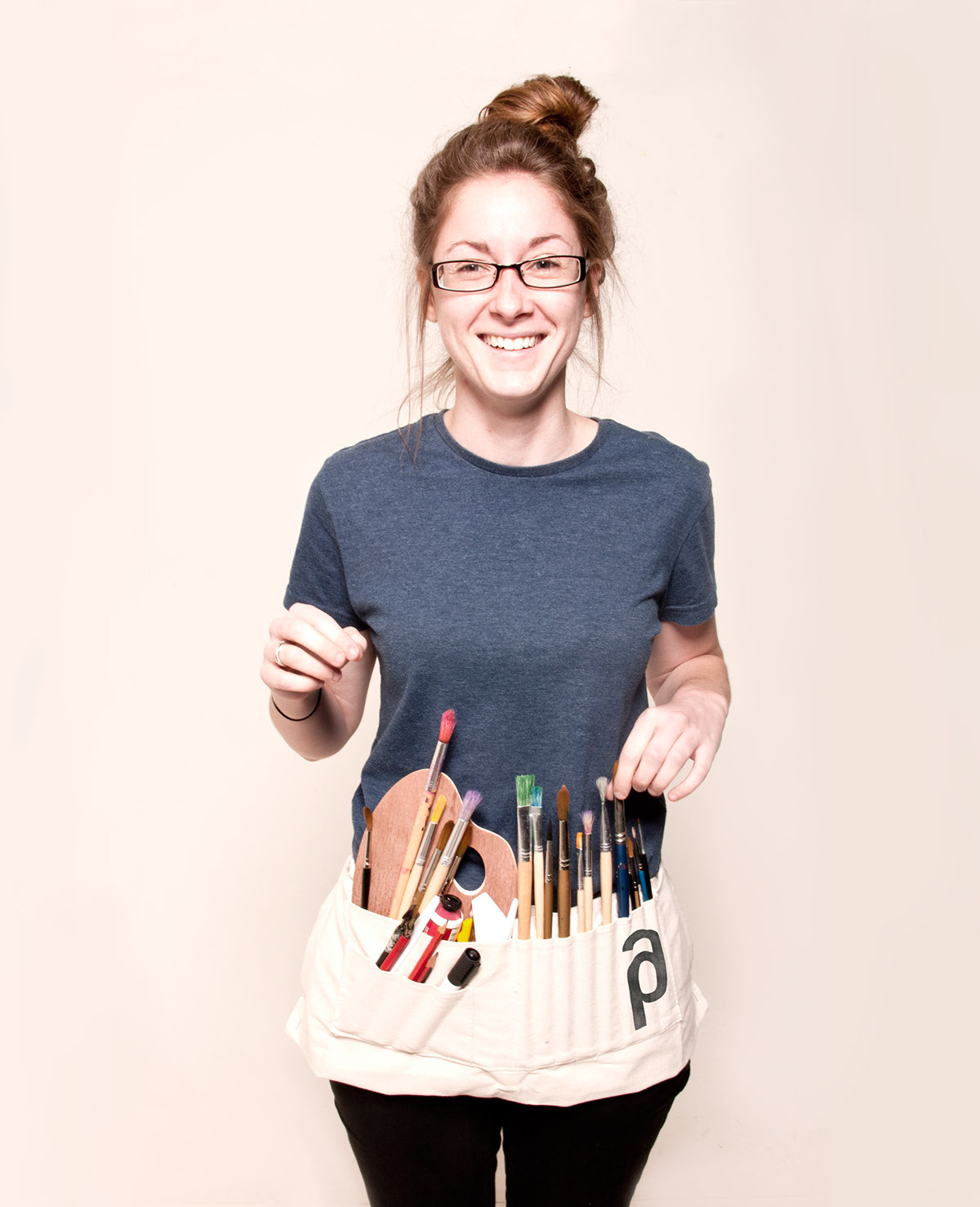
Artists are usually very experimental people,always playing with different media and creating shapes in many ways. Throughthis I decided to develop a brand that had a provocative contrast between thecorporate ambiance of the logo and the messy experimental nature of artiststhemselves. I worked with splashes of colour and eccentric images throughoutthe advertising and merchandise, but scaled back to a humbler impression throughoutthe stationery and box packaging. The vibrancy of the advertising, shop frontand the store brochure was to entice new people to enter the shop and feelinspired to experiment more with their work. The clean, practical designelements in the packaging and stationery gave the supply shop structure andorder.
Artists are usually very experimental people,always playing with different media and creating shapes in many ways. Throughthis I decided to develop a brand that had a provocative contrast between thecorporate ambiance of the logo and the messy experimental nature of artiststhemselves. I worked with splashes of colour and eccentric images throughoutthe advertising and merchandise, but scaled back to a humbler impression throughoutthe stationery and box packaging. The vibrancy of the advertising, shop frontand the store brochure was to entice new people to enter the shop and feelinspired to experiment more with their work. The clean, practical designelements in the packaging and stationery gave the supply shop structure andorder.