The Age of Liberty

Image taken from Ulster Museum website - http://www.nmni.com/um/What-s-on/Current-Exhibitions/The-Age-of-Liberty
This 'Age of Liberty' began around the 1900s, a time when women were fighting for their right to vote and changing the way society viewed them. All of these factors dramatically transformed fashion. This Exhibition showcases this said change brilliantly as there is a huge variety of dresses ranging from day to night. The craftmanship and effort put into a number of these garments is obvious with many of them having breathtakingly stunning embellishments. As well as the garments, information and the year that they date to are also provided,
Primary Research -
To kick start my research I Began by visiting the Exhibition In the Ulster Museum. I took Photographs of the garments which you wll be able to see fully on my pinterest page as well as a sketch i did whilst at the museum.
You will be able to find this research at the link below.
https://www.pinterest.com/mcgookin0243/specialist-illustration-using-computer-application/

Layout Research -
In order to decide on how i want my page to look I did some research into various page layouts. I looked at magazines and books that i own as well as visiting the Belfast Met library. I also looked on pinterest for inspiration.
https://uk.pinterest.com/mcgookin0243/ulster-museum-book-page-layout-ideas/
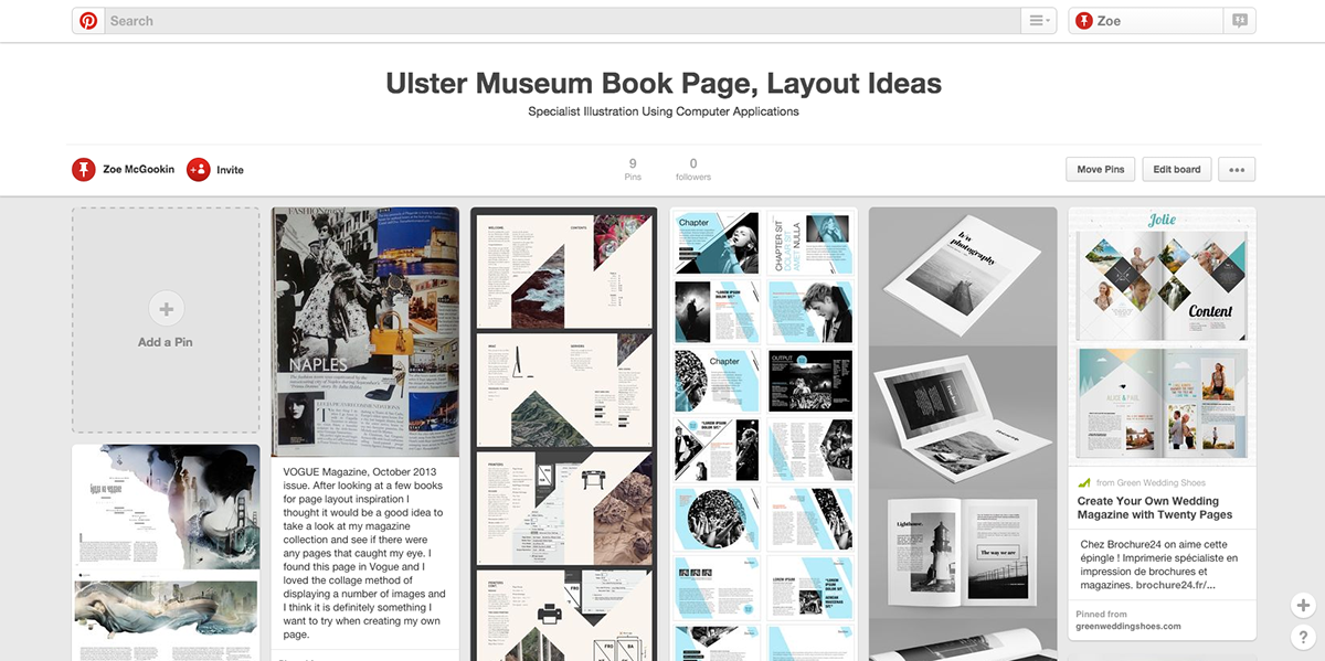
Below are three layouts that i found particularly inspiring.

Above
VOGUE Magazine, October 2013 issue. This page in Vogue caught my eye because of the collage method of displaying a number of images and I think it is definitely something I want to try when creating my own page.
I feel that the text is easy to read and although it has a lot of images all on one page it is not cluttered.
Another thing i like about it is the contrast of the colour images beside the black and white images, this to me leads to a more interesting page which is what i want for my own design.

Above
I absoloutely love the layout of this book Bergenfield / by Sorbet Design that i came across on Pinterest as its simplistic design is clean cut and modern.
Although this isthe complete oppisite to the example above, i think mixed together they would compliment eachother well.

Above
Again, i found this book page layout through pinterest and it was taken from Minimal Photography Portfolio Brochure by Rounded Hexagon. What drew me to this page was the use of margins, I like how the images are vivid and surrounded by the crisp white background. I also like the font that was chosen as it is clear and readable. I can see my self using a similar margin size for my page layout because i believe it leaves a much cleaner look.
As i just mentioned i am keen to use margins on my book page so i decided it would be a good idea to do some research and look into this topic in detail. I did this by watching a video on Lynda.com -
http://www.lynda.com/Design-Typography-tutorials/Creating-manuscript-book-grid/162443/192699-4.html
I watched the video
Creating a manuscript or "book" grid From: Foundations of Typography: Working with Grid with Ina Saltz.

From this video i learned that the margin on the inside has to be wide enough so that you can still read the text clearly when the book is open because without it the text would cuve into the book, proving to be difficult to read. The top margin should be more than the inner margin and the outter margins should be wider than the top margin. Lastly, the bottom margin should be the biggest of all.
Below is my final book page.

I am reasonably happy with how my page turned out. I tried to make use of the margins provided and i also wanted to be able to insert text in Photoshop which i achieved. My final result is very simple and not the most extravagant or pretty page you've ever seen, however it does match my love for simplistic style as you can see through my research. I am happy with the range of images i have as their is both photograph an illustration of my own. One thing i would change is the background of my illustration as you can see the creamy coloured page that i drew on. on reflection i should have removed the background for a crisper, cleaner look.
I feel that i have learned from this task and will now know how to use margins etc for future tasks.
