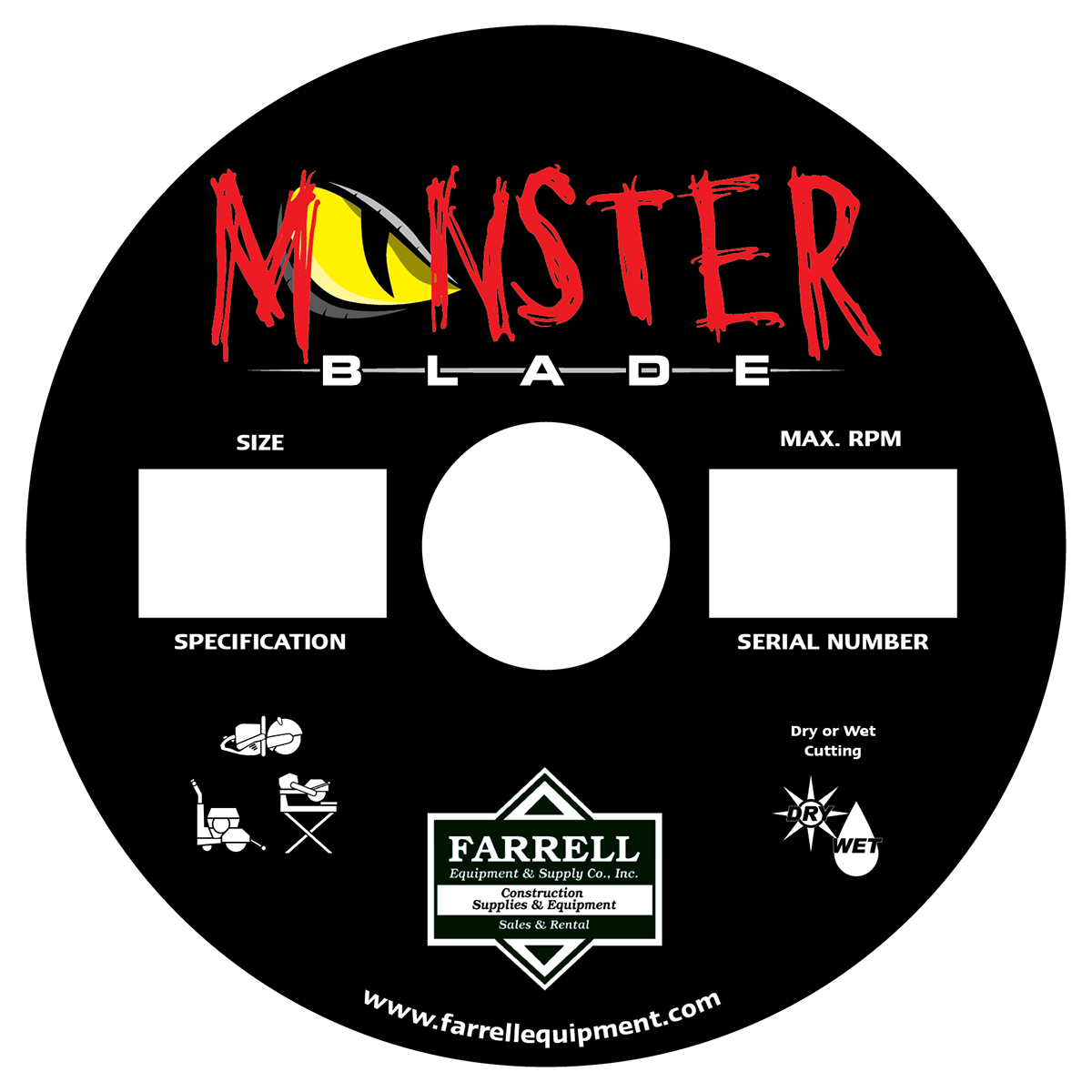
Client was looking for a brand for a concrete blade named the "Monster Blade." They sent a crude sketch with some mean eyes and squiggly mouth on a blade. I wanted to make sure that the name was the central focus of the brand but originnally thought about a stacked logo but the shape of the monster eye lended itself nicely as a replacement for the "O" in the image. That allowed for a much larger representation of the brand on the label. Below is the approved application.