Looking at a Suitable Publication for my photostory to be published in:

Athletics weekly is a publication that would be suitable to publish my photo story in. It looks at athletes of all ages and through all the disciplines. It also covers a wide range of events and competitions and has sections on up and coming athletes, which Poppy is. It also has good quality photographs accompanying its articles, which mainly tend to be action shots, which are similar to mine.

Reviewing of contact sheets:


Paper Edit - Deciding on my final selections


Final twenty photographs for online slideshow:

Through the process of chosing my final photographs for the slide show I tried to make sure every shot was different in some way and adding something new to the selection. I wanted to make sure the photostory was clearly focused on Poppy but also included her interacting with her training club and coach as well to give the story more depth.
Final six photographs to be used in publication:
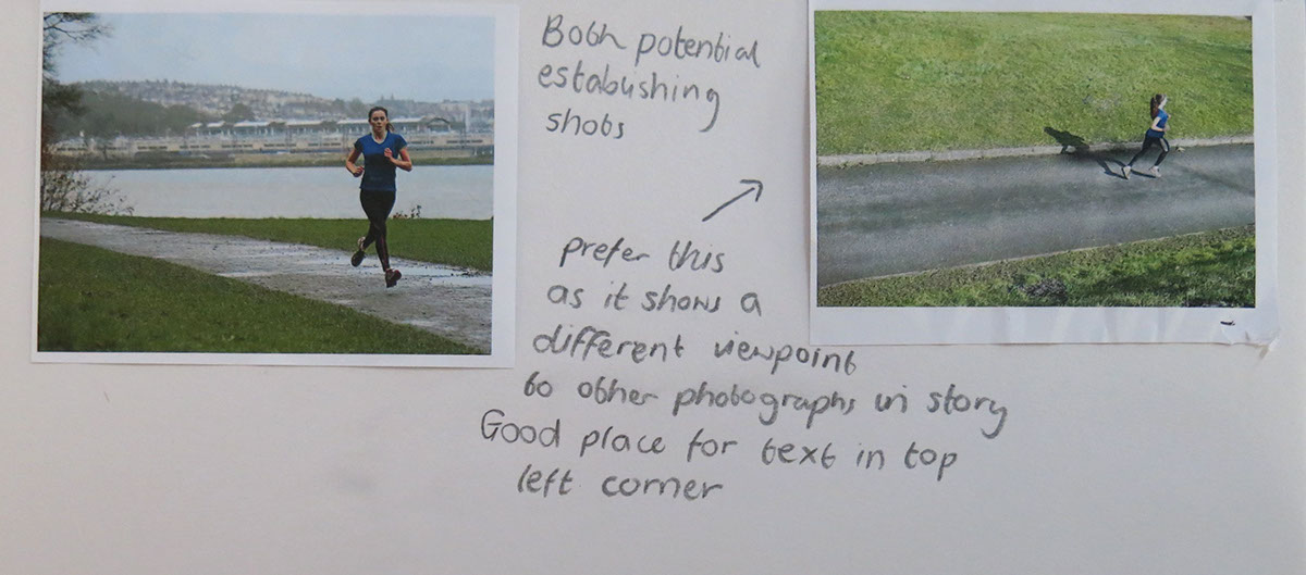
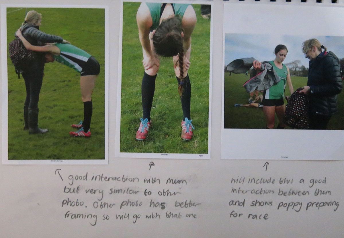
It was hard to cut down the number of photographs from twenty and choosing which final six photographs I would use as some of the photographs that I prefered didn't give enough information to be included so I had to use others. I feel like I have a clear establishing shot and finishing shot and a range of different sizes which should make putting them into a document on indesgin easier.

Designing my A3 page on Indesgin
I have decided to create two A3 pages as I am going to use one for a full bleed establishing shot as I feel that there are suitable places to put text on the photograph I have choosen. The other A3 page is going to have the remaining five photographs on it with accompanying text.

I felt the layout above had to many photographs on the right hand side of the page which made it look unbalanced.

This layout didnt give me enough space for my captions and text
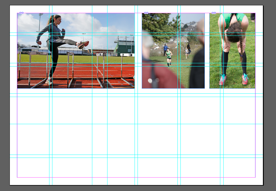
This layout had to many photograph on the top of the page

I didnt think the page balanced that well so I moved the small photographs from the right to the left as is seen below:

The page balanced better when the small photographs where to the left of the page rather than the right.
Final photograph and text layout design:

Online Slideshow of my final 11 photographs:
Captions for Photographs in the Video in order that they appear
1. Poppy Tank is an 18-year-old long distance runner, living and training in Plymouth. Poppy specialises in 3k on the track and longer distances over cross-country.
2. Poppy taking part in hurdle drills to improve flexibility and posture, which are key components of running.
3. Poppy edging in front of her nearest competition from the cross-country season to take the overall Westford League win.
4. Recovery after having placed first in the Westford league cross-country race in Redruth, Cornwall.
5. Poppy’s coach Simon Anderson pacing the spacing between hurdles before drill training.
6. Plymouth Athletics clubs long distance training group finishing the warm up with short sprints
7. Early morning hurdle drills
8. Walking over hurdle drills to make Poppy think about her movements
9. Poppy handing extra layers to her mum before the start of her cross country race
10. Poppy training at home on Brickfields Athletics track with her coach Simon Anderson
11. Recovery at the end of Saturday morning sprint training session
Evaluation
For my final publication I chose to put five photographs on the main page of my article and use my establishing shot for an A3 opening page. I did this as I felt that on my establishing shot there was a good amount of space for my title and caption, which would give a good introduction to my project. Arranging the other five photographs onto an A3 page was harder than I thought it was going to be. Through out shooting I should have thought more about taking my photographs in both landscape and portrait. This would have made it easier to arrange my photographs on the page, as I would have had more options if I could have used different orientations of my photographs. To overcome this I made two of my landscape photographs smaller so that they could be placed in a column and balance with one of my only portrait photographs. I also wanted to include a few different sized photographs on my page to prevent it from looking to repetitive. However, from looking at other peoples work in my research I saw that I didn’t want more than three different sizes as this makes the pages look less organised and prevented the work from looking like it fitted together. Through out the process of creating my publication I also realised how important it is to make the pages balance. This was hard as I had to think about both the text and the photographs while also making sure I kept the spacing between the text and all the photographs the same. I am pleased with the balance of my final outcome and the placing and spacing between the text.
I did four separate shoots over three different locations for this photo story. I feel this provided me with enough photographs to have variation in my story. However, there are shots I feel would have improved and developed the story further, which I am missing. My project would have been stronger if I could have had access to more of Poppy’s life rather than just the running side, such as her trips to the doctors for her running related injuries or photographs relating to her school life. I did have good access to the running side of her life though and opportunities to talk to her about if and get information for my article.
To improve the photographs I was taking I should have started the editing and selection of potential photographs sooner by looking at printed versions of contact sheets from the very first shoot. This would have made it clear what direction I was heading in from the start, rather than starting paper edits after the third shoot. I did choose to focus on Poppy from the group of runners at the start though which did help direct my project.
Making my final selection I wanted to make sure that the photographs were not repetitive and each added something new to the story, to do this my final selection for the online PowerPoint was eleven. I think my final selection has a good mix between focusing on Poppy and also showing her interacting with others. It was easier making the final selection when getting other people to look at my work as it made me realise that particular shots that I really like might not be the best for the story.
In conclusion I am pleased with how my photo story has turned out with how the photographs work together in a set. However, it is missing shots that would have developed it further and made it stronger.

