


Testing K on Keira
— part 2
Graphic design
Typography
Illustration
Illustration
Poster
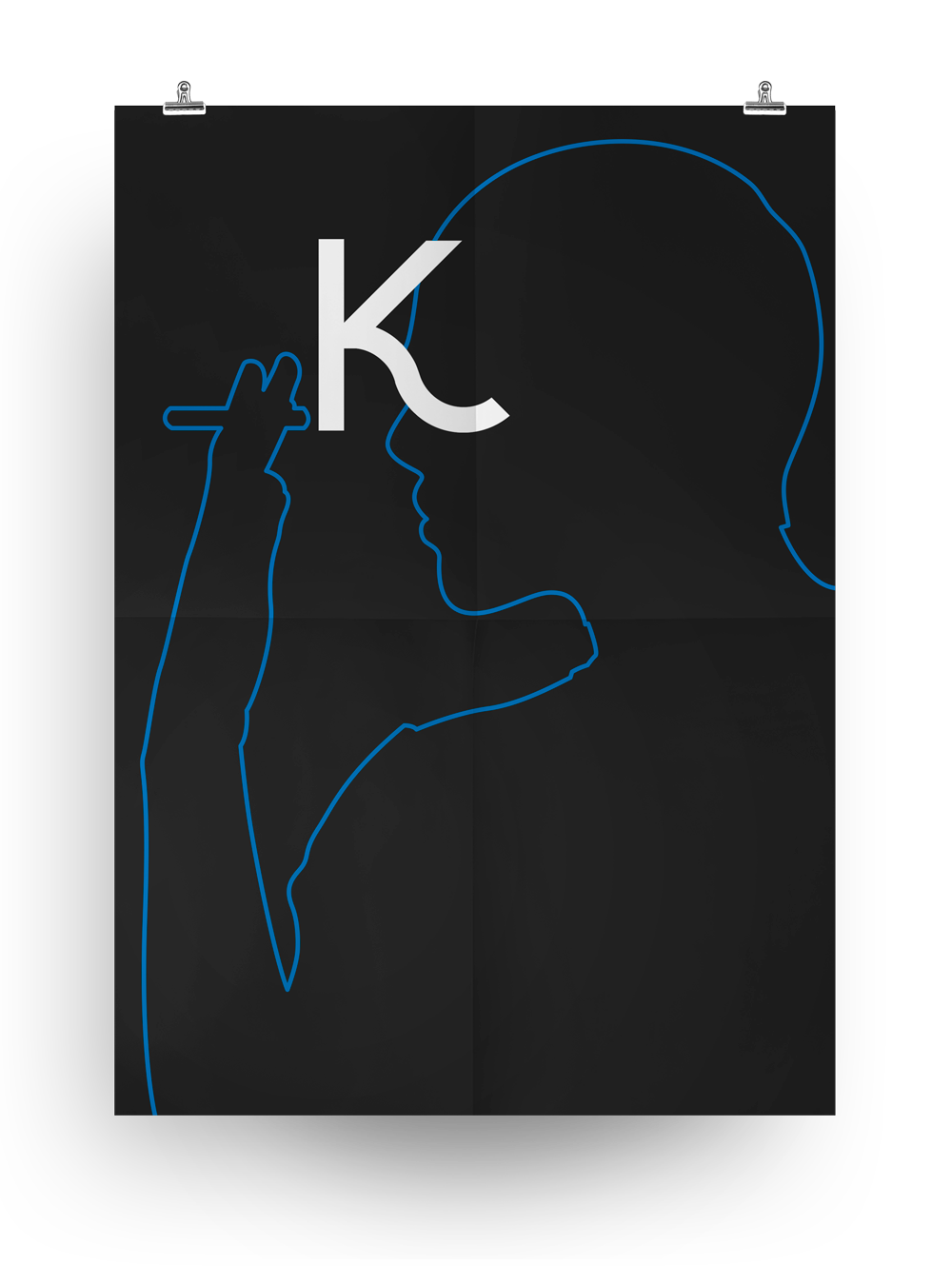
When designing letterforms — in the rare moments when I am doing that — I use to present, once done some letters, the exported shapes in some printed graphics. Just to taste (and test) how does the type work and what is the feeling of it. At the same time — in the font designing process — I tend to put a movie into my dvd reader and let it go. I do not watch the movie, I only hear the dialogues. In this case — while designing this upcoming font with some female-alike inspired curves — a Keira knightley movie was reproduced by the dvd player. I really love her and her divine style, so I immediately decided to 'try' my type on her beautiful figure. So she became both a muse and a cavy. An amazing cavy.
This is the second test on a Keira's photo (pic found on the web — it is from the 'Atonement' movie and here I do not quote the photographer and its credits because this experimental design is strictly for personal use — for my letterform 'uppercase K'.
A3 poster print:

A3 outline illustration print:
Credits:
Graphic design → Aleš Brce
Outline illustration → Aleš Brce
Type design → Aleš Brce
Type design → Aleš Brce


