


Out of Character
Experimental Typography
Experimental Typography
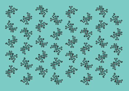
Alphabetic symbols were created to be our visible language. What of them? Each has a story to tell. Each has a history to its form that is irrelevant to its function. The function of the alphabet as representation of verbal language has triumphed over its physical form. In ‘Out of Character’ form fights back, the alphabet reclaims its visual language. ‘Out of character’ creates a new language experience through pattern.
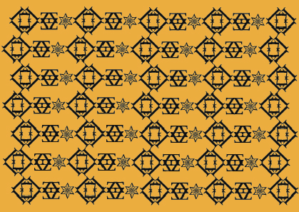
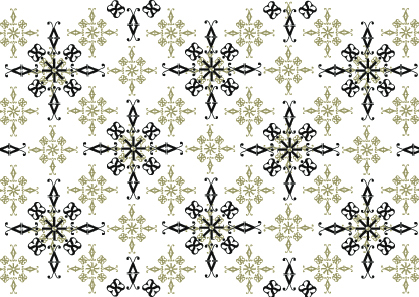
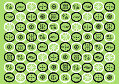
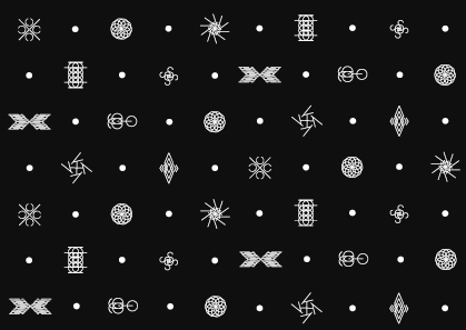
‘Out of Character’ is an experimental project looking at the world of letters in a new and unexpected way. By taking different typefaces and stripping them of their ability to speak verbally and literally their visual language and beauty has been rediscovered. Freeing letters from the strictures of using words to communicate meaning they become able to show their hidden messages of shape, proportion, space and pattern.
The Vox system provides the basis for the selection of typefaces used in the ‘Out of Character’ project. One typeface was chosen from each of the first six categories plus one from the category ‘display’. Each typeface was selected on how it seemed to offer itself to the playful nature of the project. Once selected individual letterforms were played with as visual units to be combined and juggled and encouraged into new glyphs and flowers and patterns. They didn't need asking twice!
Innovative and exciting the alphabet will never seem the same again. ‘Out of Character’ celebrates the joy of letters by letting them have a party on their day off.
This work formed the final major project of my BA (hons) Graphic Design helping to achieve a first. It also had me seeing patterns in my sleep!
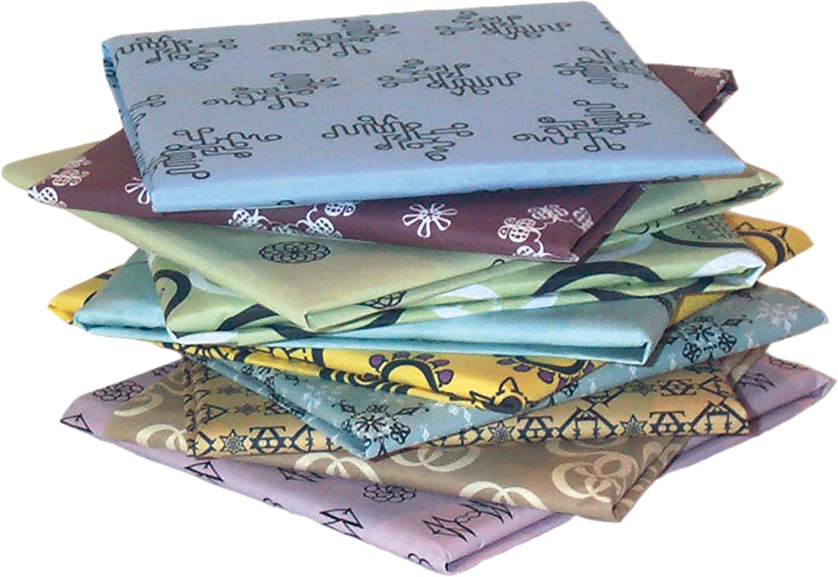
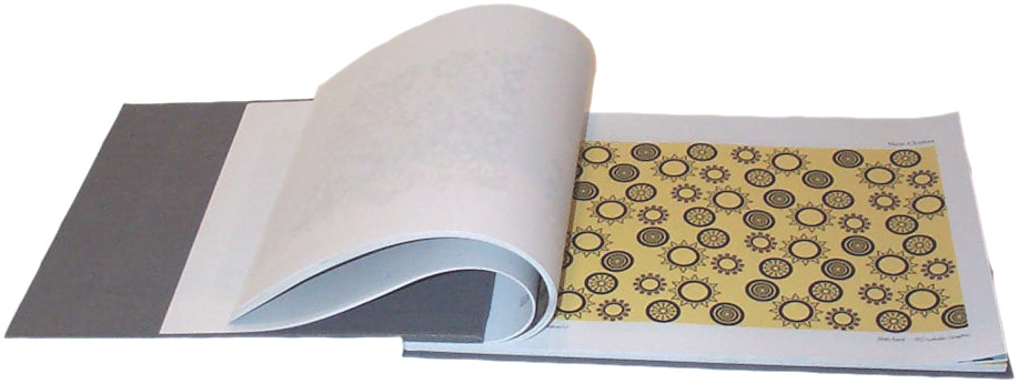
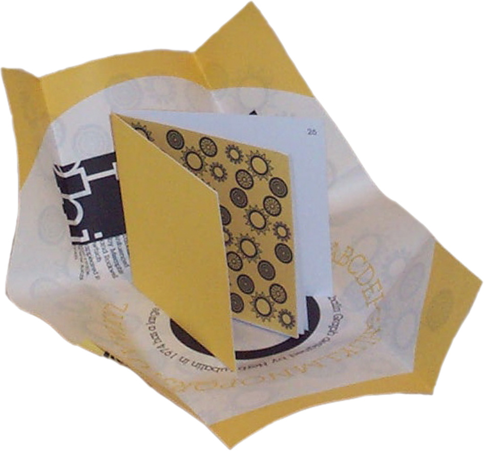
Wrapped Alpahbooks.
Each type pattern had a small book highlighting its virtues made in both hardback and softback.
The softback set were each wrapped in a poster, pattern on one side, information on the other.
The hardbacks had the pattern as endpapers.
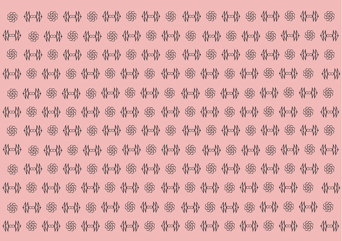
Humanist: Centaur
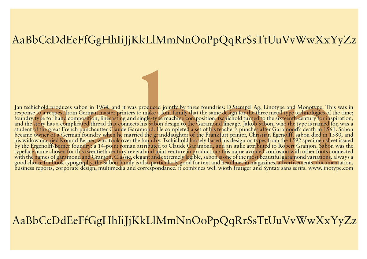
Garlde: sabon
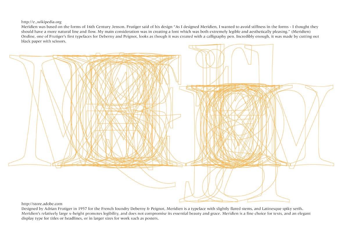
Transitional: Meridien
Didone: Didot
This was one of the few designs which was taken into the next stage of multilayered pattern.
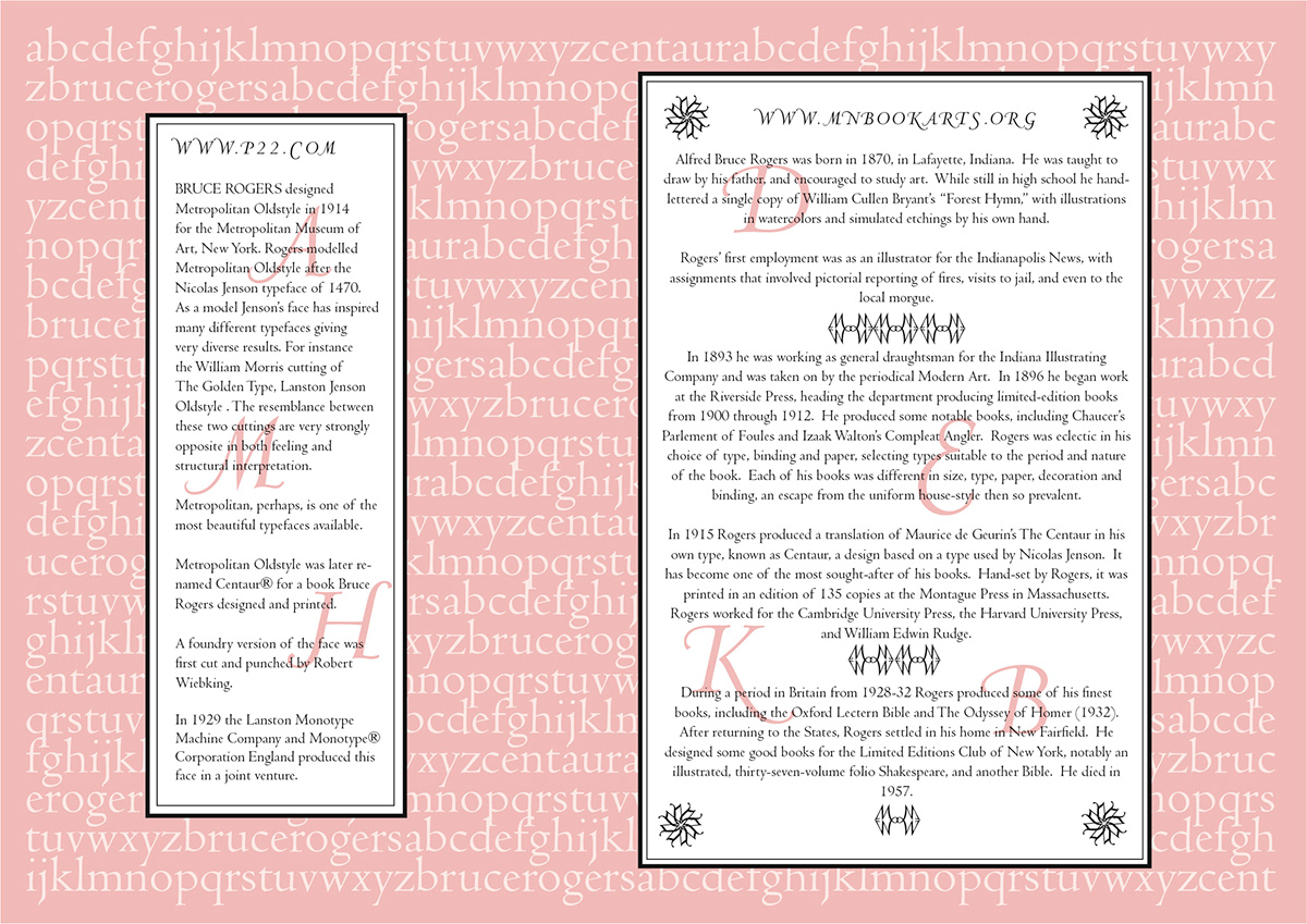
One large wallpaper sampler style book was made to present the technical details of the project.
This included historical details of each typeface chosen, how each pattern was constructed,
and possibilities for applications.
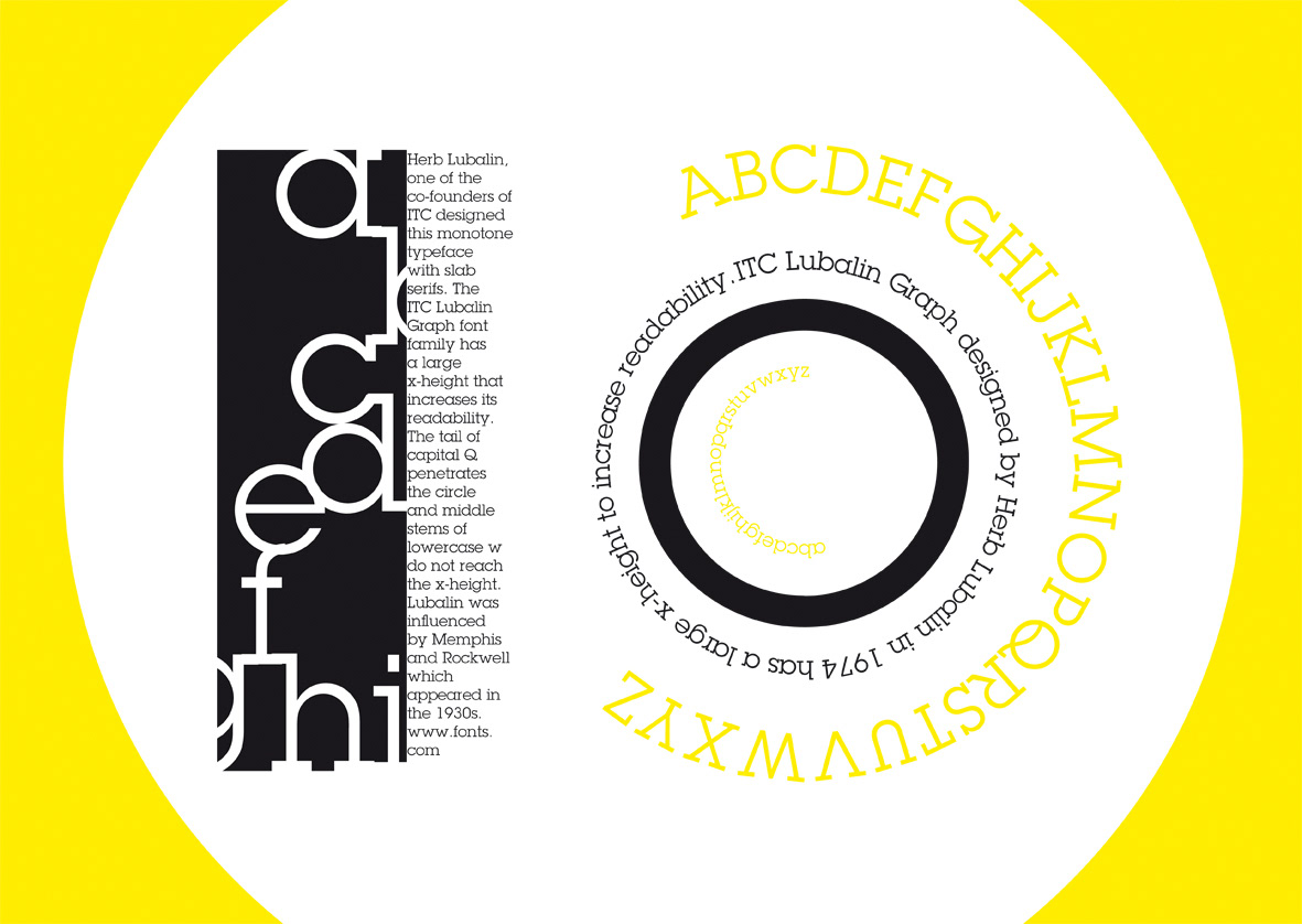
Slab Serif: Lubalin Graph
Softback book with wrapper
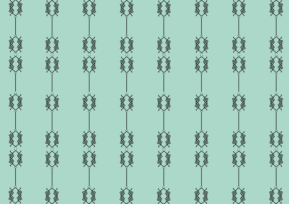
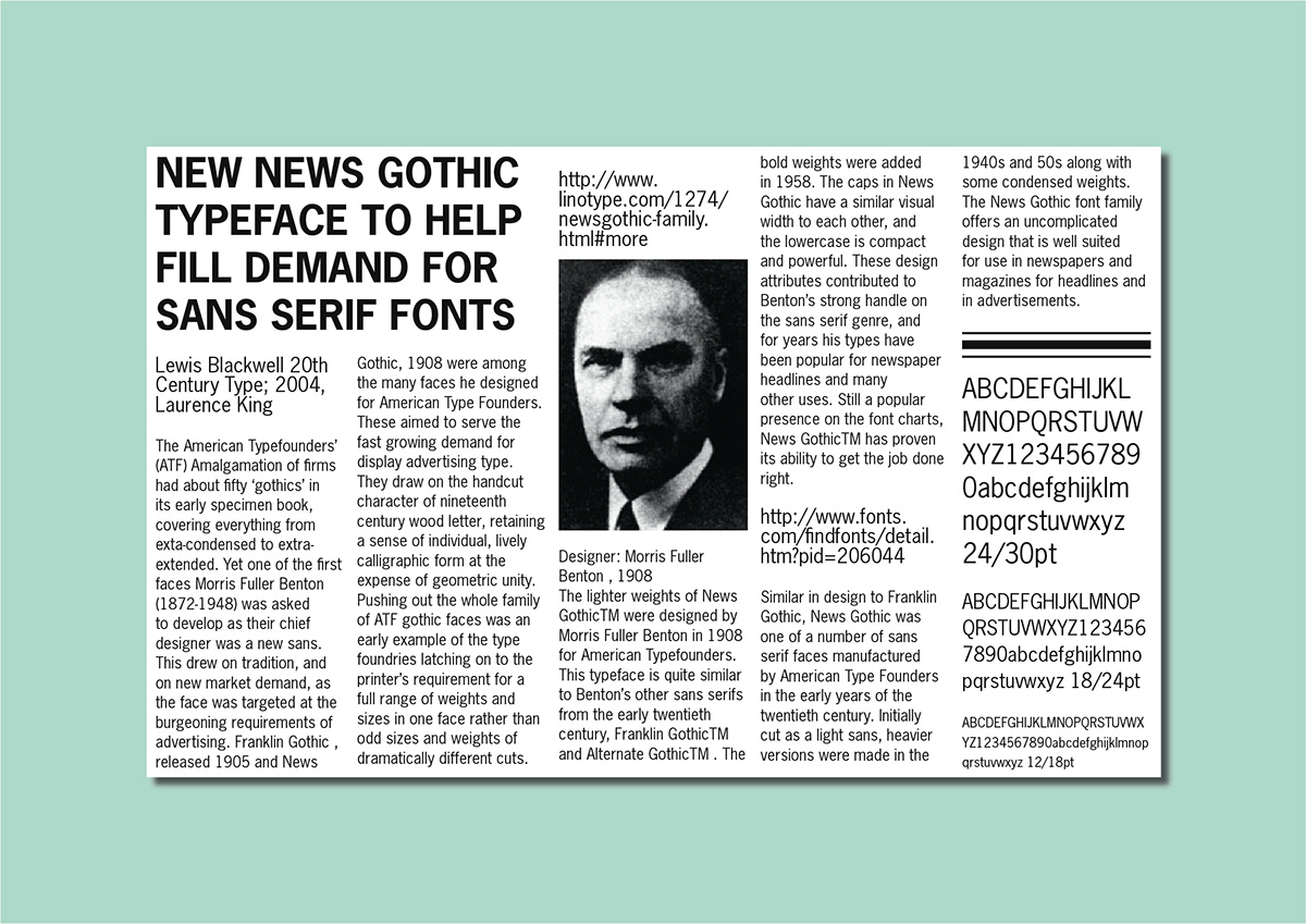
Lineale, Grotesque: News Gothic
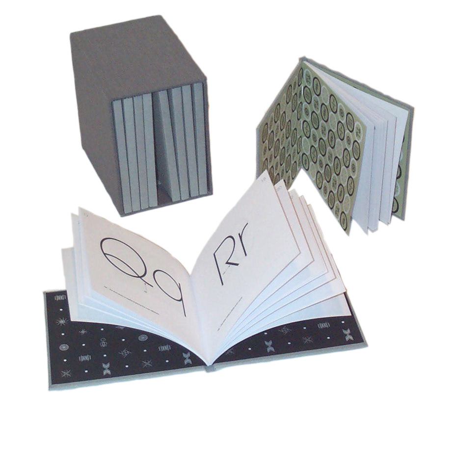
Set of ten small hardback Alphabooks in slipcase
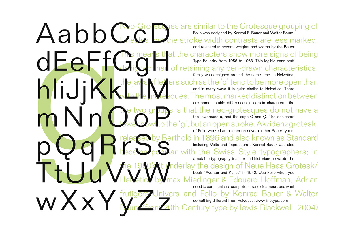
Lineale, Neo Grotesque: Folio
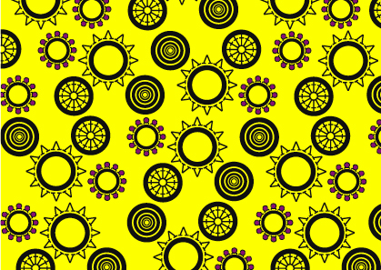
Lineale, Geometric: Avant Garde
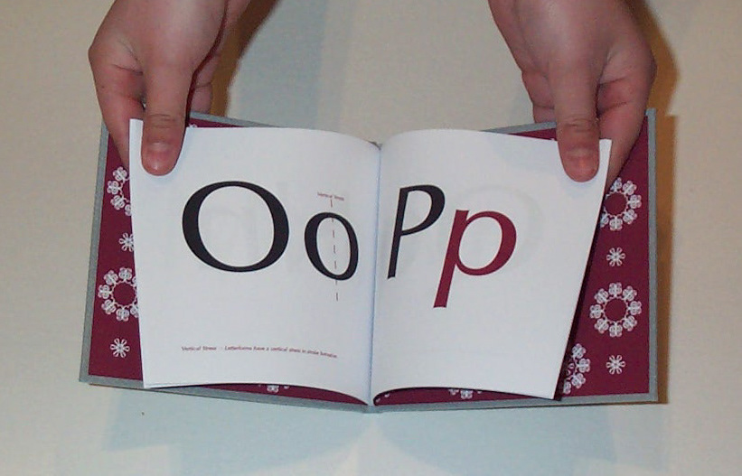
Inside one of the hardback Alphabooks clearly showing the endpapers.
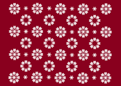
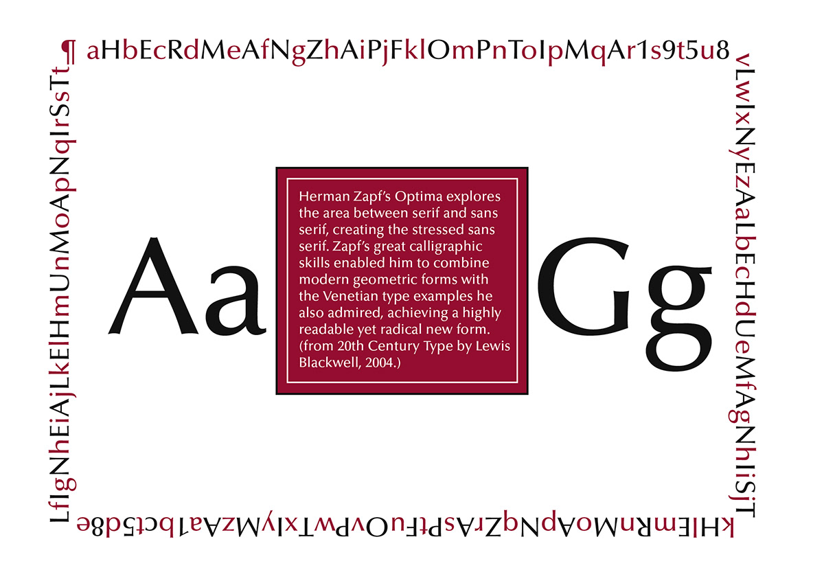
Lineale, Humanist: Optima
Display: Bauhaus
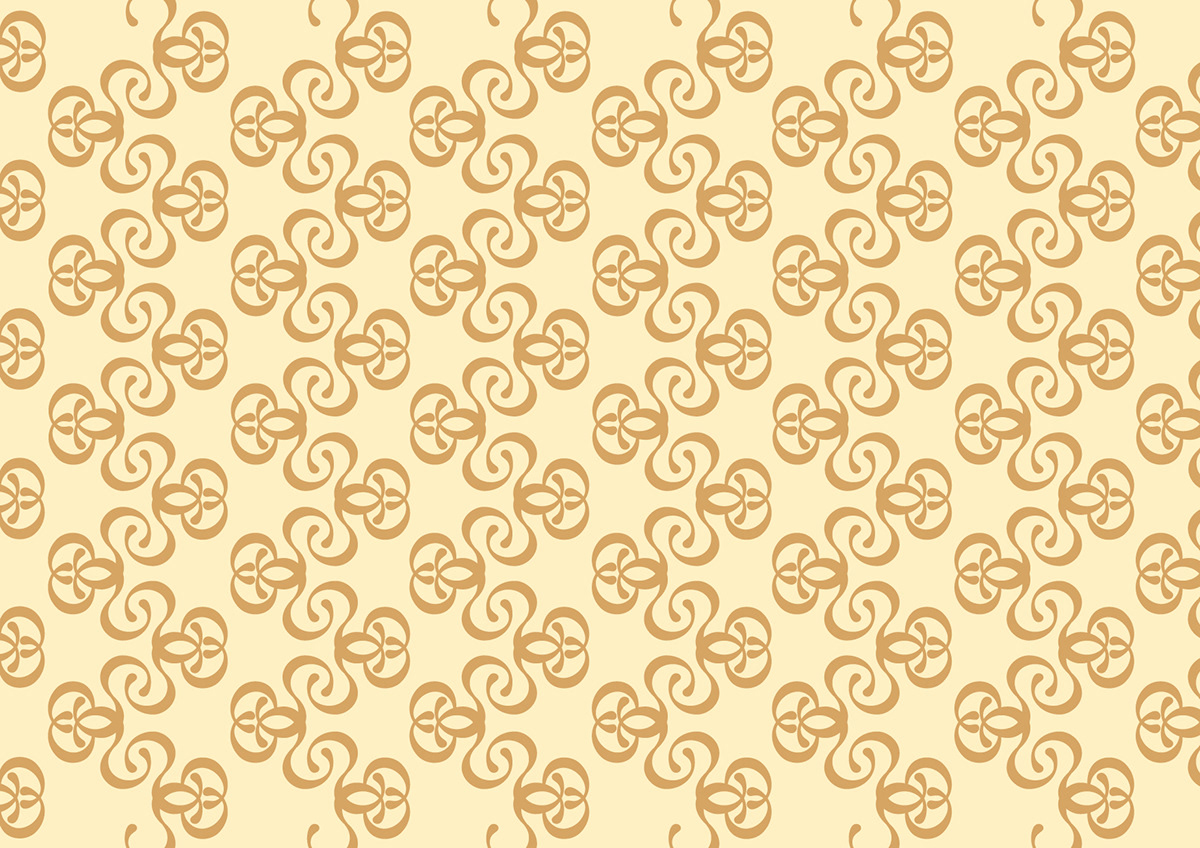
This was the only pattern which was constructed using every letter of the alphabet within the one glyph.


