Epsilon
Full rebrand for a global marketing agency
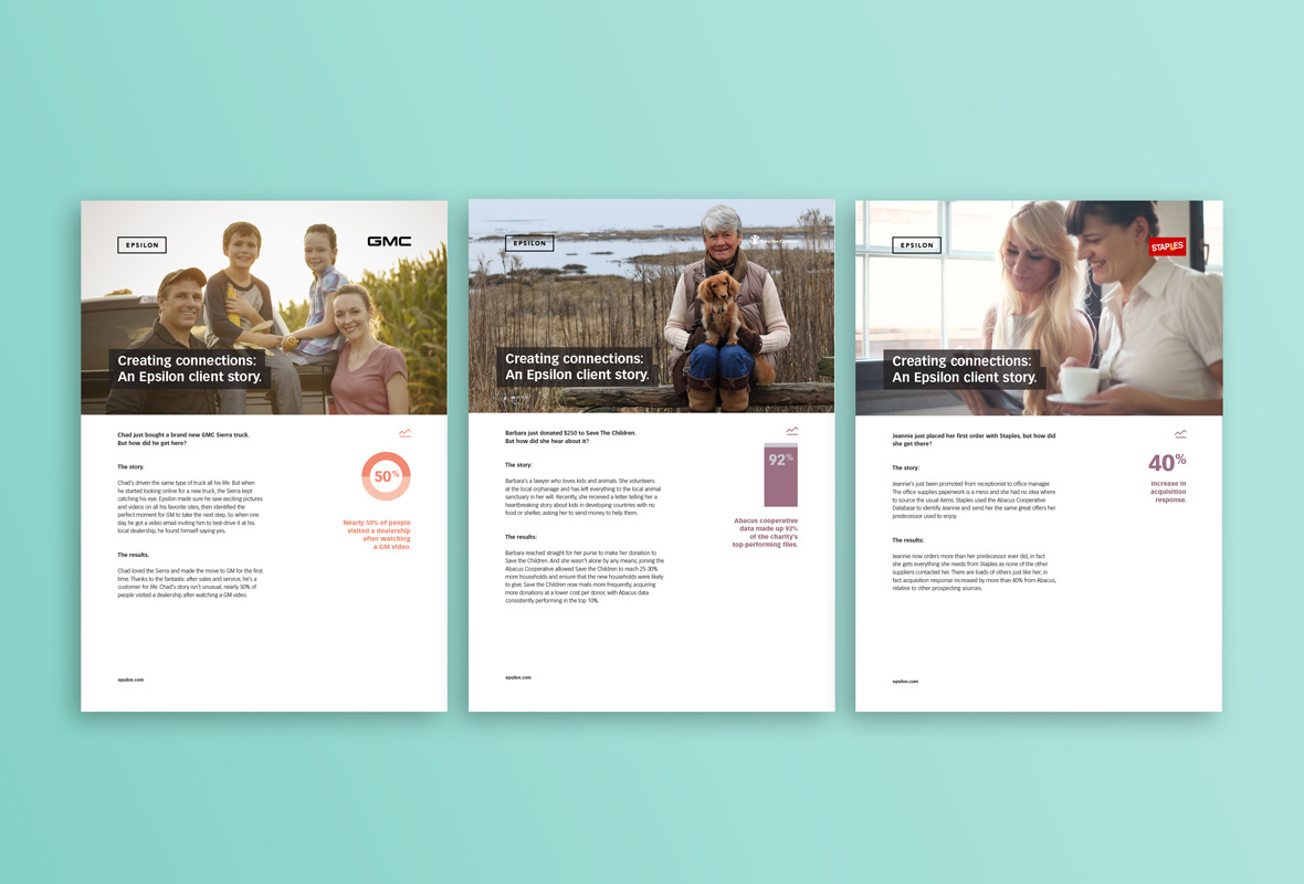
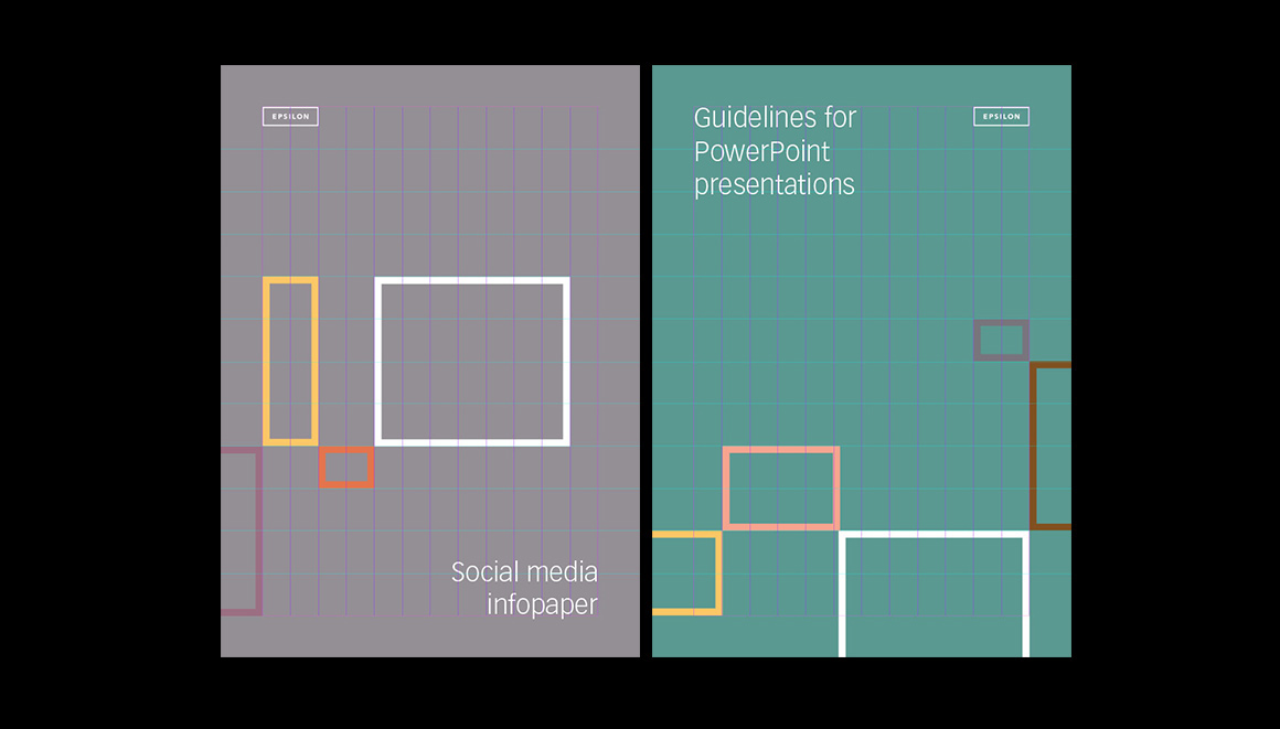
Following multiple acquisitions, Epsilon needed an identity and branding scheme to unify its separate entities. The widely kerned typography in the logo represents the global reach of the individual businesses and these are encompassed and protected by a strong holding device, the rectangle which represents the new integrated agency — bringing separate entities into one. The visual language is one of sophistication and structure. A graphic device based on the agencies tagline of building connections was created using the logos rectangle to allow for multiple cover designs.