
Project Objective
My objective here was to create competition in an old market. Office supplies have been needed for years, that's nothing new. My job was to try and add a competetive edge and design something to catch the viewers eye.
Research
Many of the stores already servicing this need have a cut and dry theme. Something I noticed was a lot of red being used, not always but often enough. Second to that would be blues. No over the top designs at all, the simpler the better seems to be ringing true here.
Concept and Solution
Trying to go against the grain a little, I went with a pastel green and some light greys to go with it. I used a tiny checkerboard pattern in my main logo, which can be easily used as a nice repeated pattern. I'm hoping the soft colors and overall design make the viewer feel welcomed and intrigued.
Brand Message
Office supplies in a jiffy.
Target Market
I was aiming for the average business person. Male or female, ages 20 to 50. Spedite also has school supplies though as a portion of their business. So included would be parents of school-going children, aswell as college students.

Desktop and mobile website mockups

Full web mockups

Large ad, used for windows and such

Mockup store front
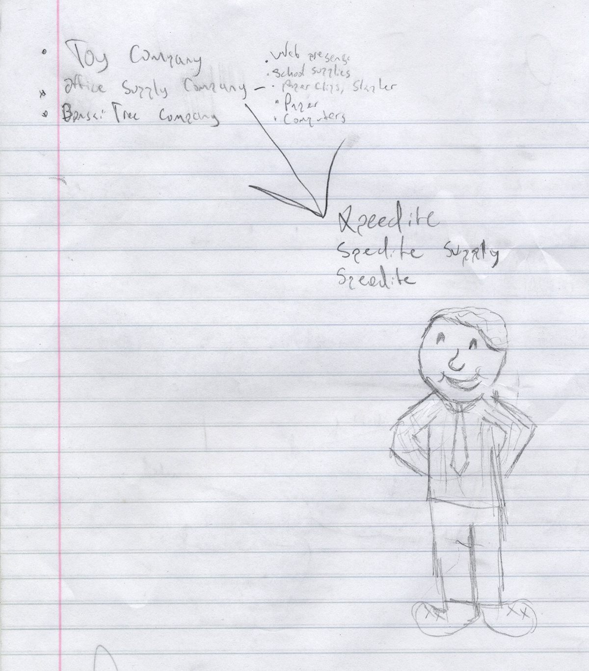
Some of the first ideas for this company, including a character that got the axe

A few ideas in progress in Illustrator

Trying some ideas on the website mockup

Common colors used through the project
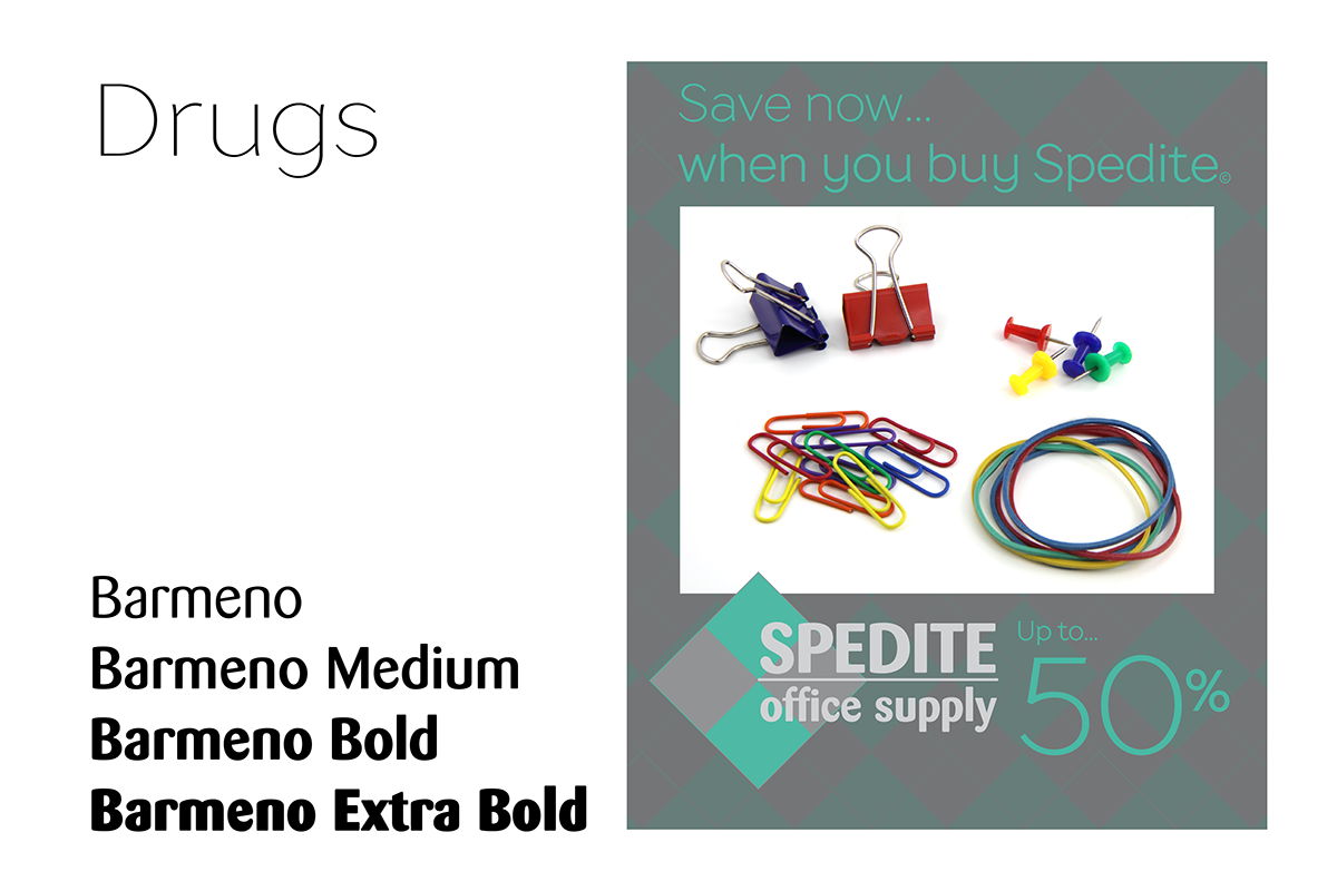
Drugs comes from dafont.com used for prescriptions, Barmeno is a pretty well known typeface but worked quite well for what I needed


