1. Logo Sketches
I wanted the logo to be exciting enough to sound like 'Woop!' but as typographically unique as possible. I've always though that the surest way to ensure that no font comes close is to do somethign handwritten. Hence 4 pages of scribbles, and one logo in the end.


Final Logo
2. Mockups+ Sketches


The first time we knew what a page would actually look like.
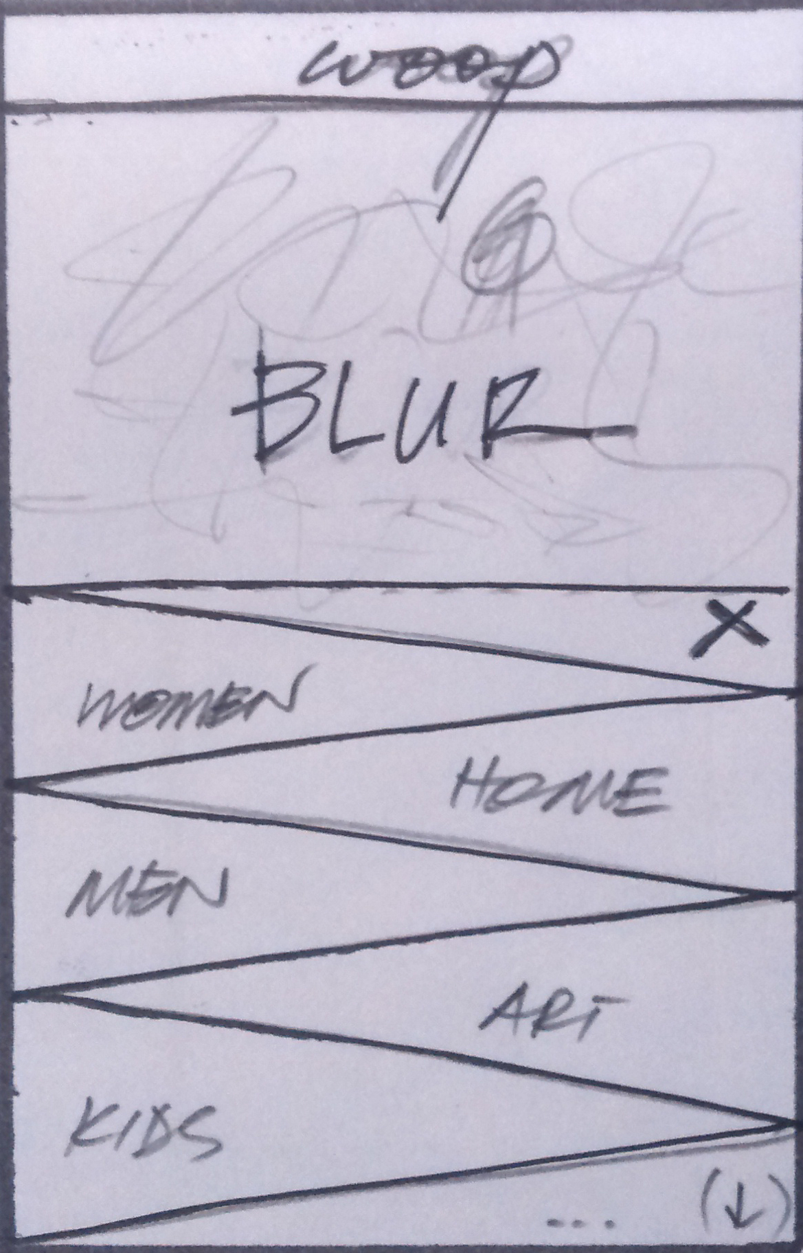
3. Menu Structure
I wanted to experiment with a menu structure that brought the same functionality as a common, 'list-them-all' online marketplace menu while trying to subtly reduce the amount of information thrown into users' faces when they called it.
Since our opening categories are fashion and clothing, I categorized everything someone would want buy to wear - into things that belong on the head, the mid/ tordo, and then bottoms. I mean- this was an extensive exercise that we still keep open to refinement, but it was extremely interesting to design and implement.


The first mockup we'd seen. In this one, the categories and brands are actually mixed up and inaccurate.
Perhaps the most important modification we made, was to allow users to toggle the 'Shop by category/ brand' button the left side of the menu under the figure's sketch. Toggling brand refresehd the menu in place, but with brands we carry listed under alphabetical headings.
4. Thinking Mobile - For web and native app experiences.
The menu structure adjusts to a mobile phone pretty conveniently. For the app however, the menu structure is completely different. From how it's called, to how it works.

The menu button is initially placed on the left side, on the middle, even on the respnsive site, because that allows one-handed operation; the menu button is placed within range of an extended thumb of the right hand of the user. For left-handed users, this is still reachable, and the best part about how it's designed is that like a Facebook messenger chat head, it can be dragged to any part of the screen, as shown in the initial sketch above.