

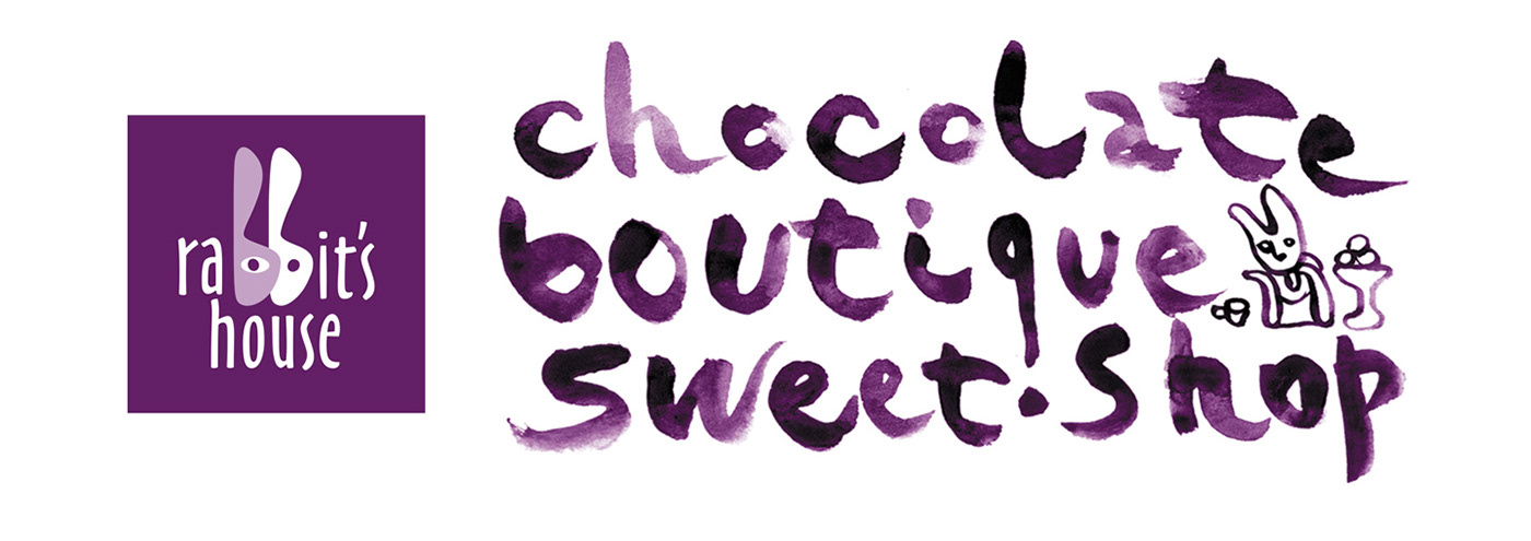
The «Rabbit’s House» brand is a family chocolate coffee house chain that has been launched recently in Kazakhstan.
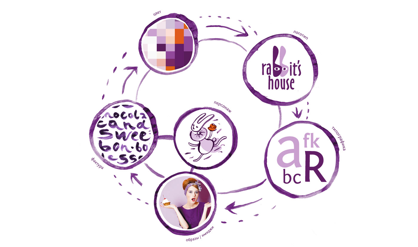
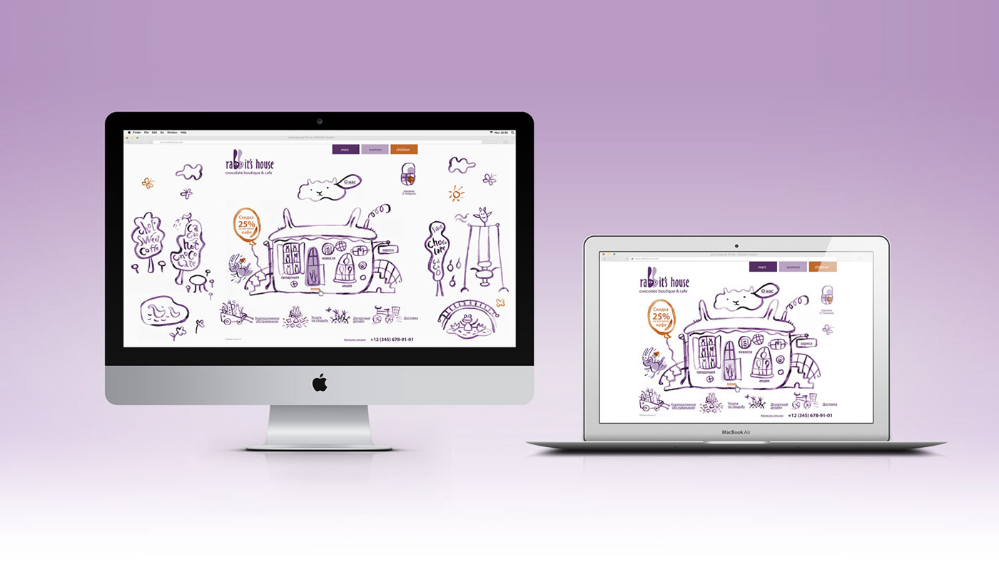
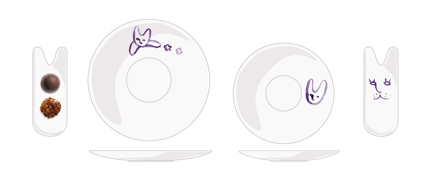
Our goal was not only to create a corporate style for the chain but to make a project of the whole interior decorations, package, menu and web site as well. We stressed lightness and openness in the style. We made the brand modern, dynamic and open to extension. We used water-color illustrations that remind of «Alice in Wonderland» and A Mad Tea-Party in design. The basic character is the White Rabbit. He shows up in different consumer situations. His main attribute is a cup of hot chocolate. The principles and color-coding that let to extend a line of products and use any form of package were developed for the «Rabbit’s House» package set. The package construction usually comes in a form of a rabbit. Corporate vivid graphics with a recognizable character and straight bar form with color-coding make brand bright and memorable. Color-coding reaches out to three targeted audiences: men, women and kids.


Участники проекта: CBI Pioneer
Технический директор: Алексей Бабенко


