
Jump, Jive & Wail!
Promotional graphics for a
Kentucky Symphony Orchestra fundraising event

poster design

P R O C E S S
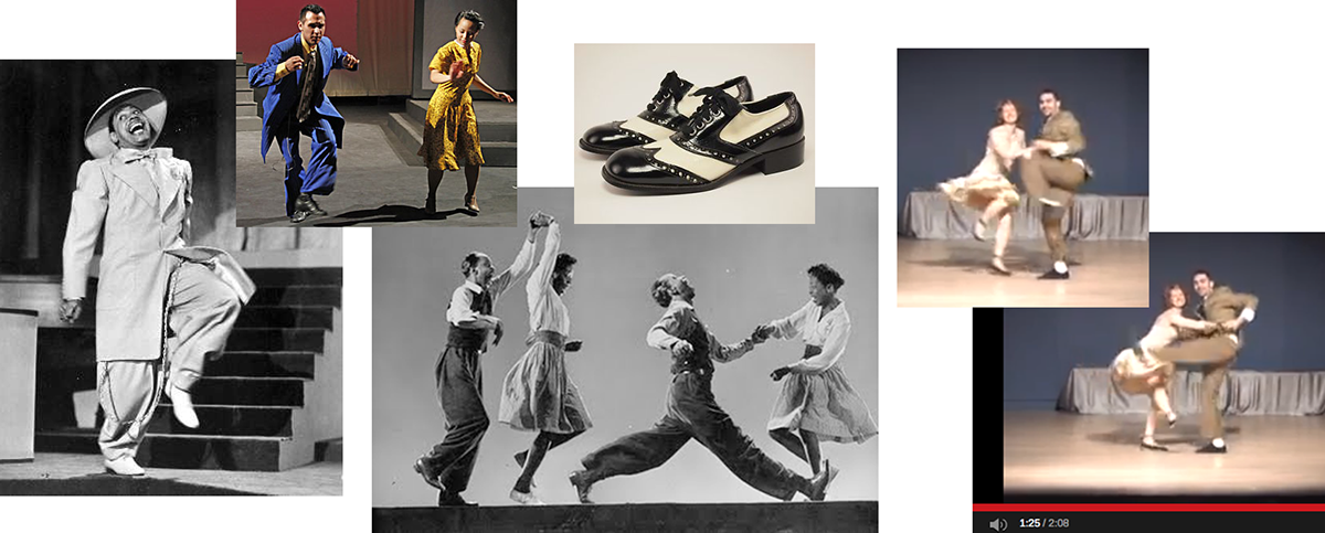
In the way of a project brief, I was given the name of the event —Jump, Jive & Wail!, a request to include a flapper and a zoot suit, and two pieces of reference artwork: recent depictions of a swing theme.

design research
I realized right away that there were several decades of swinging separating a 20's era flapper and the debut of Louis Prima's popular 1956 recording. Fashions in clothing, illustration, and typography changed wildly over those 4 colorful decades. I decided to make the piece a potpourri of all of them, with a particular debt paid to John Held Jr, Cab Calloway, and Al Hirschfeld's early artwork depicting the pop culture in Harlem.
T Y P O G R A P H Y

For the event logo, I culled together as many Jazz-era fonts as I could and spread them out on a page.
I eventually settled on a 20's era font, but gave it a colorful, more deco-inspired treatment.
I L L U S T R A T I O N

preliminary sketches
The illustrations were developed simultaneously with the type and patterns. I usually jump right in with random drawings of characters. No thought to composition just yet. Just loosen up and get the feel of the period —and a sense of fun.

developmental sketches

refined sketches
Always on the lookout for subtle improvements, I tried variations on the couple's expressions and character. Keeping in mind that the event is a Valentine's Day celebration, I looked for ways to play up the couple's chemistry and likeability.

vectorization
color exploration
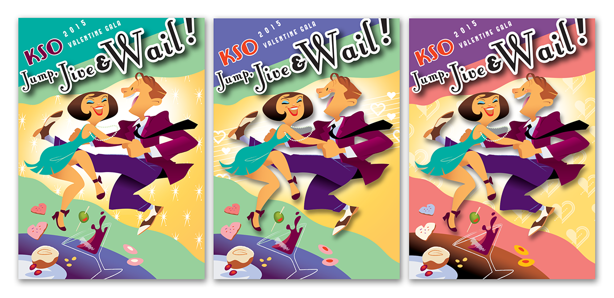
Creating color variations is a fun part of the process. The green version on the left was my initial take. The client felt this might be too spring-ish for a Valentine's Day event, so I tried a variation that expanded the role of the dark blue as well as a more feminine pink and purple version. I also added heart-shaped cookies and patterns to push the theme a bit.
With the pink cookies added, the director felt that the Valentine's theme was coming through well enough. The initial green version became the final.


