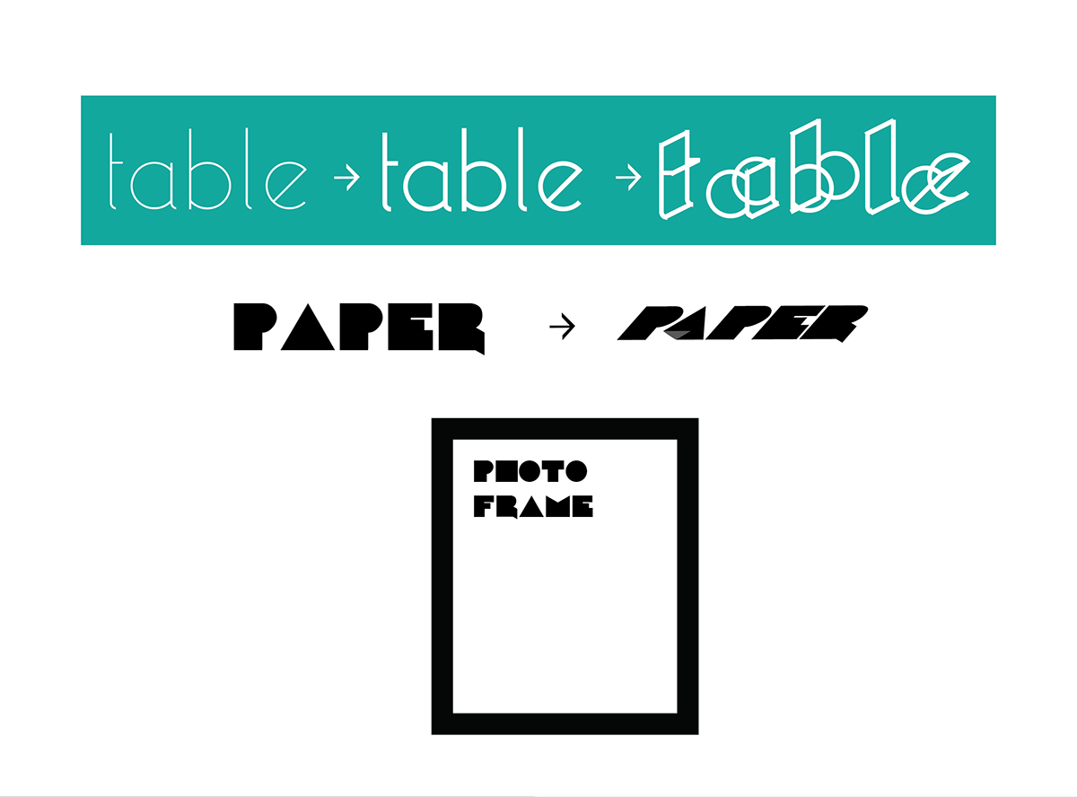
The main aim of the project was to have interactions with a user in a very witty way. Typography has always been seen in a very static manner. Typography is always used as a supporting item for object and does not have any meaning in itself. What if we could give physical properties to different words based on their properties. Imagine a world where objects don’t exist and are replaced by the typographical graphics and forms.
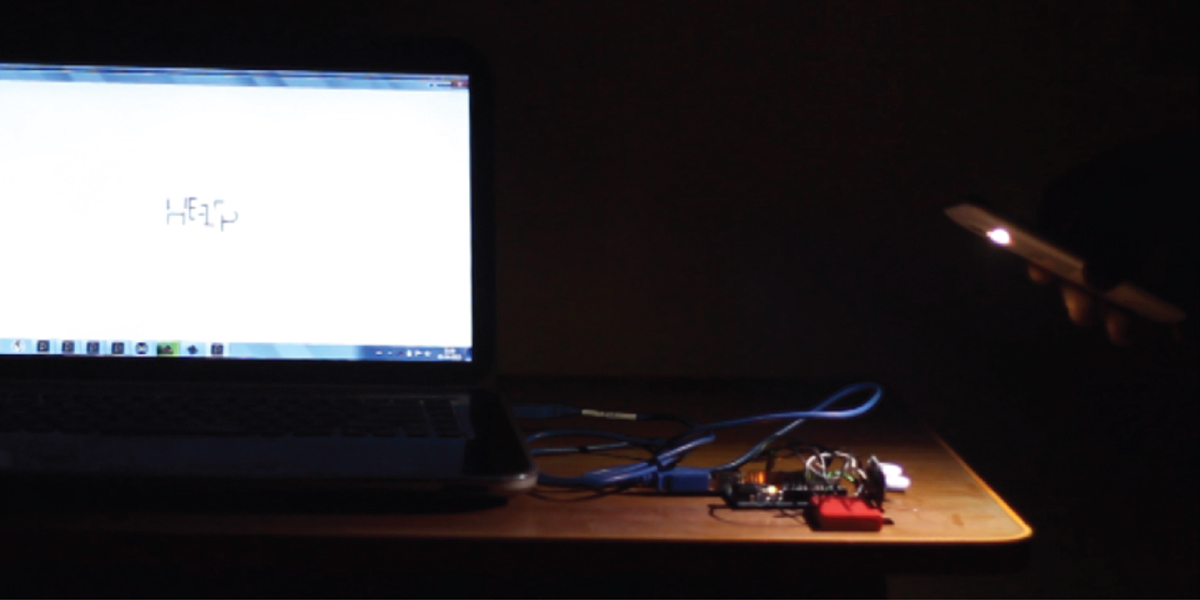
An LDR was used to detect the sensitivity of light and was controlled using an arduino. The graphics were programmed in Processing.

A close up view of an LDR (Light Detecting Resistor)

A webcam was used to detect the movement. Camera Mouse software was used to calliberate the movements and Processing was used to program the graphics.
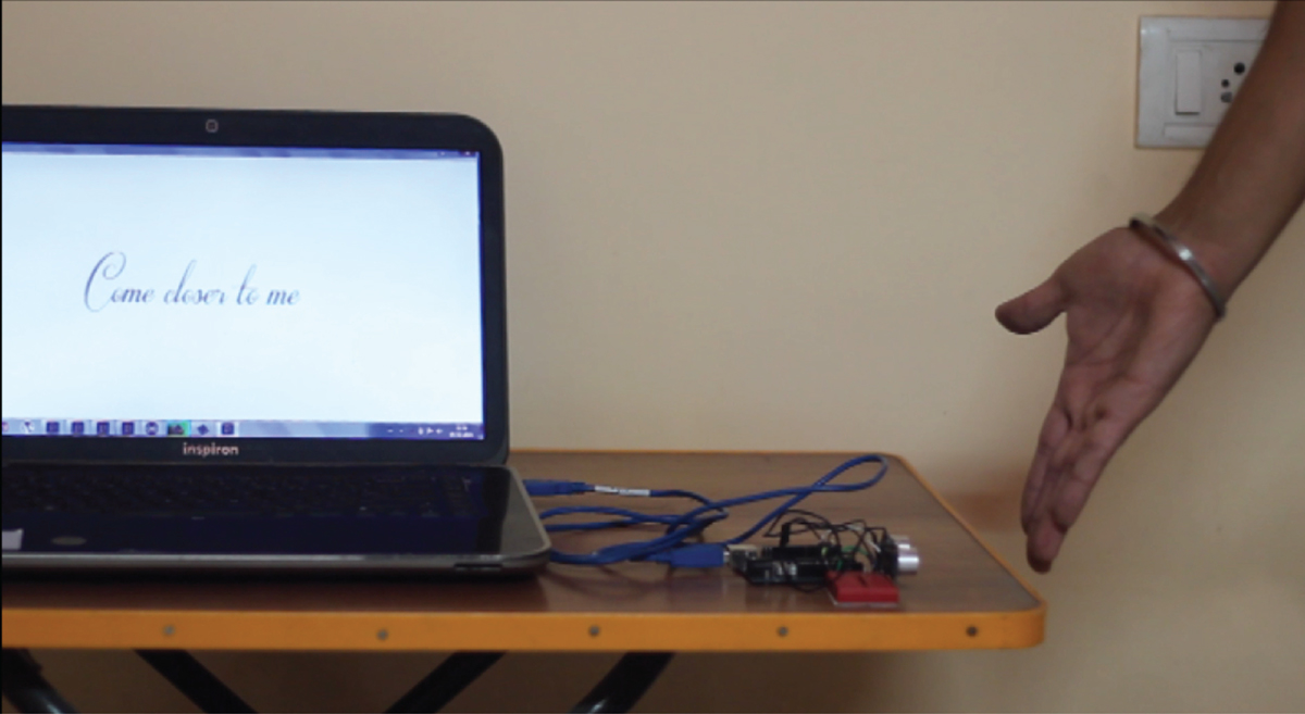
An Ultrasonic sensor was used to detect the distance of the object. It was controlled by an Arduino and the graphics were programmed using Processing.

A close up view of an Ultrasonic Sensor
The typefaces have been carefully chosen so as to portray the properties of that particular object/person.
Cursive fonts are used to portray women as they are much more feminine and similarly bold fonts are used to give weight (typographical as well as real word mass) to words defining heavy objects.The typefaces have been played around with to give it a visual feel of that particular object.
Cursive fonts are used to portray women as they are much more feminine and similarly bold fonts are used to give weight (typographical as well as real word mass) to words defining heavy objects.The typefaces have been played around with to give it a visual feel of that particular object.