
My original past template that i just finish redesigning it to refine a housing development site UI/UX. I have made the experience and usability to be multi screen friendly. This is the existing site url : http://ecoworld.my/ecospring/

I find that the Homepage of the existing site still lacking of a simple and clean layout and description about the company branch background which is crucial to gain reliability as well as credibility.

Most of sites existing now tends to have the same problem which is users are being directed to login page whenever certain content been clicked that makes navigating around pages tends to be quite tedious. So, adding slider effect and component on navigation div container is a good solution for both main and registration page.

Using card based layout is an ideal way to display content as it is easy to position information when device screen size changes and adequate use of white space to reduce clutters.

Existing Master plan page looks a bit dull so i've made a bit changes in arrangement and compass icon.
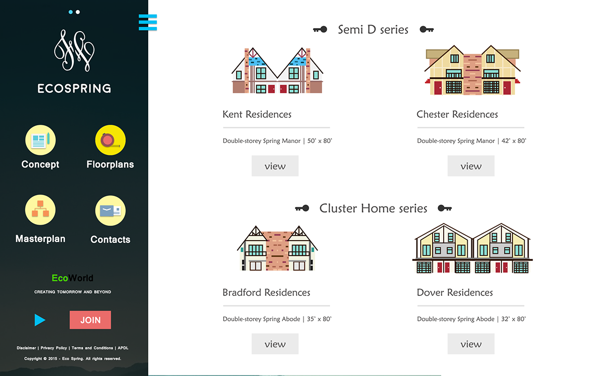
The most irritating page that i hate to visit is the Floor plans because it's not colorful and lively so i've designed icons for each residences.
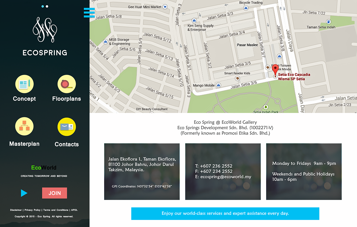
Finally the contacts page which i only select crucial information to be display for existing and potiential customers.
If you like my design, do place a comment below or share it. Thanks.


