T H E B R I E F
To come up with a logo identity for a fashion accessories brand that had a mix of vintage and modern elements.
Some initial concept explorations

T H E C O N C E P T
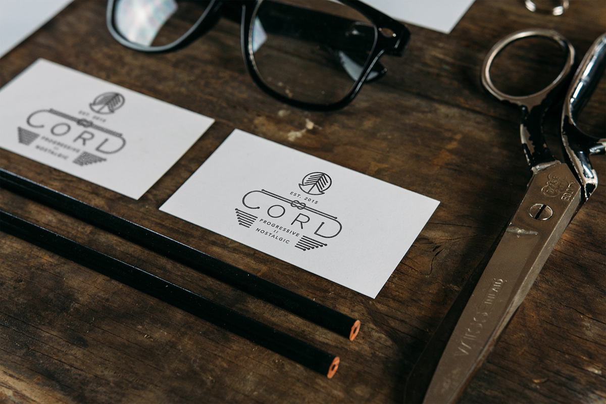
The word 'Cord' was used to link the two elements of the brand philosophy -- vintage yet modern. Thus, a knot made out of the 'cord' was created to show the same. There are two versions of the logo -- one with just a the word 'cord' and another with an elaborate symbol, year of establishing and the tagline. The symbol in the elaborate logo was created by extracting an inverted C out of a circle and inserting upward arrows to indicate the progressive nature of the brand.


P R I N T C O L L A T E R A L S

T H E P R O D U C T S


C O V E R I M A G E S F O R T H E F A C E B O O K P A G E


You can check out their amazing range of products at:
https://www.facebook.com/cord.27?fref=ts

