A major initiative during Hunter's rebrand was packaging. With over 30,000 SKUs in their professional distribution channel, a system needed to be developed that would allow for easy packaging updates that did not demand excess time from a small inhouse creative team. The result, however, still needed to look professional and on brand. Many departments within the organization need to be involved in the packaging process as well, ranging from international compliance to engineering.
Taking the many facets and complexities of the project into consideration, I developed a simple system that worked to address all these needs while allowing designers to complete a packaging request in mere minutes—while ensuring the quality of the final product remained professional and in tact.
Branding, Design, Proprietary Design System Development, Technical Specifications Development
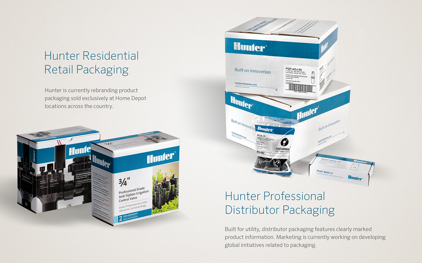
A project is currently underway to rebrand Hunter's retail packaging as well, available exclusivey at Home Depot locations nation-wide. Whether retail or B2B, the key objectives in Hunter packaging is to provide the end user with the information they need to make informed decisions. I researched the user experience in each market to identify the decision-making process for each market, balanced with compliance codes and guidelines as needed. A lengthy process that required the collaboration and input of many professionals with diverse specialties that added to the success of each project in the field.
The Rubber Grid
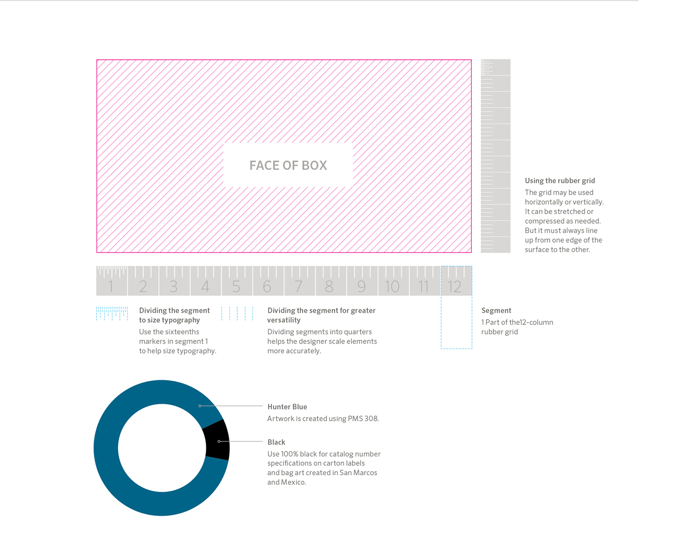
I developed a "rubber grid" to make it easier for designers to maintain consistent placement and size ratios of typography and standard identity elements when creating new package layouts, regardless of unique package sizes. The rubber grid uses a 12-column system. Each column is further broken down into quarters for cases where further segmentation is
needed. The first grid segment is broken into sixteenths to help size type.
needed. The first grid segment is broken into sixteenths to help size type.
The rubber grid may be stretched or compressed in any direction, but it must always start and end at each end of the package face being measured. This system allows designers to create packaging consistently and work quickly, without compromising the professionalism of the piece.
Master Cartons
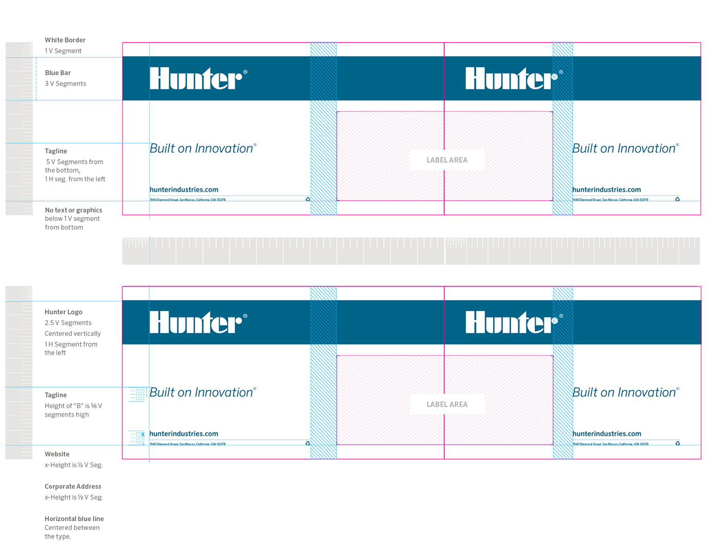
All B2B packaging was built for utility first. Elements include a striking Hunter Blue band that wraps around the entire box that houses the Hunter logo—an industry stamp of quality. Hunter's tagline, Built on Innovation, appears clearly on each side. The final execution is clean, simple and professional, but much care was taken into developing a system that worked for the many varying shapes and sizes of the 1000s of unique boxes that houses over 37,000 SKUs.The success in this exercise was developing a solution that could be executed in mere minutes by a designer, and would have a strongly identifyable branded component out in the field.
B2B Product Packaging
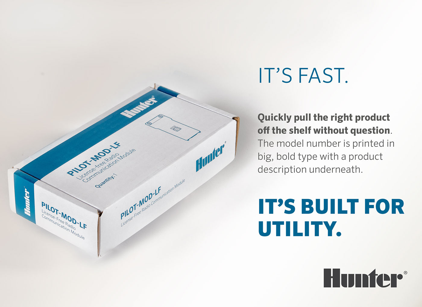
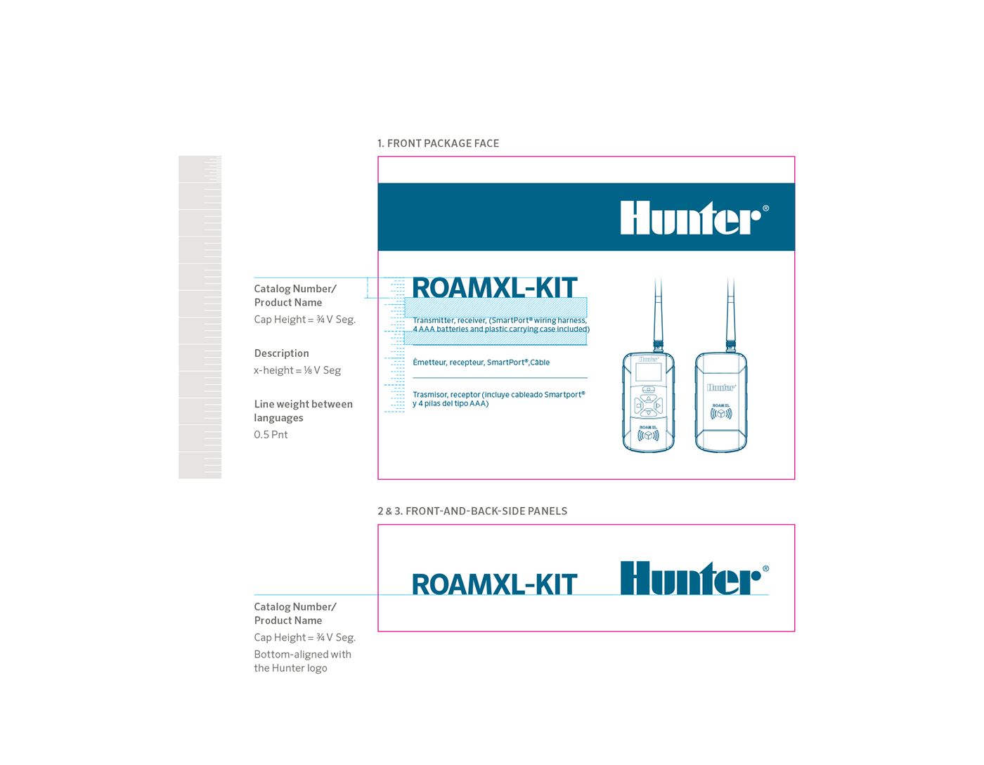
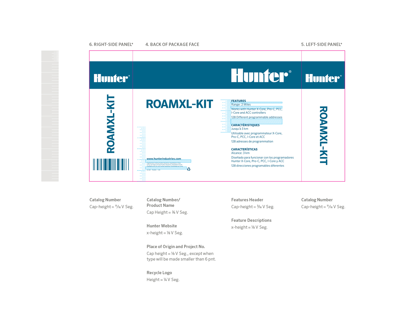
Hunter products are sold by irrigation distributors to a professional contractor customer. In most cases, the contractor knows the product and brand they will need to purchase before entering their local distributor location. Part of the packaging rebrand was to boldly identify the product catalog number to ensure the distributor staff was pulling the correct product for their customer. The catalog number appears boldly on all sides of the packaging to aid easy identification. Under the catalog number is a brief product description as secondary confirmation that the right product is being provided to the customer. This was a necessary solution to solve slight variations in model numbers that could get quite complex for more sophisticated product offerings.
Maintaining a Consistent Scale in Typography
When sizing type throughout the package, designers always use the vertical grid sized for the package face. This helps the designer ensure that all type is scaled proportional
to each other throughout all the panels.
to each other throughout all the panels.
Bag art
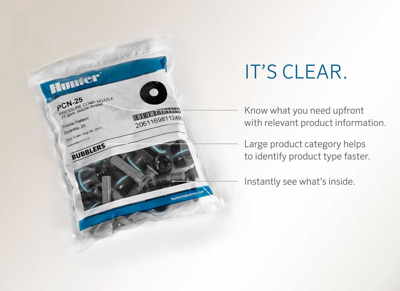
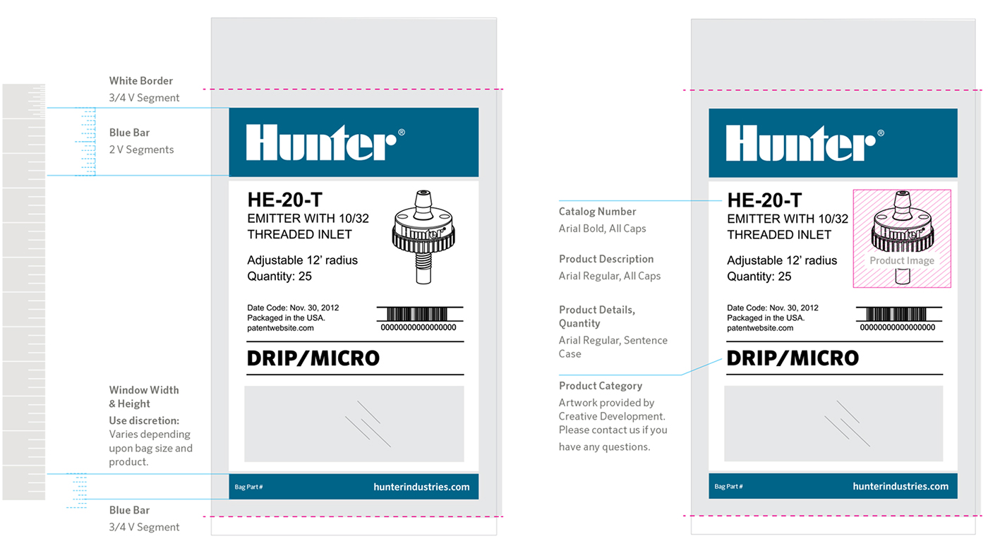
Bag art is printed at a vendor off site and delivered to Hunter Industries. Product labels are then created by Hunter's manufacturing engineer team and printed and packaged inhouse.
I created a labeling system that worked with the manufacturing engineers' labeling software that maintained the brand integrity throughout the entire packaging process.
I created a labeling system that worked with the manufacturing engineers' labeling software that maintained the brand integrity throughout the entire packaging process.

Built for Utility
Thoughout the entire packaging rebrand, my goal was to create a professional system that took the many compliance and functional aspects into consideration, delivering an end result that served the customers' needs and further enhanced Hunter's reputation for quality. The end result is a B2B package identity system that flows as seamlessly as possible throughout every stage of production to customer delivery and use. As we work to continually meet international compliance standards, the packaging may need to be updated, but thanks to the solid groundwork created at the beginning of the process, building upon the system is proving to flow smoothly.


