CONCEPT
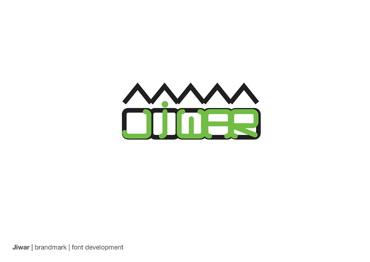
This route was inspired by the concept behind the name “jiwar” and is all about the spirit of local communities. The typography we created solely for Jiwar’s brandmark; based on shapes of houses next to each-other, as shown in the previous pages.
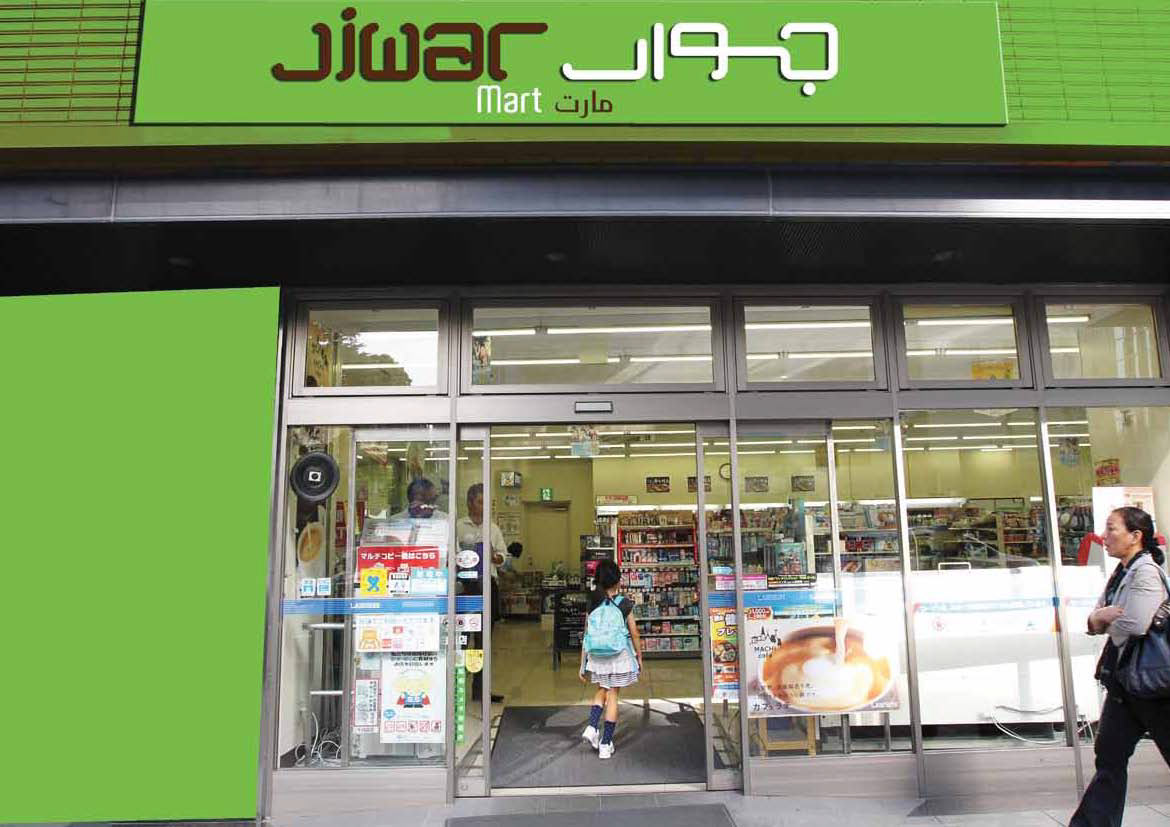
The brand language we created is simple yet eye-catching, it resembles the community and the accessibility of Jiwars stores, creating an inviting brand that communicates directly with the market and their daily needs. The brand language is smart yet simple and would appeal to a wide target market and create brand loyality with its personalized local touch.
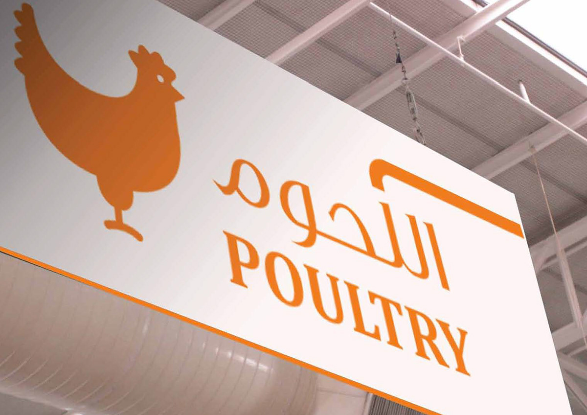
The colors chosen for the brandmark are orange and red, orange; as its a natural warm rich color, and is known to be a reminder that you might be hungry activates your instincts and red; and it is widely known to symbolizes affordability. As for the secondary brand colors we have chosen fresh colors to compliment the fresh products available at our stores, we chose to mainly use simple fresh illustrations on white backgrounds so as to maintain the simplicity of the brand.
As for the imagery style, we have chosen two photography styles; first style is to be used mostly for advertising and follows the same feel we have created for the brand local and personalized where images have to be shot from the buyers angle. As for the second imagery style suggested, we have used images of products, which has be used for indoors branding and advertising, the images of the products should always be photographed on white backgrounds and should always reflect the freshness of the products.


