

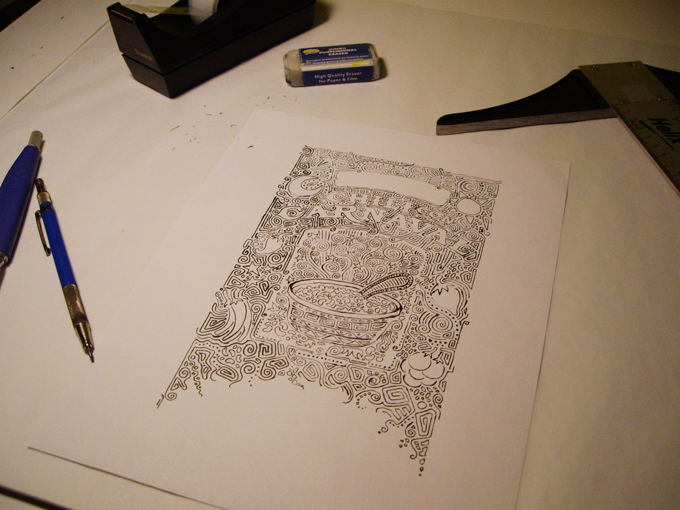

ORIGINAL HAND-DRAWING &
LAYERED REFINING PROCESS
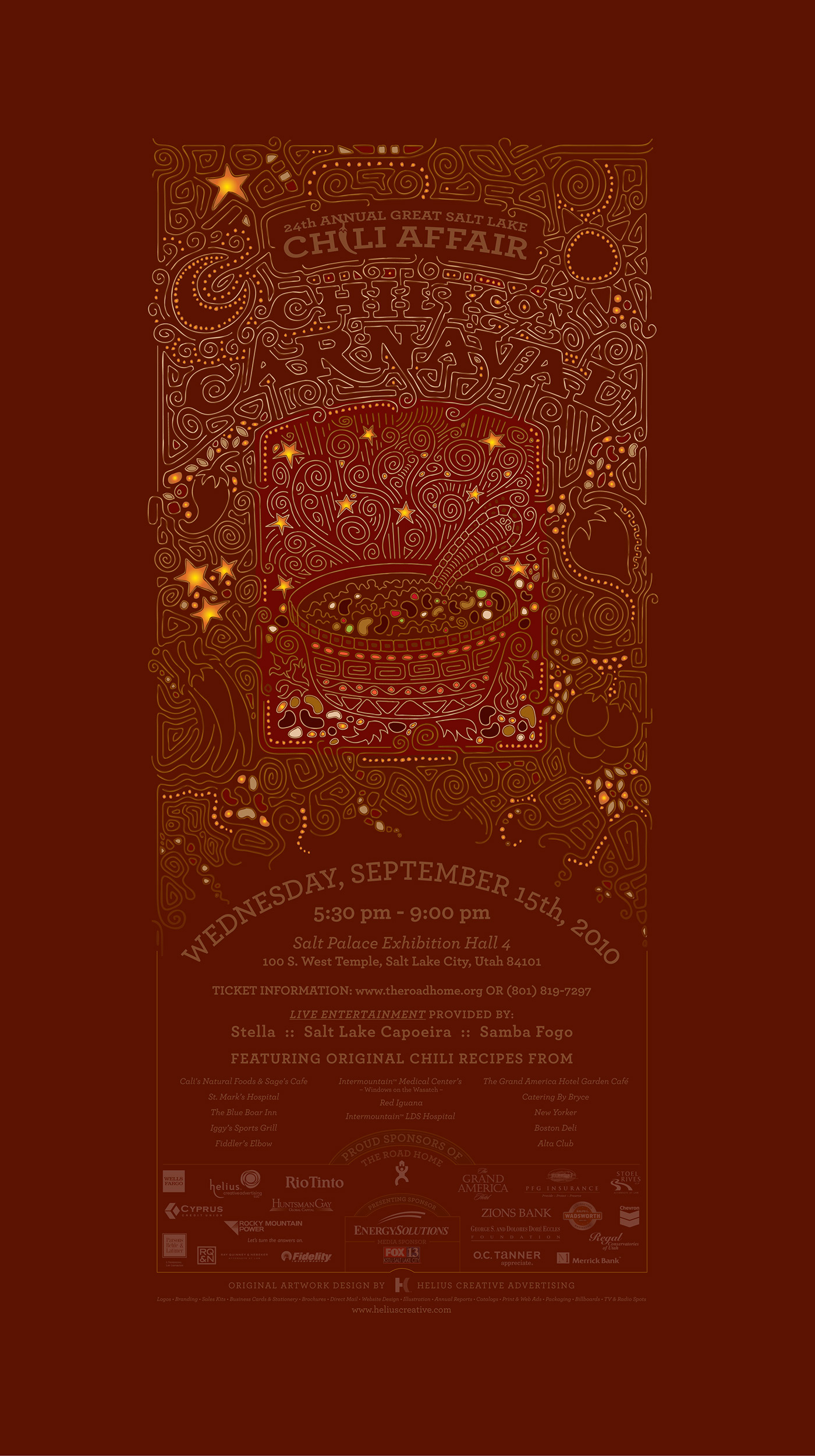
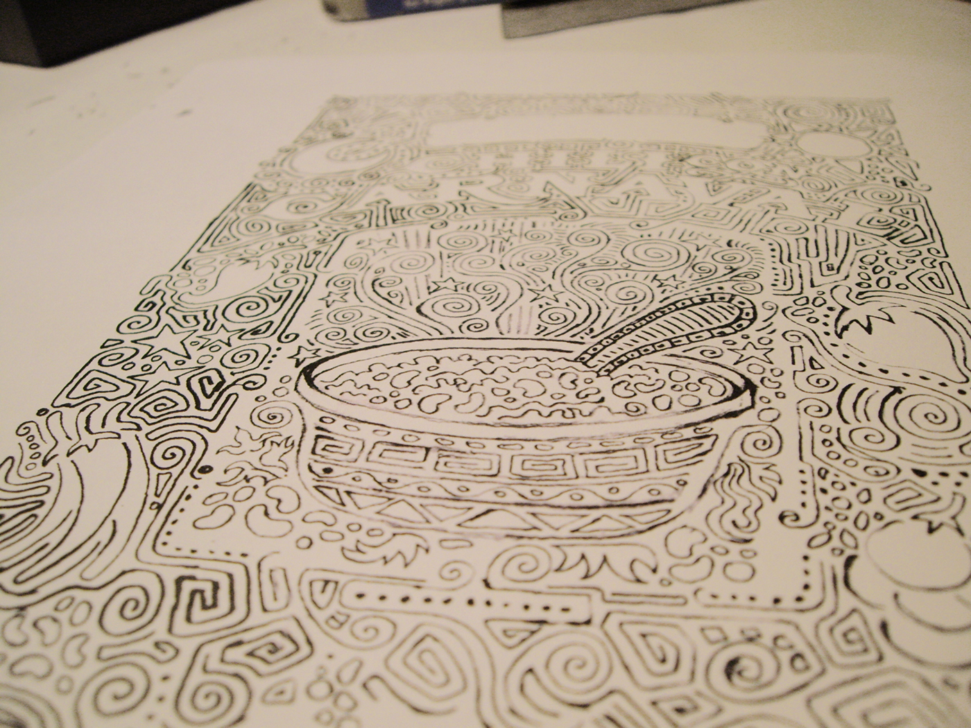
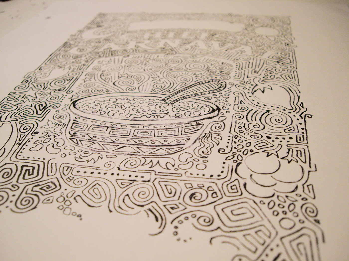
People have been asking about the bottom curve on the design and, yes, there's actually a good reason for it.
With a really detailed illustration like this, you can't actually resize it and place it randomly, anywhere on the page like your typical logo and elements
to fit any size paper. No matter how tall any particular design piece is, the design has to fit the entire width of the paper to get the most detail out of it.
The problem with this is that sometimes you end up with a LOT of extra space on the bottom of the page or you might end up with very little.
A solution had to be formed so there was always room for important information. As designers, sometimes we find text can be an ugly inconvenience,
but events like this are all about giving back, so information is crucial, even on the poster announcements. By gradually tailing off all the squigglies at the bottom, I would be free to add whatever content would fit any given size paper that fell below the design, keeping the design always the width of the page, where it would remain the focus.
So, notice on the poster how the lines end and the information on the poster falls below the lower hemisphere. ...and then notice the
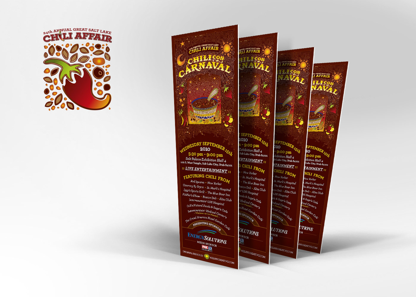
tickets (further down the page). This is probably the smallest the design is going to be printed and we had to fit a lot of info below and still fill
the width of the design area. I think tailing off the artwork at the bottom like this actually worked out really good for such a detailed piece.
It's not a flawless design strategy but it worked out really great for this project.

Typography & Reverse-Lettering
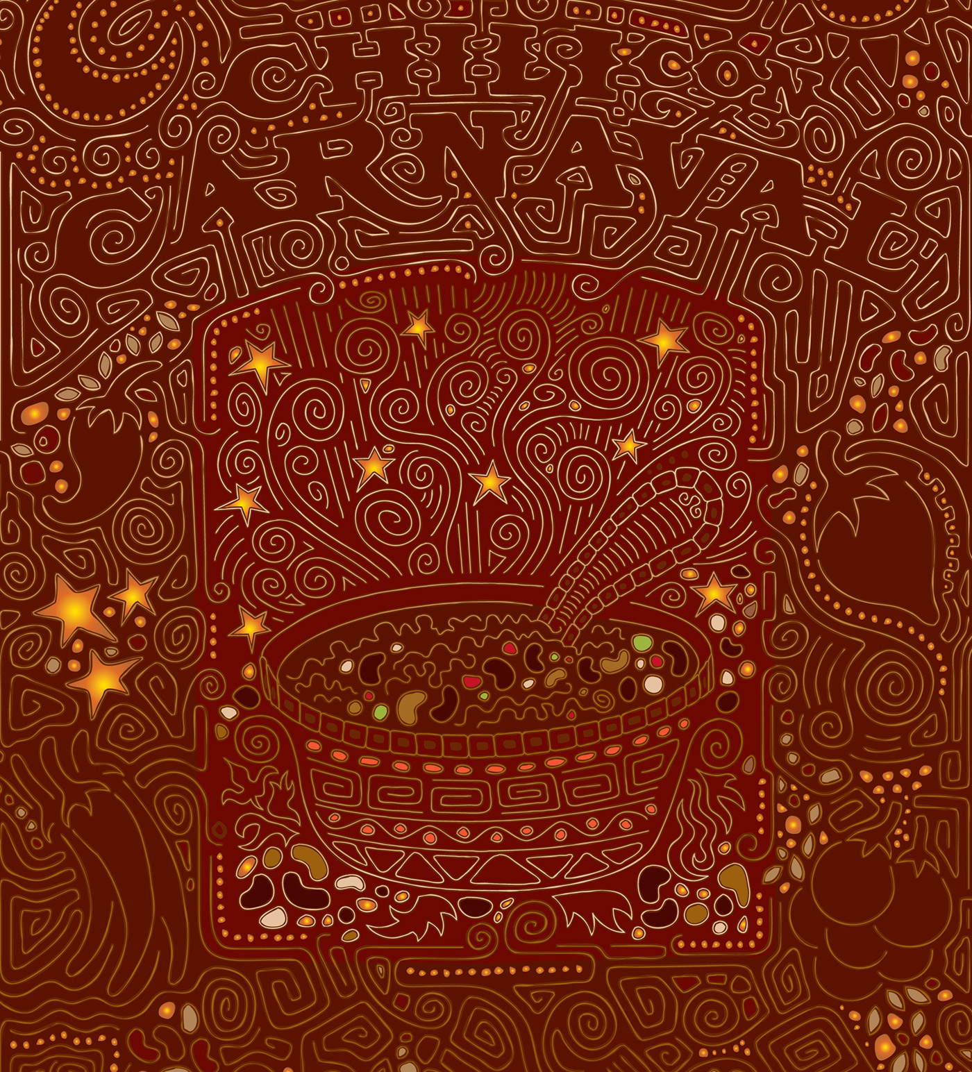
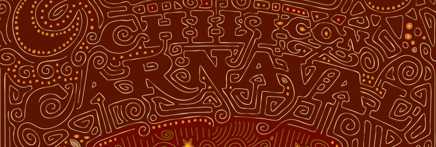
Most people don't notice this unless it's pointed out but rather than being letter forms or a font, this lettering is actually reverseed out from negative space. Notice the lines from the design come in, from outside the design and outline the forms of the letters which not only creates custom letter forms but creates a reverse typography effect.
Most people don't notice this unless it's pointed out but rather than being letter forms or a font, this lettering is actually reverseed out from negative space. Notice the lines from the design come in, from outside the design and outline the forms of the letters which not only creates custom letter forms but creates a reverse typography effect.
COLOR INSPIRATION
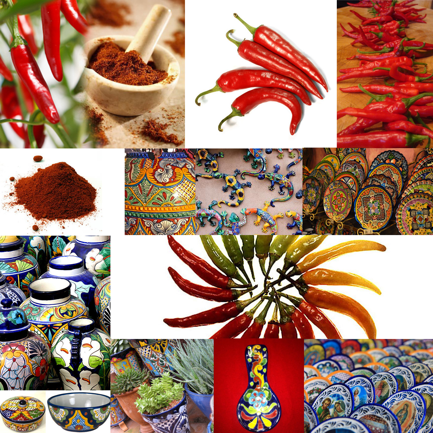
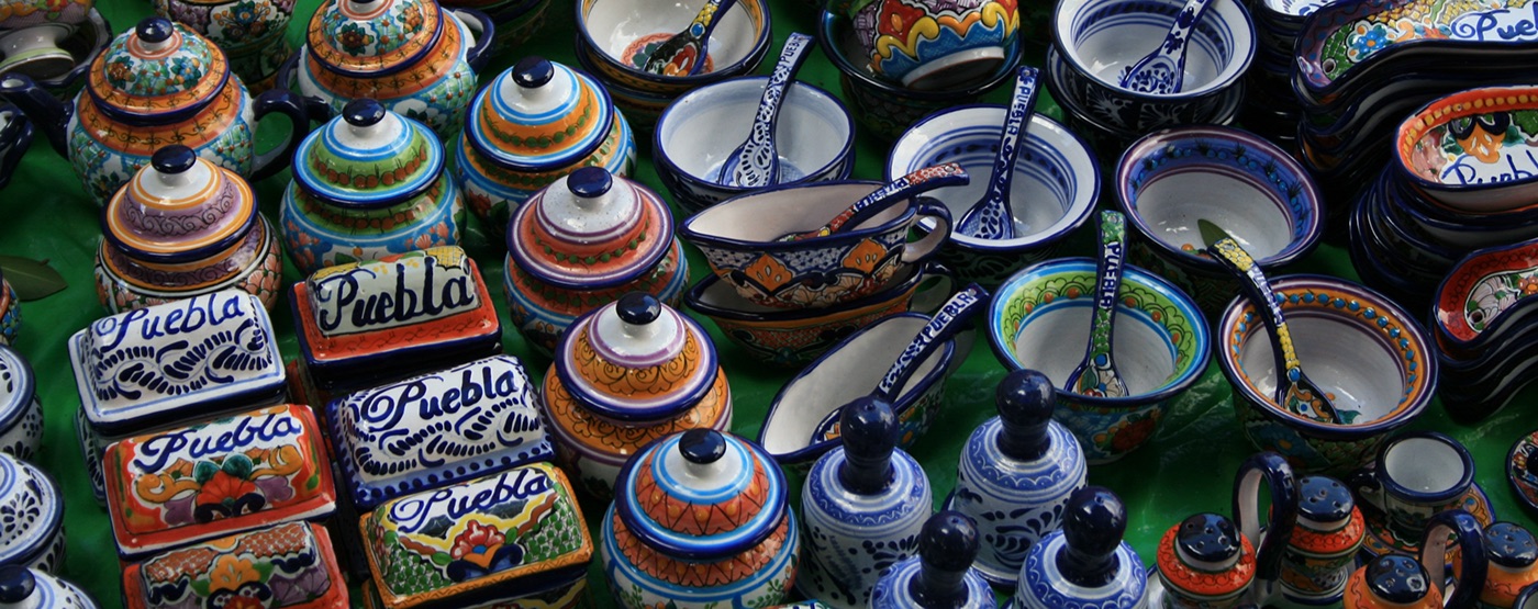
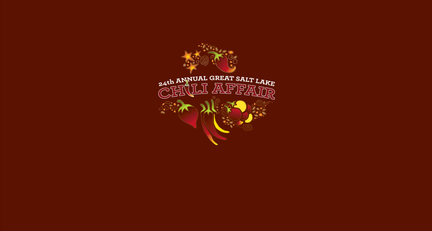
Vibrant Latin Colors: Cayenne Pepper, Red, Green, Yellow, Orange Peppers, Cherry Tomatos and Vivid and inspirational Latin Talavera Pottery

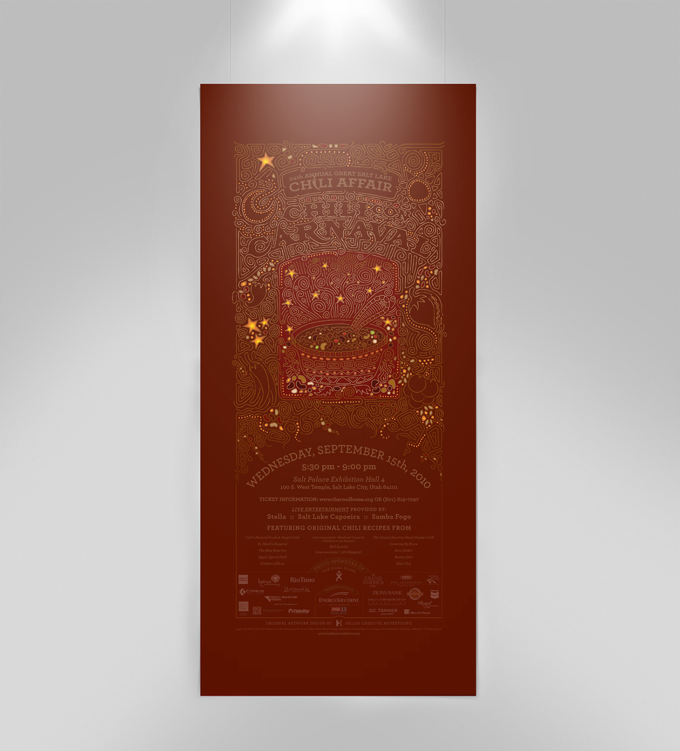
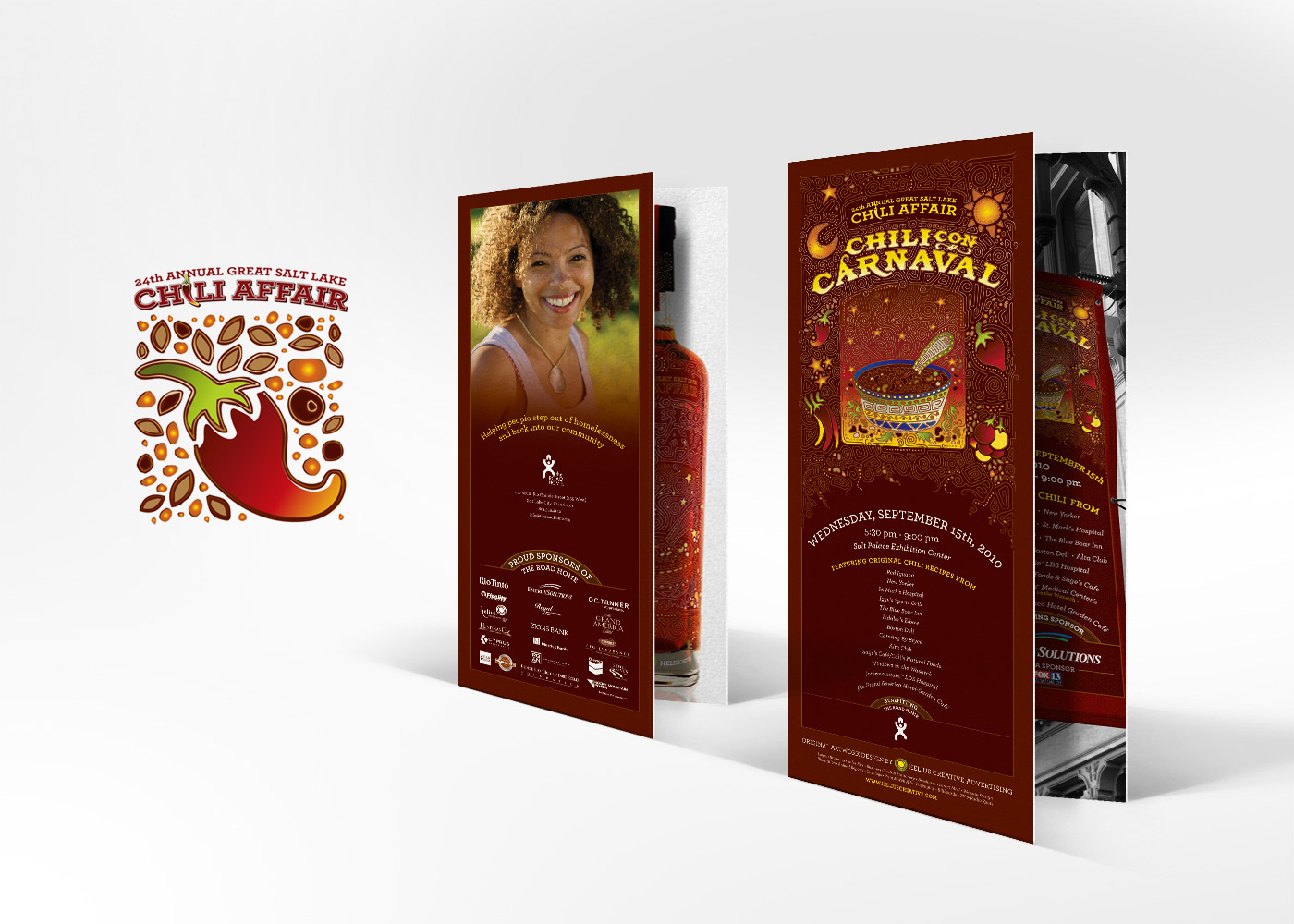
FULL-COLOR PRINTED EVENT POSTER

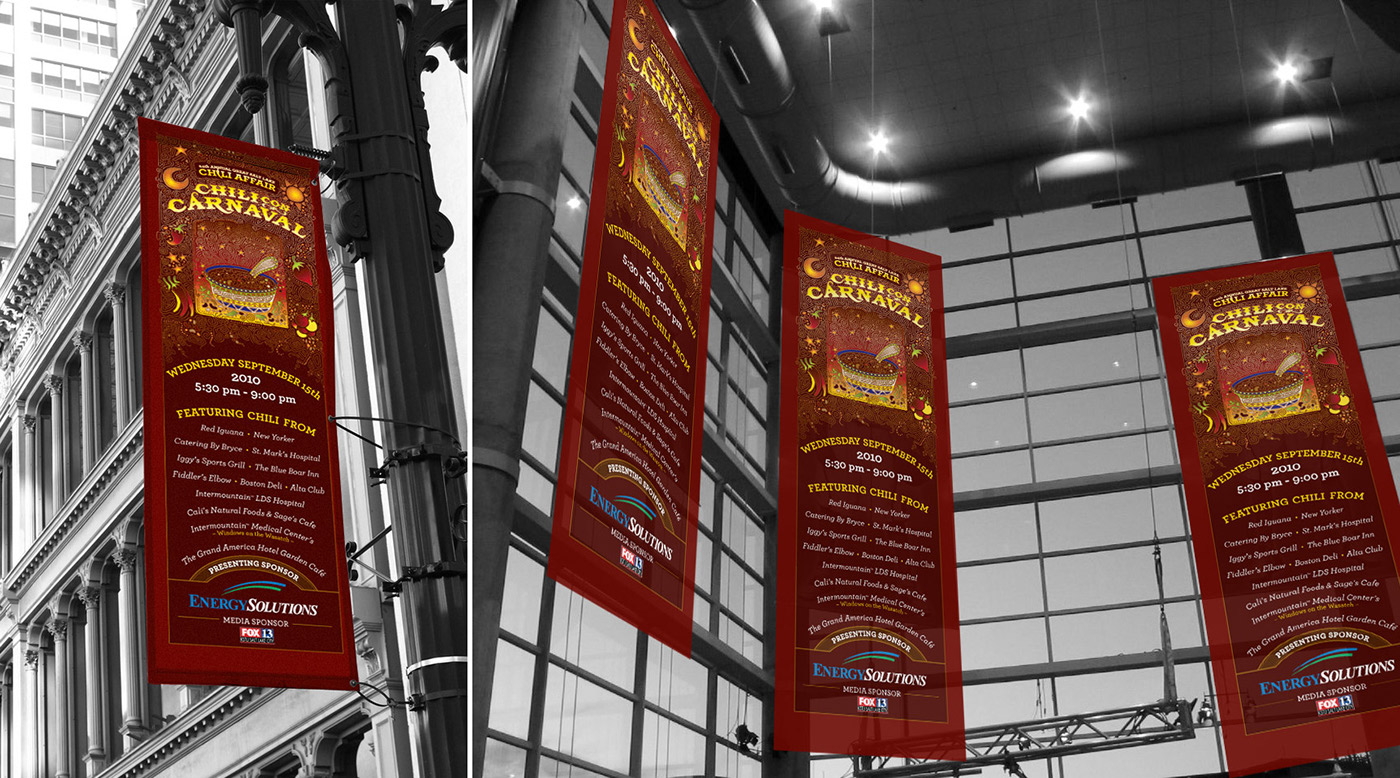
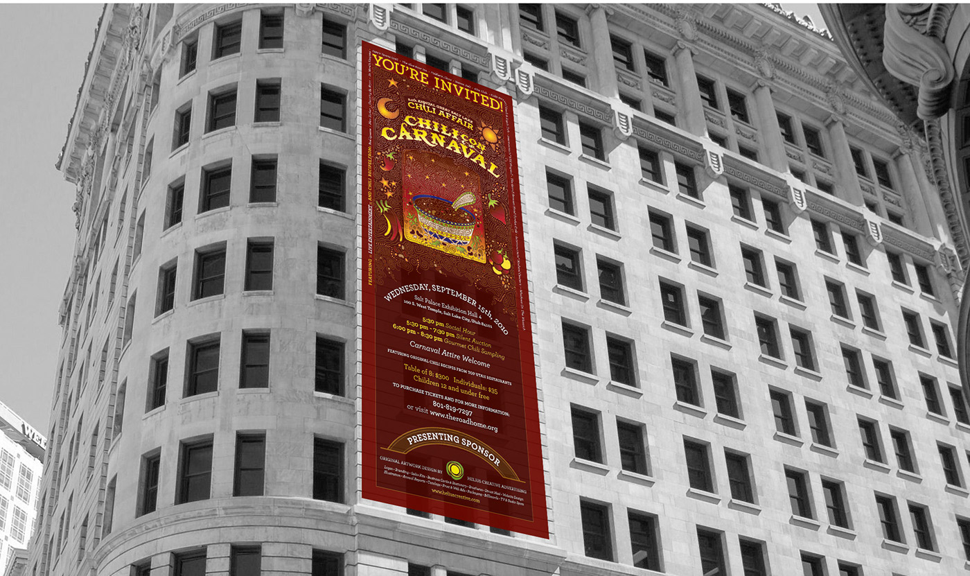
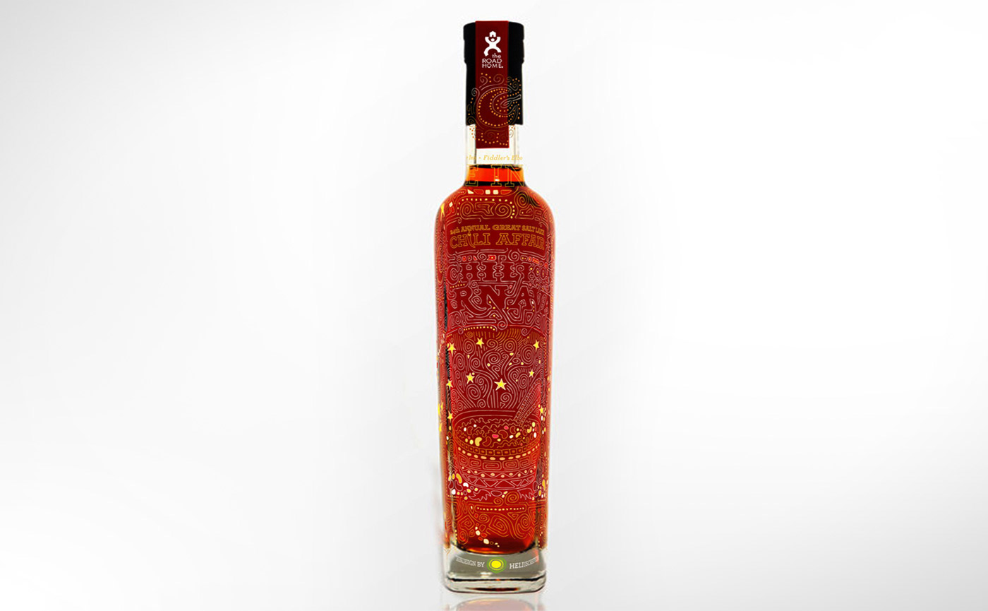
MARKETING, SIGNAGE & PROMOTION



IMAGES OF HEADLINE ENTERTAINMENT: Samba Fogo Salt Lake


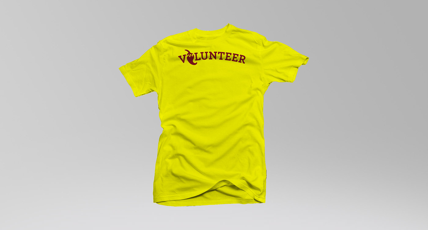
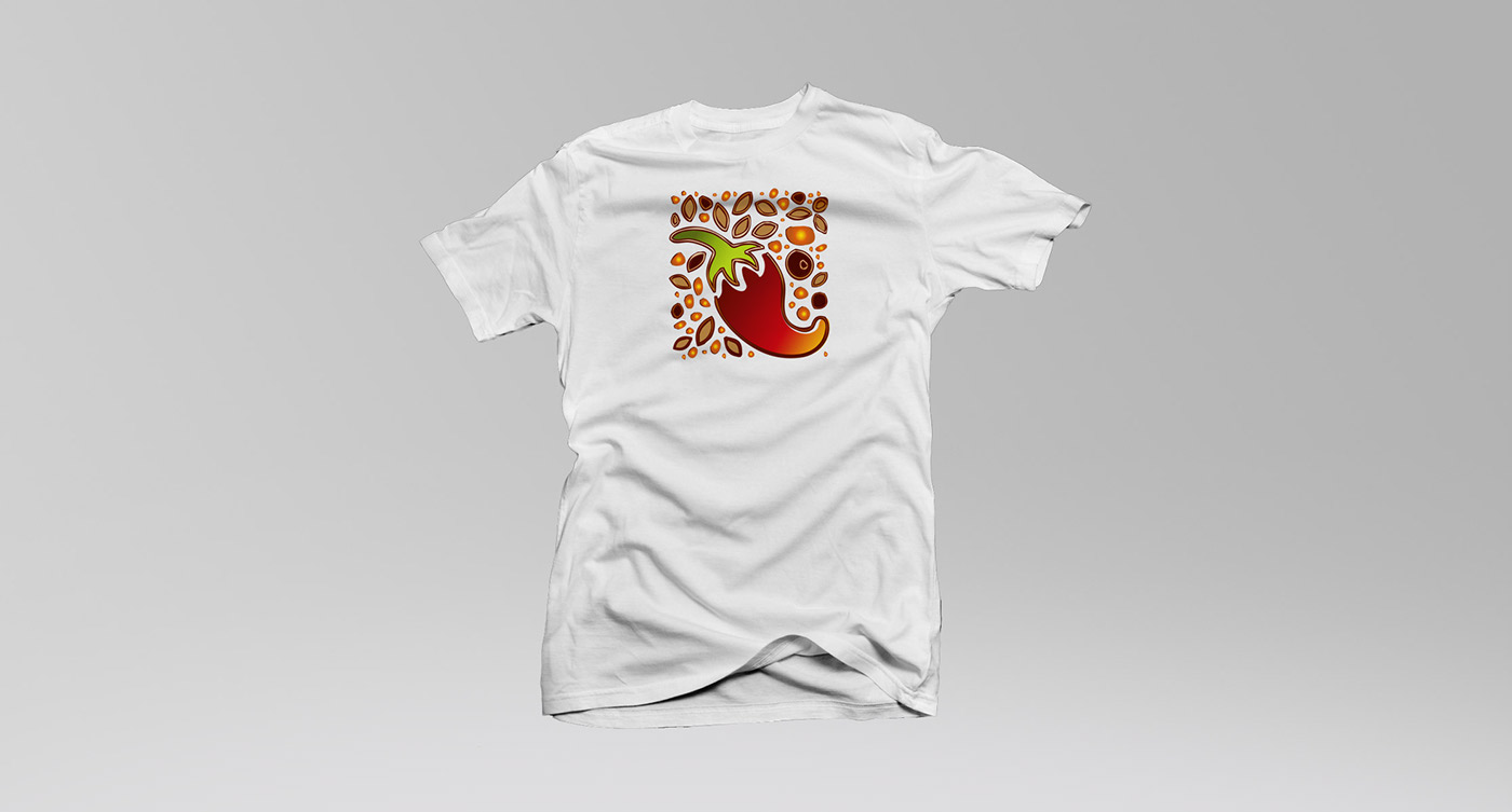
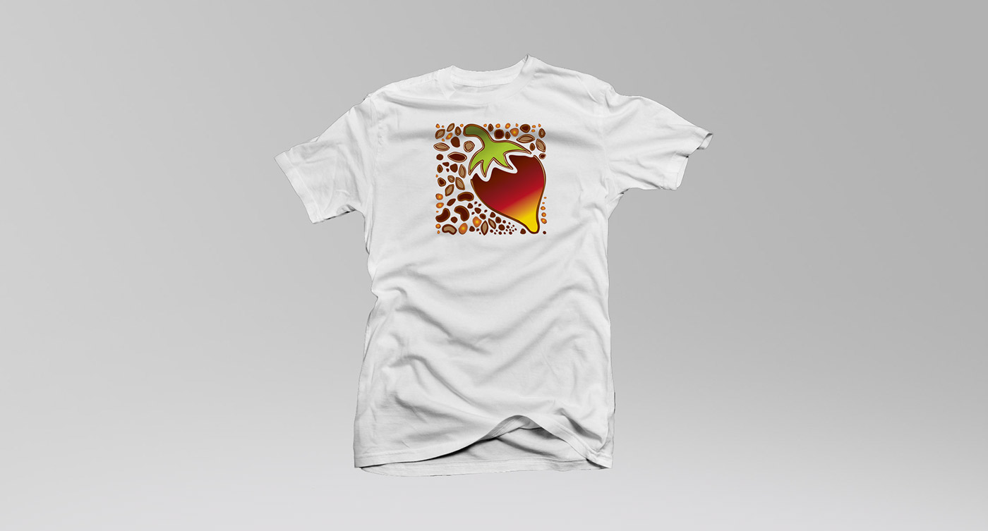
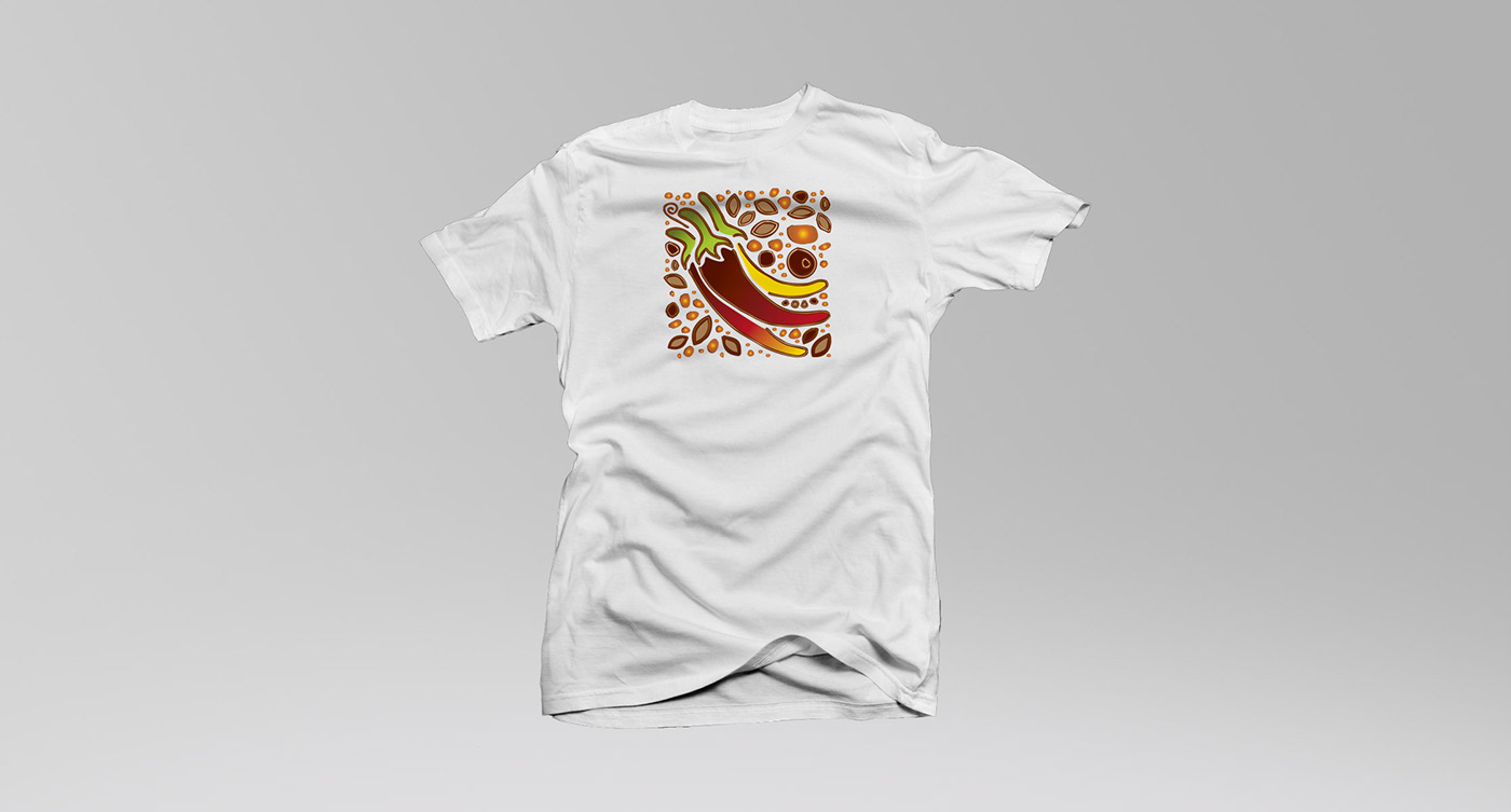
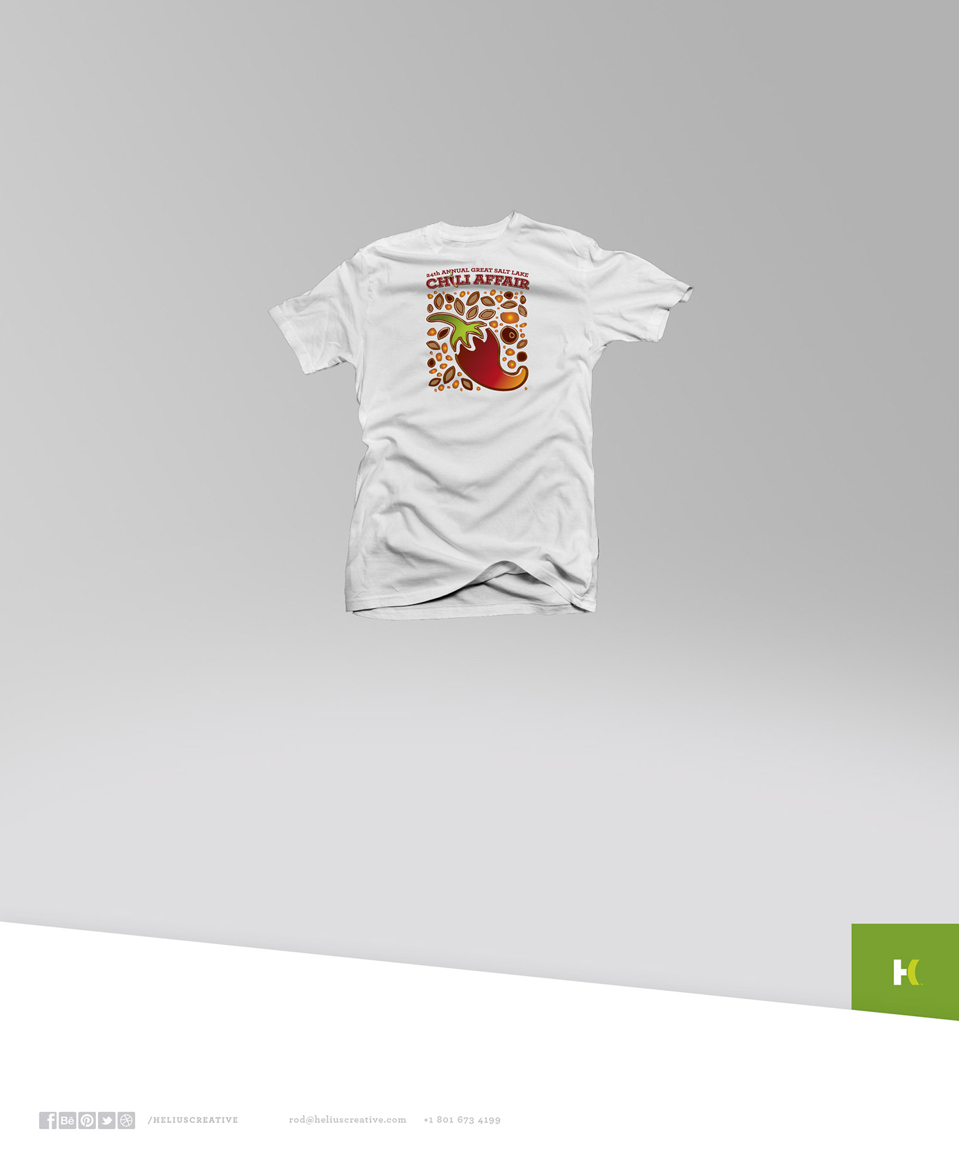
EVENT T-SHIRTS
Designed from Elements of the Original Artwork
Designed from Elements of the Original Artwork


CUSTOM :: GRAPHIC DESIGN :: LOGOS :: BRANDING :: ILLUSTRATION :: ADVERTISING
ROD@HELIUSCREATIVE.COM Email, Text or Call +1 801 673 4199


