

B-Sides Trailer by Kevin Graber, David Röthlisberger and Johnson / Kingston.

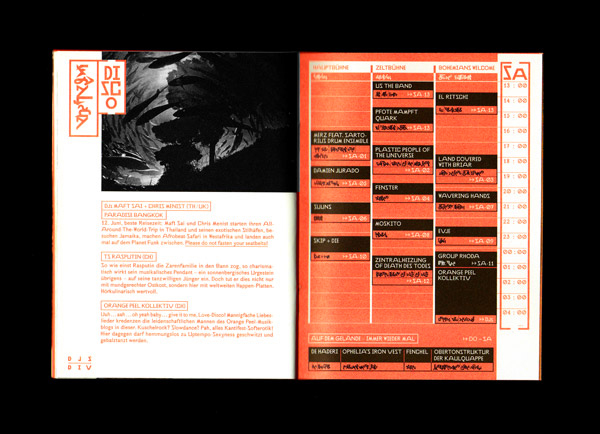
The language system/typeface is called "Neuland". The idea behind the language system is to create a visual analogy to the philosophy of the festival: To bring new, experimental music to the audience that is accompanied by astonishment and the feeling of making first steps onto new ground.
In contrast to the Latin alphabet, uppercase and lowercase letters are not distinguished but, rather, are supplemented by special signs to indicate the beginnings of sentences and proper names. Additionally, the spoken language, or a text authored in phonetic spelling, can be translated to the new writing system by a relatively simple set of rules. Text can also be translated back to spoken language by the assignment of sounds to the individual spoken syllables of the text. As such, and in contrast to common historical developments of writing stemming from the spoken word, in this system, the textual information is the basis for its vocal expression.
Finally, the shapes aren't derived from specific writing surfaces and tools; they are basically created with aesthetic criteria in mind. Not insignificant, among other things, is the inspiration found in Arabic and Eastern calligraphy, as well as Sumerian cuneiform.


