
▼
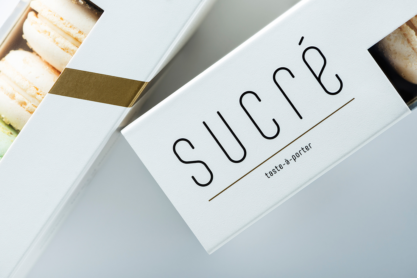
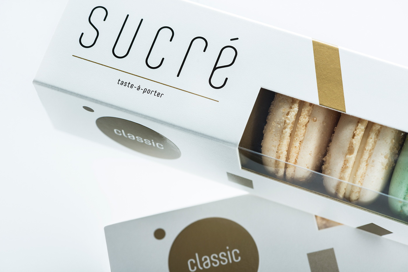
Sucré – is not a brand. This is something very personal, emotional and sincere. It is an area of a cosmopolitan woman. She is educated and confident. Refined, but in the other hand – not afraid to be flirtatious, just like the fashion world. Confectionery and fashion are the only weaknesses that she herself allows to enjoy openly. It is not surprising that this experience of taste is accompanied by the slogan “taste-à-porter” – the art of living tasty. And the axiom “less is more”, in the world of high pastry standards is supplemented with a meaning “less, but tastier”.
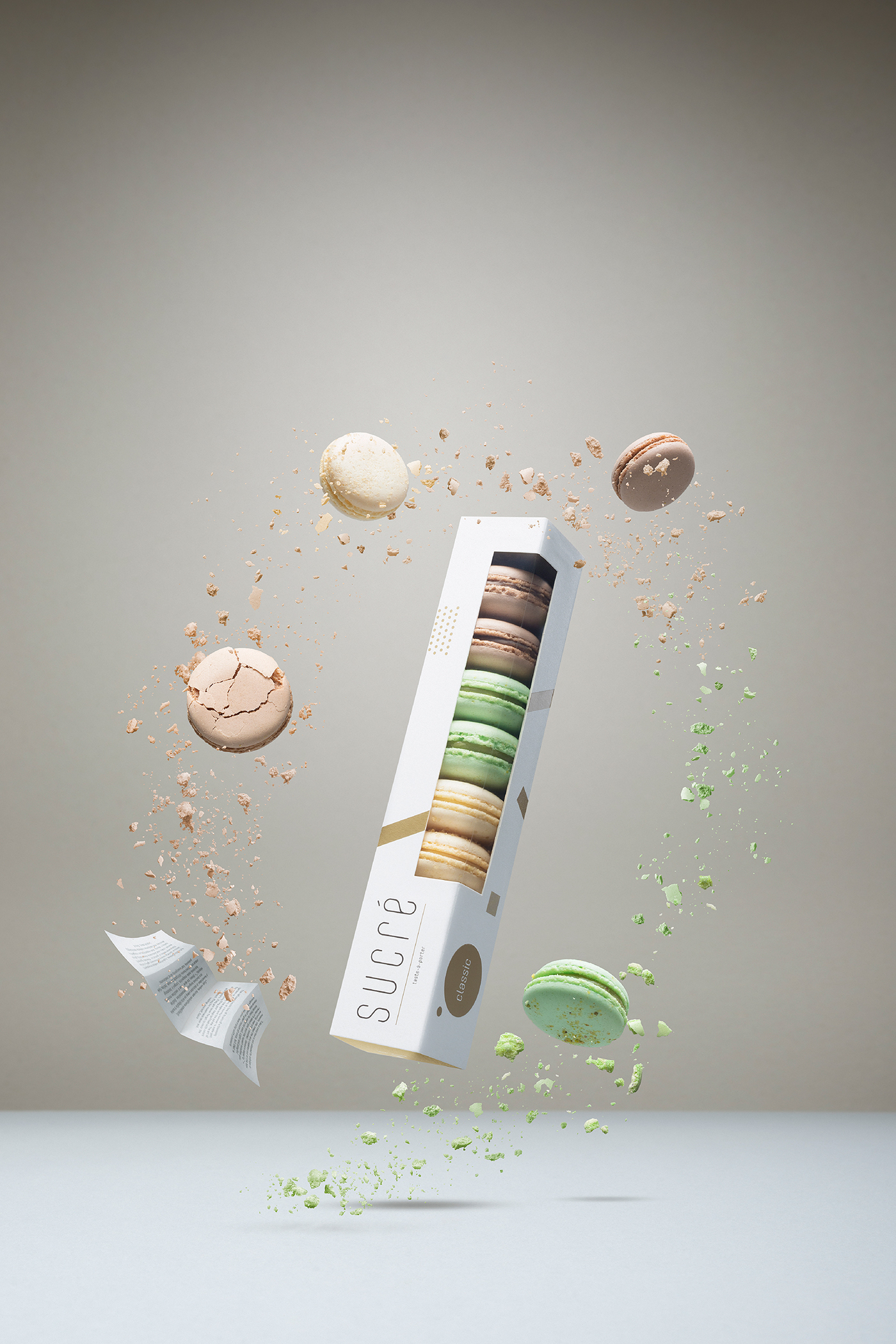
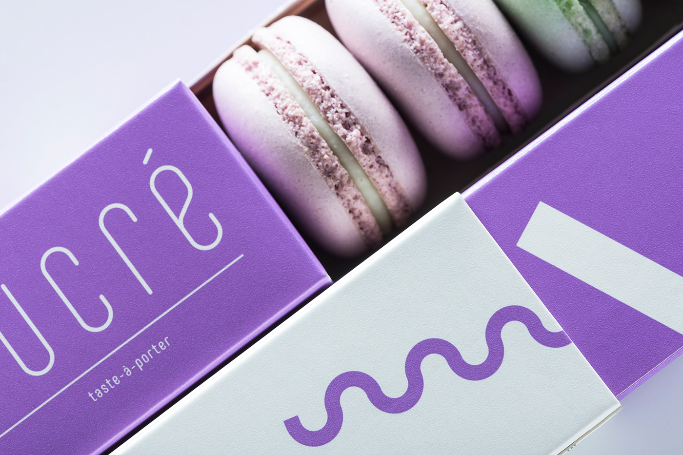
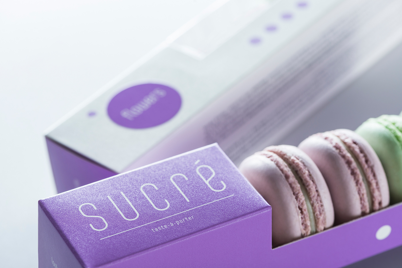
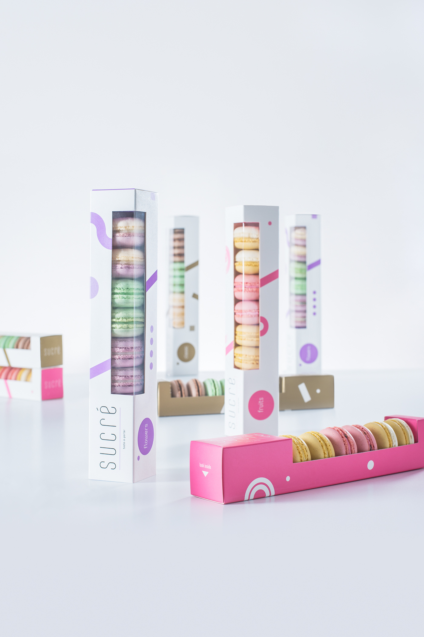
Over the past few years, small and colorful macaron cookies became popular in Lithuania. So we started telling the story of Sucré confectionery exactly from them. The collection of Sucré macarons consists of three lines of flavors. Classic flavors: champagne & brown sugar, pistachio with chopped nuts, sweet tonka beans. Fruit tastes: refreshing lemon, juicy strawberry & thyme, exotic passion fruit. Floral tastes: dizzy lavender, cool mint, sweet lilac.
Over the past few years, small and colorful macaron cookies became popular in Lithuania. So we started telling the story of Sucré confectionery exactly from them. The collection of Sucré macarons consists of three lines of flavors. Classic flavors: champagne & brown sugar, pistachio with chopped nuts, sweet tonka beans. Fruit tastes: refreshing lemon, juicy strawberry & thyme, exotic passion fruit. Floral tastes: dizzy lavender, cool mint, sweet lilac.
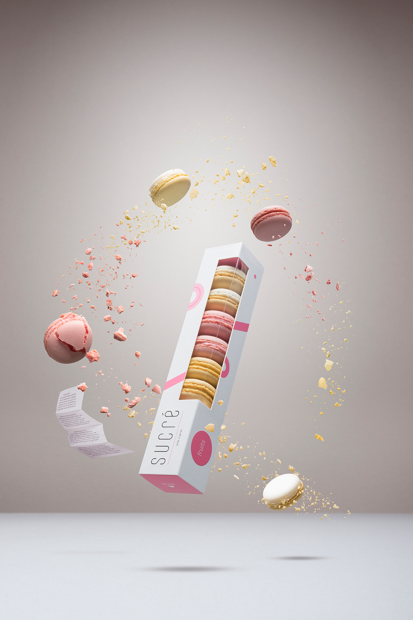
The first stage of the packaging design process was a full-scale analysis of the macarons consumption habits as well as the search for the eligible construction. Pastry products are usually given as a present or shared among girlfriends. It is important to bring a kind of adventure in the un-packaging process itself. Moreover, it has to be confortable to place the macarons on the table, remaining the opened package attractive as well. This is why we decided to deliver the double package, with the allusion to the double-layer dress.
Individual and associate geometrically formed graphic reflects three types of macarons, their colors and tastes. Classic flavors: champagne & brown sugar, pistachio with chopped nuts, sweet tonka beans. Fruit tastes: refreshing lemon, juicy strawberry & thyme, exotic passion fruit. Floral tastes: dizzy lavender, cool mint, sweet lilac. The influence mostly came from suprematism and constructivism artists who impacted the abstract art trends, among those – minimalism and especially contemporary fashion.
Individual and associate geometrically formed graphic reflects three types of macarons, their colors and tastes. Classic flavors: champagne & brown sugar, pistachio with chopped nuts, sweet tonka beans. Fruit tastes: refreshing lemon, juicy strawberry & thyme, exotic passion fruit. Floral tastes: dizzy lavender, cool mint, sweet lilac. The influence mostly came from suprematism and constructivism artists who impacted the abstract art trends, among those – minimalism and especially contemporary fashion.
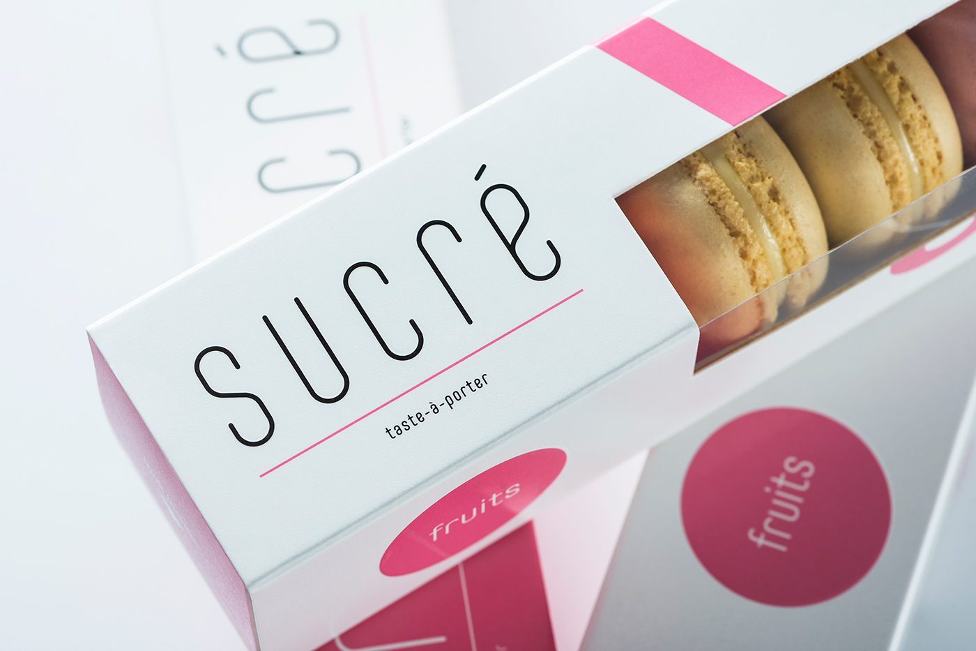
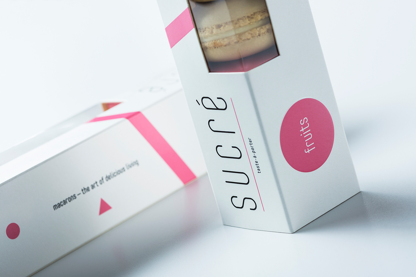

Seeking the additional sensory experiences, special attention was paid to board, which also has its effects of coloring and printing. White minimal packaging has a difficulty in achieving a pleasant touch and effect of visibly attractive uniform surface. In cooperation with the printing house we discovered the possibility to cover the packaging in drip-off effect varnish. It was chosen on a vibrant “Pantone” colors for the graphic elements. Some graphic elements, that do not change, were additionally applied by a high-gloss, making the logo and the taste of the line prominent referring to the embossed circle.
Finally, in order to strengthen the emotional connection with customers, a letter on behalf of the Sucré was written. We printed it on translucent paper and put into a box as a small feminine secret.

Brand concept


