Citinerary
Rebranding / 2015 / citinerary.net
Citinerary was in need of a rebrand. As the initiative grew, they needed an identity that could grow with them.
Rebranding / 2015 / citinerary.net
Citinerary was in need of a rebrand. As the initiative grew, they needed an identity that could grow with them.
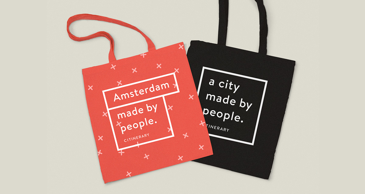
Citinerary reports on everyday city life. Every city is represented by a team of correspondents who write about their city. I came up with an identity that reflects the sense of community and also gives the city correspondents a part of the Citinerary identity to claim for themselves.
For this project I worked closely together with Daniël van der Winden and Rens Verschuren who designed and developed the website.

Logo
The logo is the base of the identity for Citinerary. The focus is on the Citinerary tagline “a city made by people” which explains the initiative. The base logo is used as the foundation for the city identities.
The logo is the base of the identity for Citinerary. The focus is on the Citinerary tagline “a city made by people” which explains the initiative. The base logo is used as the foundation for the city identities.

City branding
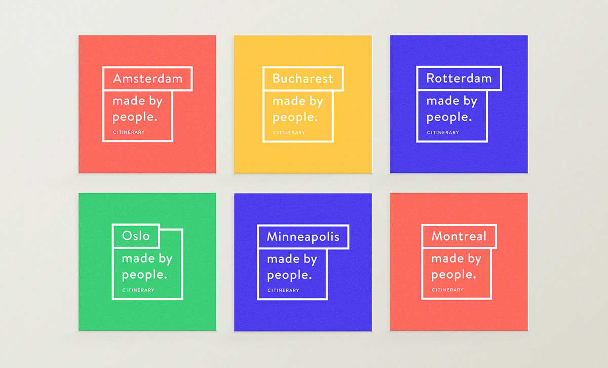
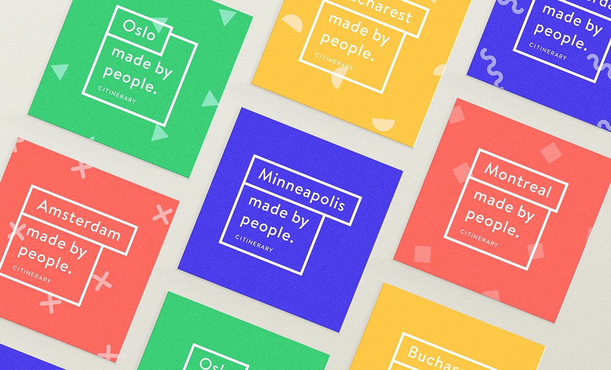
At the moment, Citinerary consists of six different cities. The city logos give every city a face of their own; something the correspondents can claim. Every city logo is red, green, blue or yellow, loosely based on the city’s already existing flag colours. Paired with a pattern that is unique to each city, the cities are able to distinguish themselves while remaining part of the main Citinerary brand.
At the moment, Citinerary consists of six different cities. The city logos give every city a face of their own; something the correspondents can claim. Every city logo is red, green, blue or yellow, loosely based on the city’s already existing flag colours. Paired with a pattern that is unique to each city, the cities are able to distinguish themselves while remaining part of the main Citinerary brand.