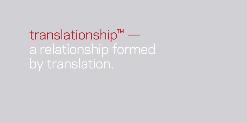
Client: Sinovo Translation — Sweden.
Description: With the translation market becoming more competitive, and the potential for
Chinese to become a second language in Sweden, Sinovo are keen to position themselves
as the leaders. I was commissioned to create a strategy which focused their strengths,
redesign the identity and develop the look and feel for the brand moving forward.
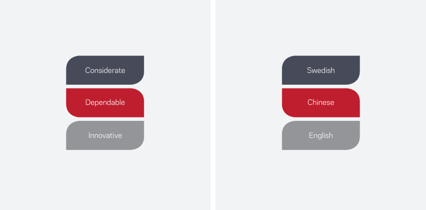
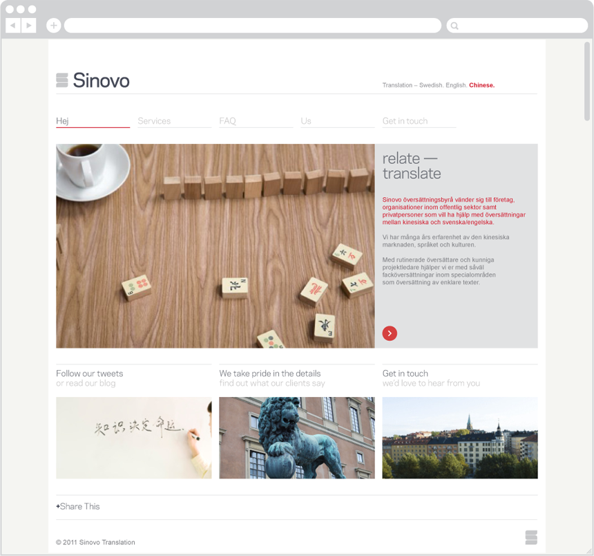
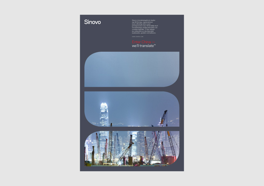
In order to position Sinovo as the leaders, I first needed to focus how they communicated
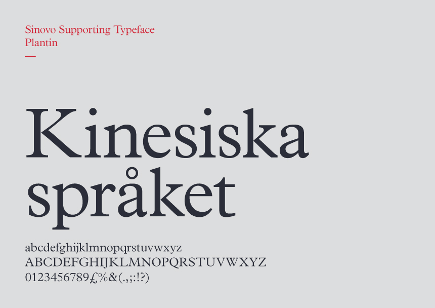
the offerings of the company and how to better represent their values. From this I created
a stronger and more iconic identity that differentiated them from the competition.
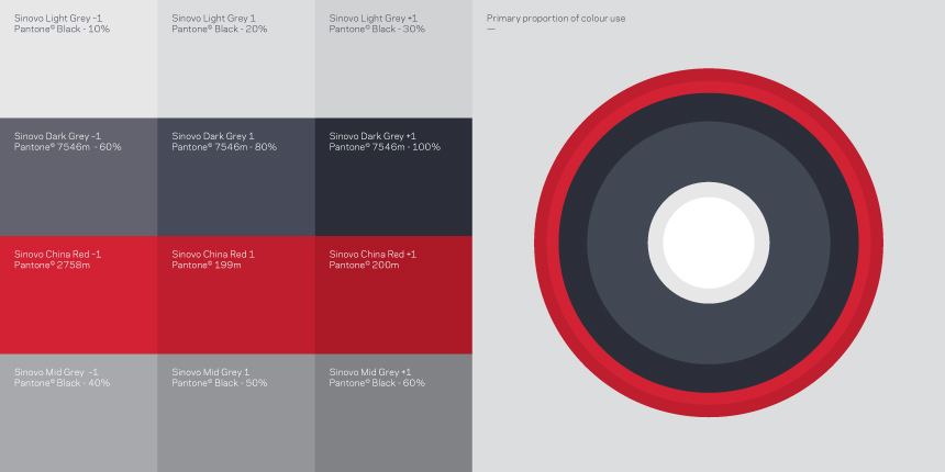
The simple colour palette came from a mix of the predominant use of Red in China and
Sinovo's forward looking values. The S symbol, split into 3 serves as a reminder of their
3 main values as well as a graphic window device – giving access to another culture,
full of opportunity for clients.


More work coming shortly


