Quorn
Design Bridge provided the brief to rebrand a famous brand of my choice. I chose to rebrand Quorn focusing on three main aspects: health, environment and ethics. I felt the current branding for Quorn was not emphasising the healthy, vegetarian and eco-friendly features of the product.
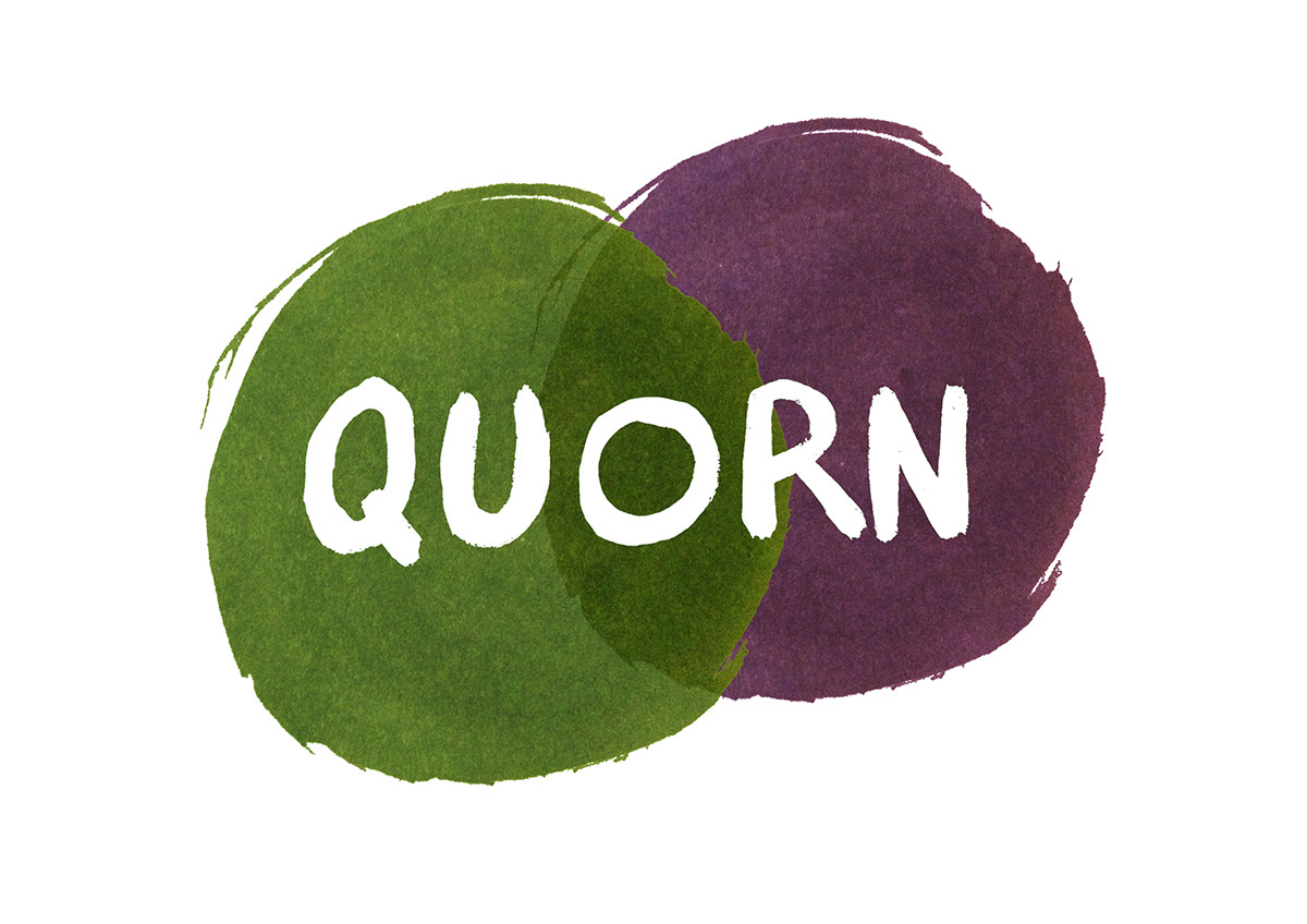
I created a logo using ink forming two circles that represent a venn diagram. The green represents vegetarians and the purple represents carnivores representing that Quorn is for everyone not just vegetarians. I experimented with organic packaging, typefaces and a variety of logos.


The final logo uses a round vegetable replacing the letter 'O'. I also decided the logo should be green with a leaf texture to represent the organic, natural and healthy features of the brand. I made a hand drawn typeface that originally had a line separating the text and the top of the vegetable. The line represented the vegetable being planted underground. I transformed the line into serifs for each letter to make the imagery and meaning more subtle. I created packaging using a recycled card sleeve for easy use and for an eco-friendly appearance.


