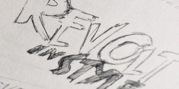
Inspired by the colorful landscape, branding for the then-upcoming Revolt Summer Surf Series 8 began as an experiment in extremes of color and typography. Wild brush strokes and bold colors were intended to capture the rush of the sport and the thrill of a festival-like environment that the event had become known for.
— — — — — — — — — — — — — — — — — — — — — — — — — — — — — — — — — — — — — — — —
— — — — — — — — — — — — — — — — — — — — — — — — — — — — — — — — — — — — — — — —
— — — — — — — — — — — — — — — — — — — — — — — — — — — — — — — — — — — — — — — —
/color + type/

— — — — — — — — — — — — — — — — — — — — — — — — — — — — — — — — — — — — — — — —
/stationery/
A full stationery system including a businesscard, letterhead, and envelope.
(Designed for standard sizing.)


— — — — — — — — — — — — — — — — — — — — — — — — — — — — — — — — — — — — — — — —
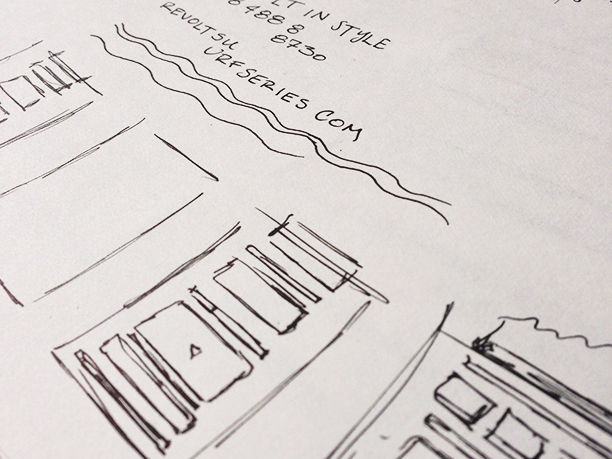
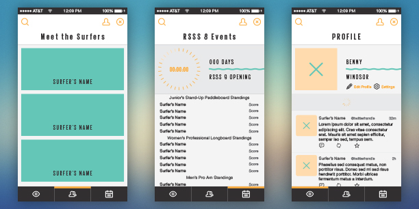
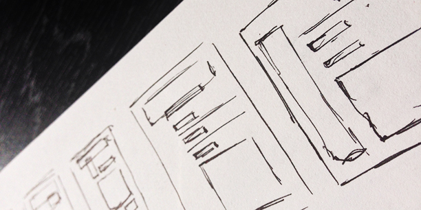
/web + mobile application/
A mobile application that allows participants and spectators to stay up-to-date on the action. Event standings, surfer profiles, and more.