

The Brief
NUVO Design Furniture is a company focusing mainly on modern office furniture and selling lockers & cabinets via a new online web store. The Company was established in 1989 in Ballito. NUVO works with modern interior architects and well-known designers to guarantee high-end and unique office furniture for more succesfull companies. After 25 years in the industry NUVO wants to revitalize their brand. The current brand looks dated und they need a fresh look while celebrating their anniversary. The Company has also entered the web arena und wants to push ther social media presence.
NUVO Design Furniture is a company focusing mainly on modern office furniture and selling lockers & cabinets via a new online web store. The Company was established in 1989 in Ballito. NUVO works with modern interior architects and well-known designers to guarantee high-end and unique office furniture for more succesfull companies. After 25 years in the industry NUVO wants to revitalize their brand. The current brand looks dated und they need a fresh look while celebrating their anniversary. The Company has also entered the web arena und wants to push ther social media presence.
The Solution
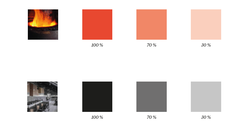
The color palette is reduced to dark, cold and less saturated black and grey tones. The only colorful tone is the aggressiv orange symbolizing the heart of the company - melted steel. Most of the furniture is based on simple geometric shapes with sharp edges. Everything is in order and seems to be in the perfect place. Inspired by the Bauhaus style the new brand looks verymodern, simple and shows the beauty of materials. The geometrical shapes were found in the letters of the companies name itself. There is no ornament or flourish because the logo finds its beauty in the form and materials used - just like the furniture.
The color palette is reduced to dark, cold and less saturated black and grey tones. The only colorful tone is the aggressiv orange symbolizing the heart of the company - melted steel. Most of the furniture is based on simple geometric shapes with sharp edges. Everything is in order and seems to be in the perfect place. Inspired by the Bauhaus style the new brand looks verymodern, simple and shows the beauty of materials. The geometrical shapes were found in the letters of the companies name itself. There is no ornament or flourish because the logo finds its beauty in the form and materials used - just like the furniture.


Logo Development
Based on the moodboard and the general look of the furniture the early logo sketches are showing an attempt of combining geometric shapes with the company name NUVO. In most cases the geometrical shapes were found in the letters themself, others were inspired by the form of the produced furniture. There is no ornament or flourish because the logo finds its beauty in the form and materials used - just like the furniture.

Final Logo
The final logo is a simple reduction of the companys name intogeometric shapes. The letters order is given by a square. Due toreadability the letter „n“ was reshaped compared to the previousversion. The main logo is using the color orange. The B/W and inverted versions of the logo are working without any further adjustments.
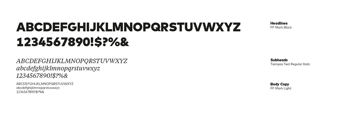
Typography / Colors
FF Mark is a strong, simple and bold font. Created with utmost consideration and precision. True to geometric tradition, contemporary for today’s needs. Designed with versatility in mind, it breaks tradition with its family of 10 weights ranging from Hairline to Black, with the extreme weights “engineered” to shine bright in large sizes and middle weights optimized for body copy. Tiempos Text is a serif typeface. The design was heavily influenced by Times New Roman, especially in the italic variant. As a whole Tiempos seems is linear, sharp and has a stern taste. This seems to describe consistency or reliability which is required for the furniture company. The meaning of the color orange is stimulating, vibrant, and flamboyant. While made up of red and yellow, it carries less aggression and fierceness than the color red due to its combination with the calming color yellow.

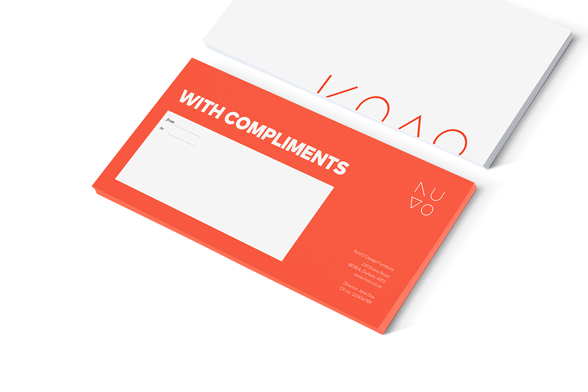
Stationary
Every stationary item works with the main logo on the top right side. The envelope uses the logo at the bottom right because of the strip at the top.All sides are using a wide white or orange space. The geometric shapes of the logo are used in a non-square and turned version as a design element to give the company a strong identity and specific look and feel based on the logo. The Layout is very geometrical and consists of simple constructed shapes.

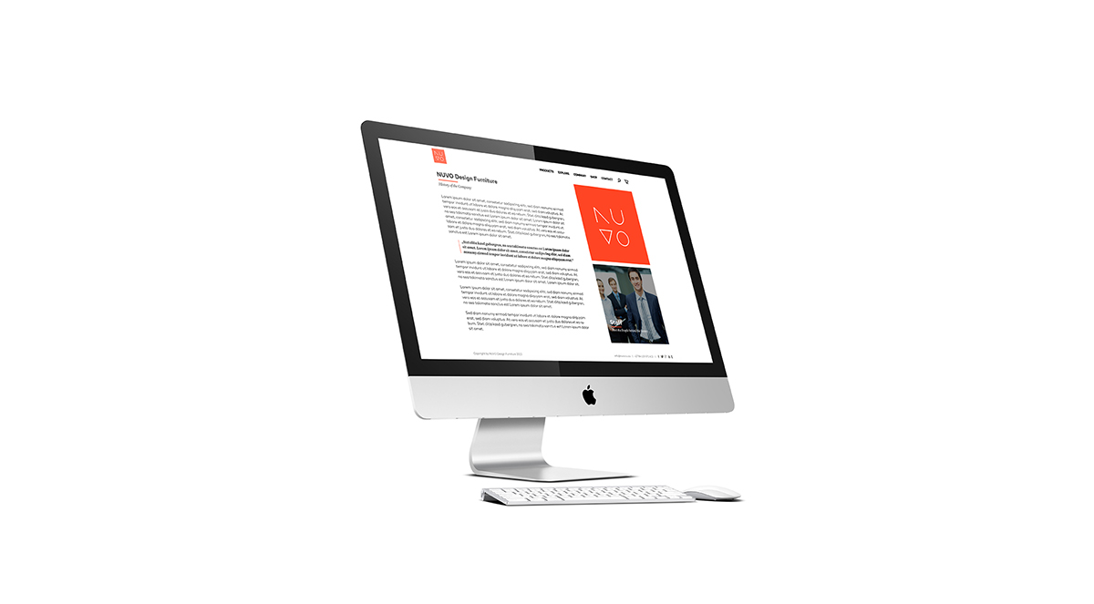
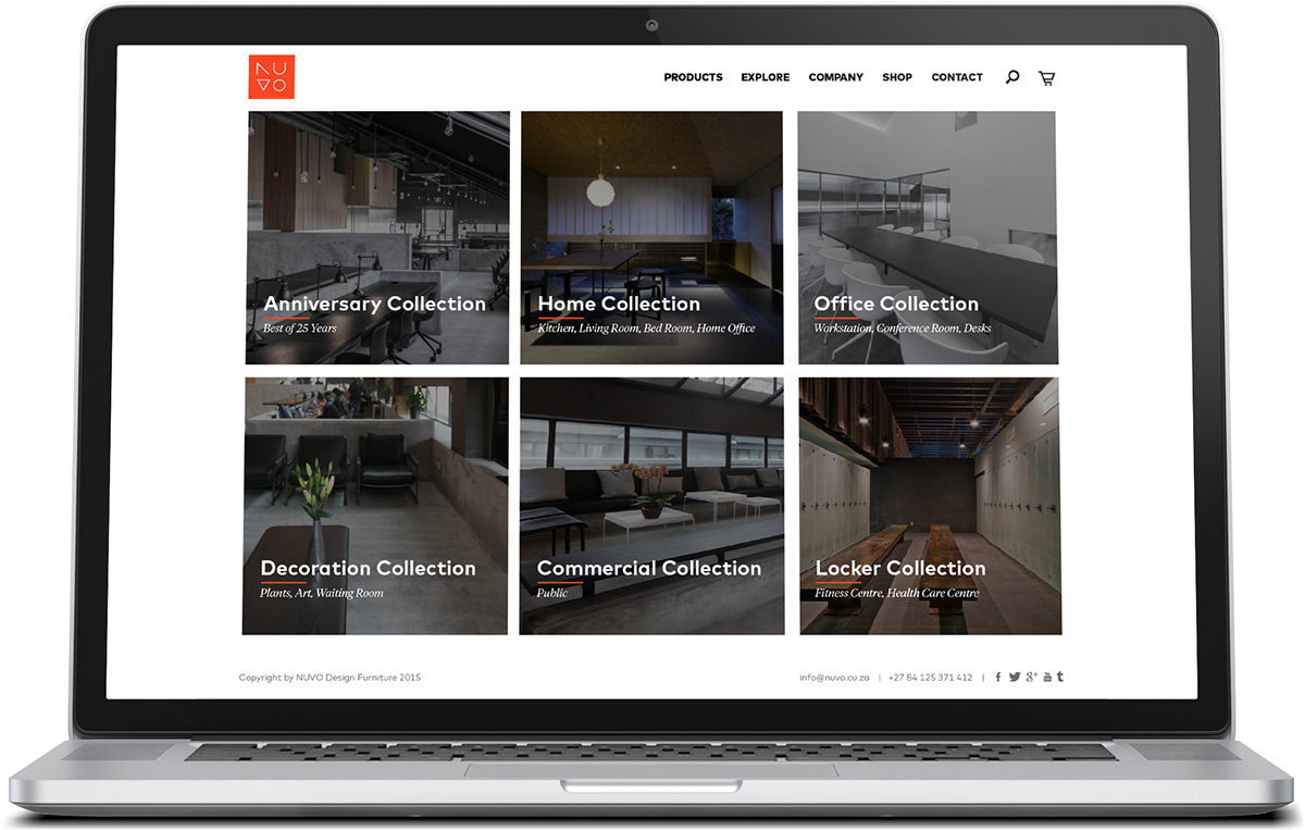
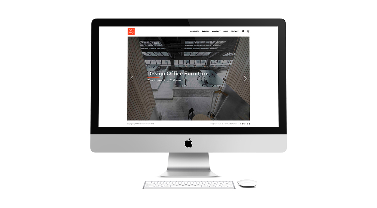
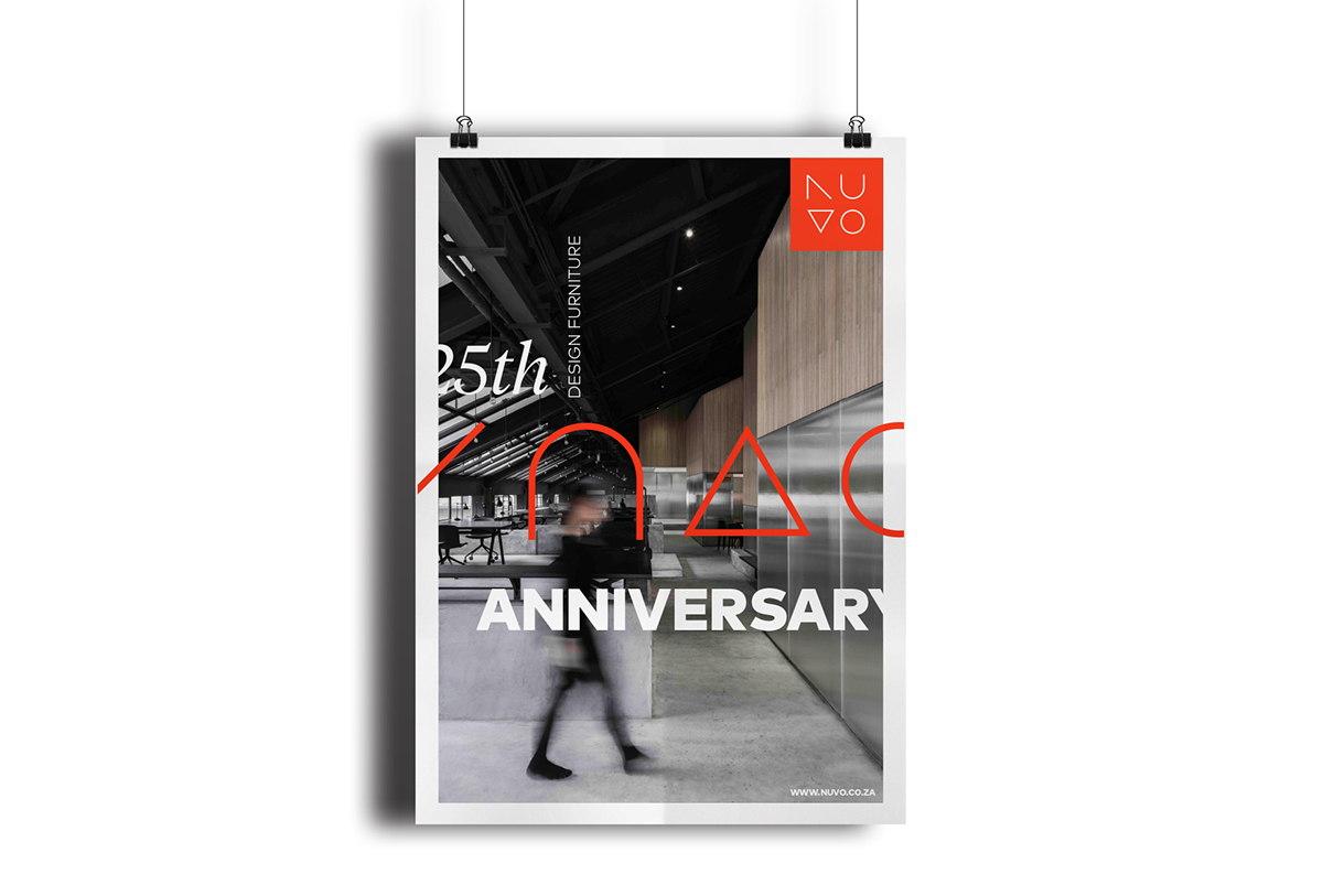
Website and Facebook
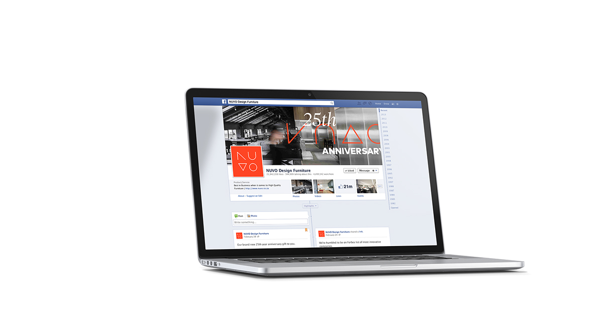
To guarantee a continuously look and feel the website also uses a wide white space with a clean and simple layout. The container for images and teaser are squares or rectangles depending on the device where the website is displayed. To push the social media presence of the company there a links for the most important social media platforms on the footer of every site. The Facebook page currently shows a cover celebrating the 25th anniversary of the company.
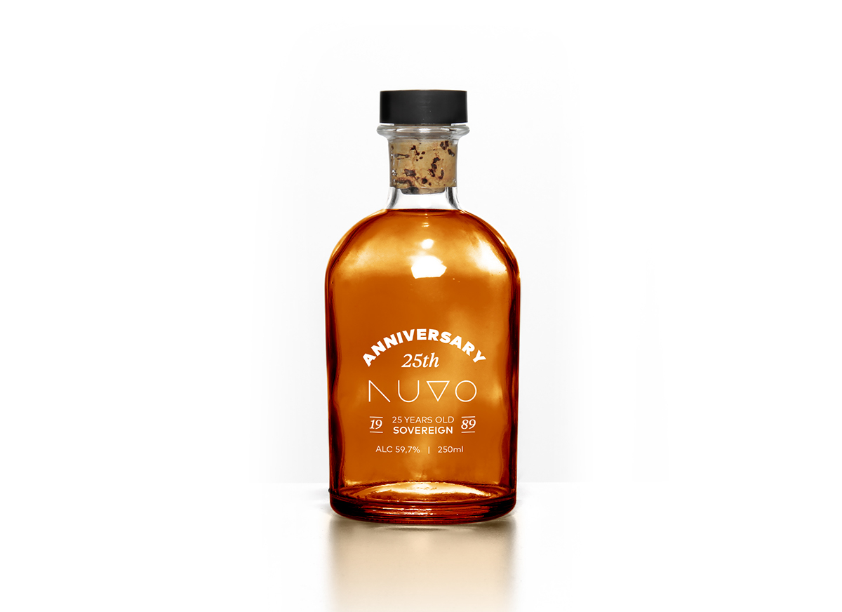
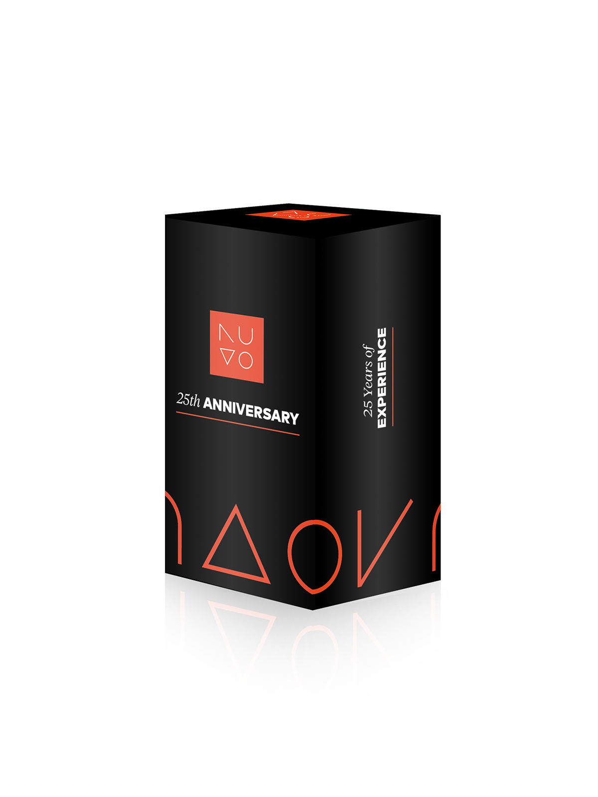
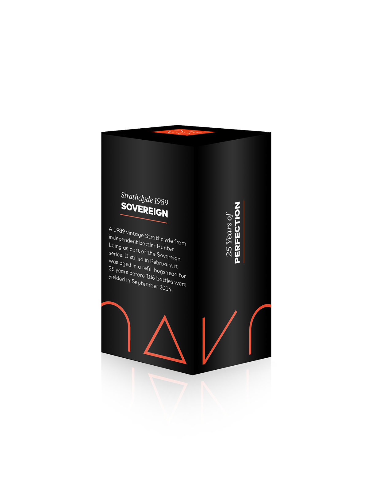
Packaging
By the given focus target the promotional gift is adressed to CEOs of succesfull companies. The mailing of the gift is part of marketing strategy to win new customers and secure customers‘ loyalty. Because of the 25th year anniversary the idea is to give a 25th year old whiskey away. Similar to the company the whiskey matures over the years. With every year theres more experience resulting in better furniture and relationship between the company and customers. It also creates the idea that the company asks the customer to join them on a drink like good old friends.
Thank you!


