OccupythePossibilities.org
An optimistic approach to clarifying the goals of the Occupy movement.
An optimistic approach to clarifying the goals of the Occupy movement.
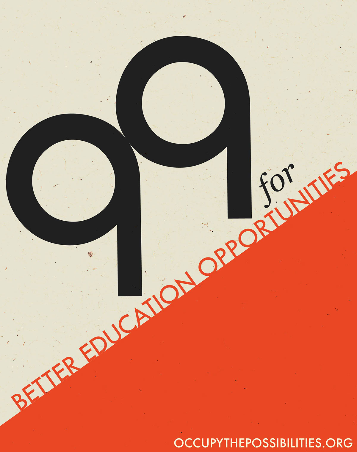
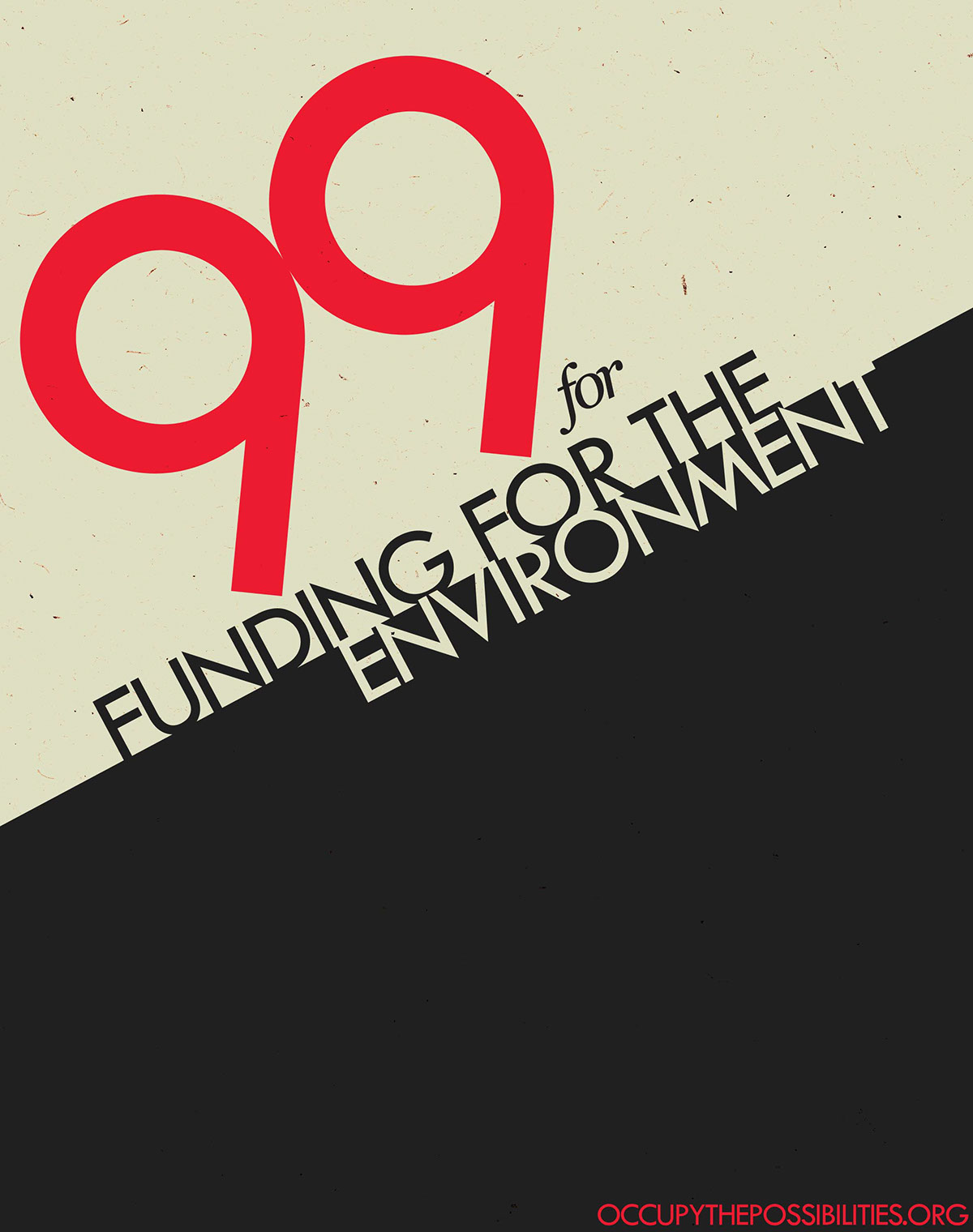
This is a project from my Art Direction class. The goal was to clarify the goals of the Occupy movement to make them seem more legitimate to the non-believers. I was aware of the movement's desire to break uniformity and maintain individuality. With that in mind I took inspiration from the style of the Russian constructivist movement of the 20s. I also incorporated symbolism of two icons into the posters. 1) The / in the Percentage sign (for the 99% of course) and 2)a hill, because this is an uphill battle. Finally to display a slight individuality, but unify the movement, I used varying shades of red and compositions, while keeping some similarities such as the typography and texture.
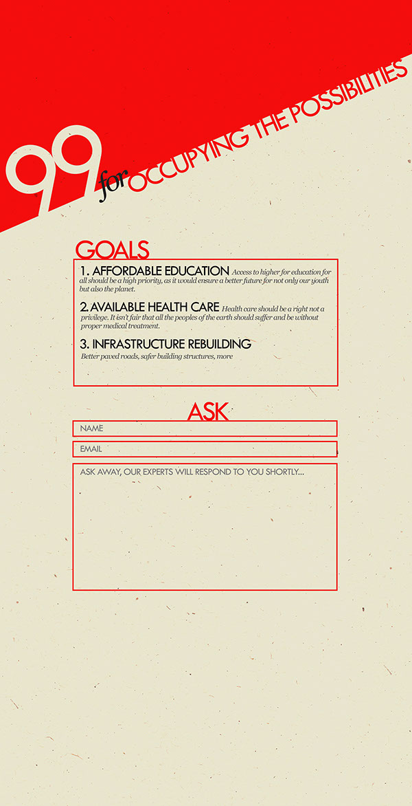
Finally, I designed a mock web page layout for OccupythePossibilities.org, with a similar style and feel to it. The website clears up exactly what the movement wants, and gives the opportunity for 'experts' to answer any questions the public may have.