
Like many categories, organic brands have developed a somewhat predictable palette of ingredients that tend to make them fit in rather than stand apart. New branding for Bonterra uses a proprietary palette — iconography, color, typography — and manages the elements in a way that feels natural, effortless and premium. All without discarding familiarity of the previous identity.


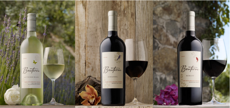
Organic farming isn't about what is prohibited. Rather, it's about encouraging nature to thrive — enabling nutrients that bolster growth, and attracting predators that protect against pests. The vineyard becomes habitat to animals, birds, insects and plants that work together, ultimately resulting in better fruit. New labels feature a sampling of this ecosystem, offering the brand new ways to tell its story and customize individual varietals.


Bonterra has legitimate organic credentials and benefits by telling a real story, inviting consumers to engage, discover and share the experience. The brand book is how Bonterra informs its distributors and partners, provides branding tools and encourages them to tell its story.


A refreshed color palette, language, typography and imagery with a point of view bring the brand to life in a meaningful way. We went on site with photographer Andy Anderson to create a library of imagery. Shot at springtime, the imagery shows new growth, animals that are part of the organic approach and artifacts used in biodynamic farming and winemaking.


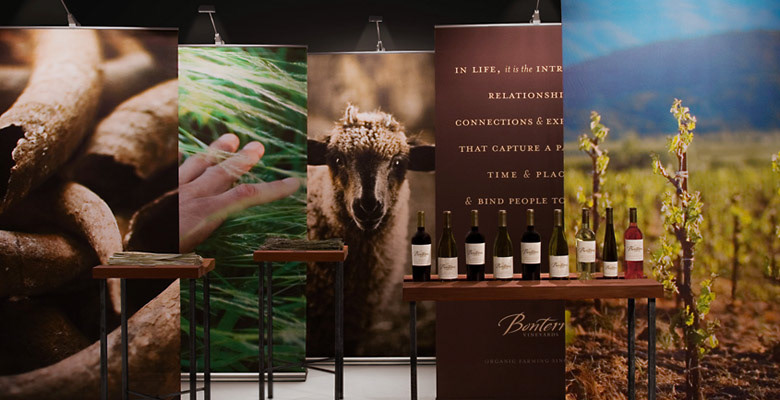
The Bonterra Roadshow includes a multimedia presentation on Bonterra’s organic practices and a wine tasting featuring several award-winning varietals. Banners create a larger than life sense of what the Bonterra Ranch is like. Display tables feature Bonterra varietals, as well as biodynamic preparations and artifacts from the ranch.


Printed materials offer the trade a glimpse into the world of Bonterra, so they can understand what's special about the ranch and pass the story on to consumers.


