The brand identity and resulting system emanate from the flagship (70 proof) label design. Key elements of the label were retained, but irrelevant and extraneous elements were edited to create a purer, more premium and confident expression for both the label and brand signature.

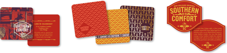
Using New Orleans as an inspirational frame of reference, the extended system of brand language incorporates elements that directly and indirectly reference the city, its culture and heritage.


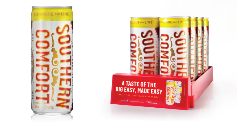
The packaging system for Southern Comfort begins with the flagship 70 proof product and extends to 100 Proof and Special Reserve. All are unmistakably connected to the core, but extend the system of iconography to create a family of products, each with a unique personality.

Language, an extended color palette and flavor cues make these ready-to-pour products premium, but a little more casual and fun.

The Southern Comfort story originates in New Orleans, a city with unique cultural influences and a rich history. We asked artist Christian Northeast to capture the diversity, energy and vibe of the place. The result is a collage of rich, eclectic imagery that is not only true to New Orleans, but is also relevant to people anywhere.