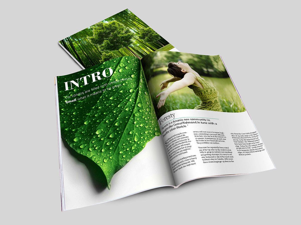
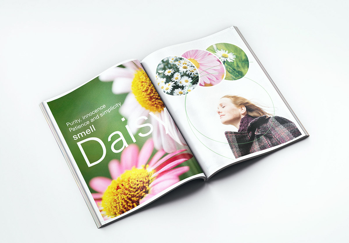


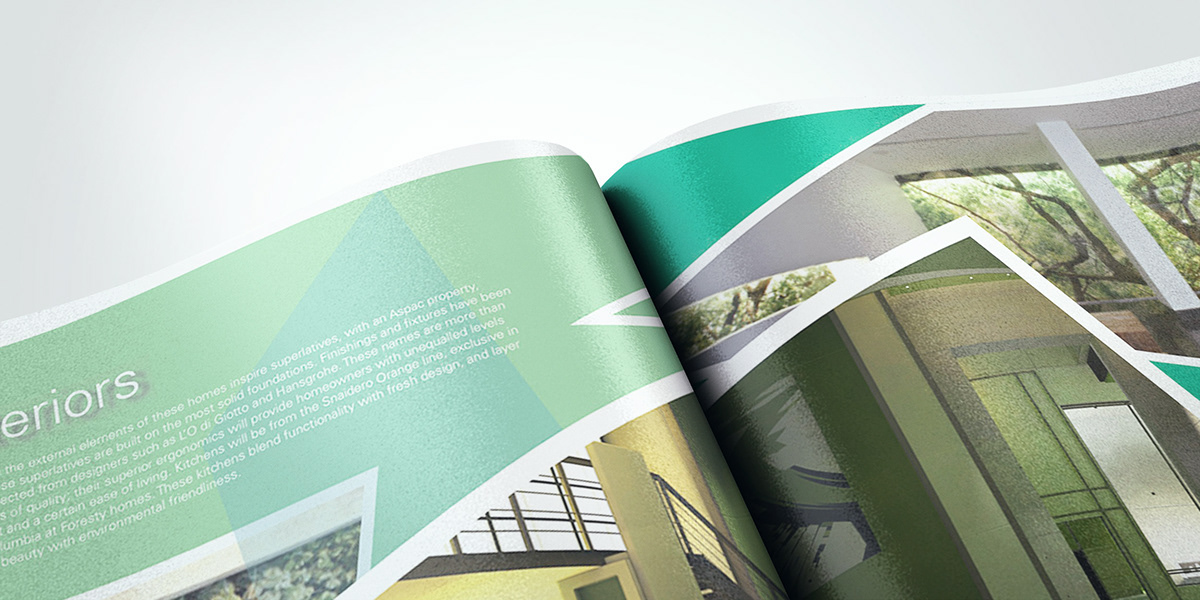


Foresty was a high-end, comfortable and eco-friendly condo located in Vancouver, Canada. The name was straightforward to indicate that the green had become the focus of attention. The logo was an abstract tree with three different geometric shapes on the top of the trunk. The main brochure divided into four different parts with activities, interior, amenities and sustainability. Each part was going with a particular flower to represent what the feature was. Daisy was going with activities. Lavender was appropriate for interior, which represented peace and calm. Tulip was going with sustainability. The last one was rose, which was fit in amenities. A sophisticated folder covered the brochure, which you would find two nice floor plans and one business card inside. The color scheme was green, which matched the entire concept.

