A school assignment to create a visual identity and develop a brand strategy for the fictional county Österlen. The goal is to attract a younger target group (30—40 years) to come live in the region.
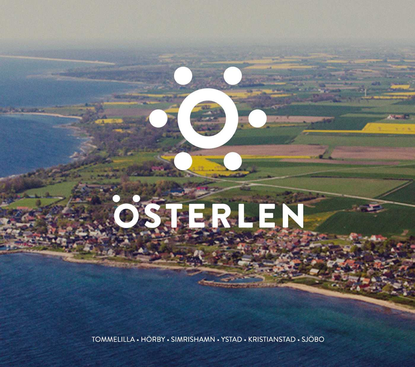
Österlen is a region in south Sweden that is characterized by its nature and farming and is known for its culture, low degree of urbanization, high average age and low migration of young people. Within Österlen, there are six existing counties today.
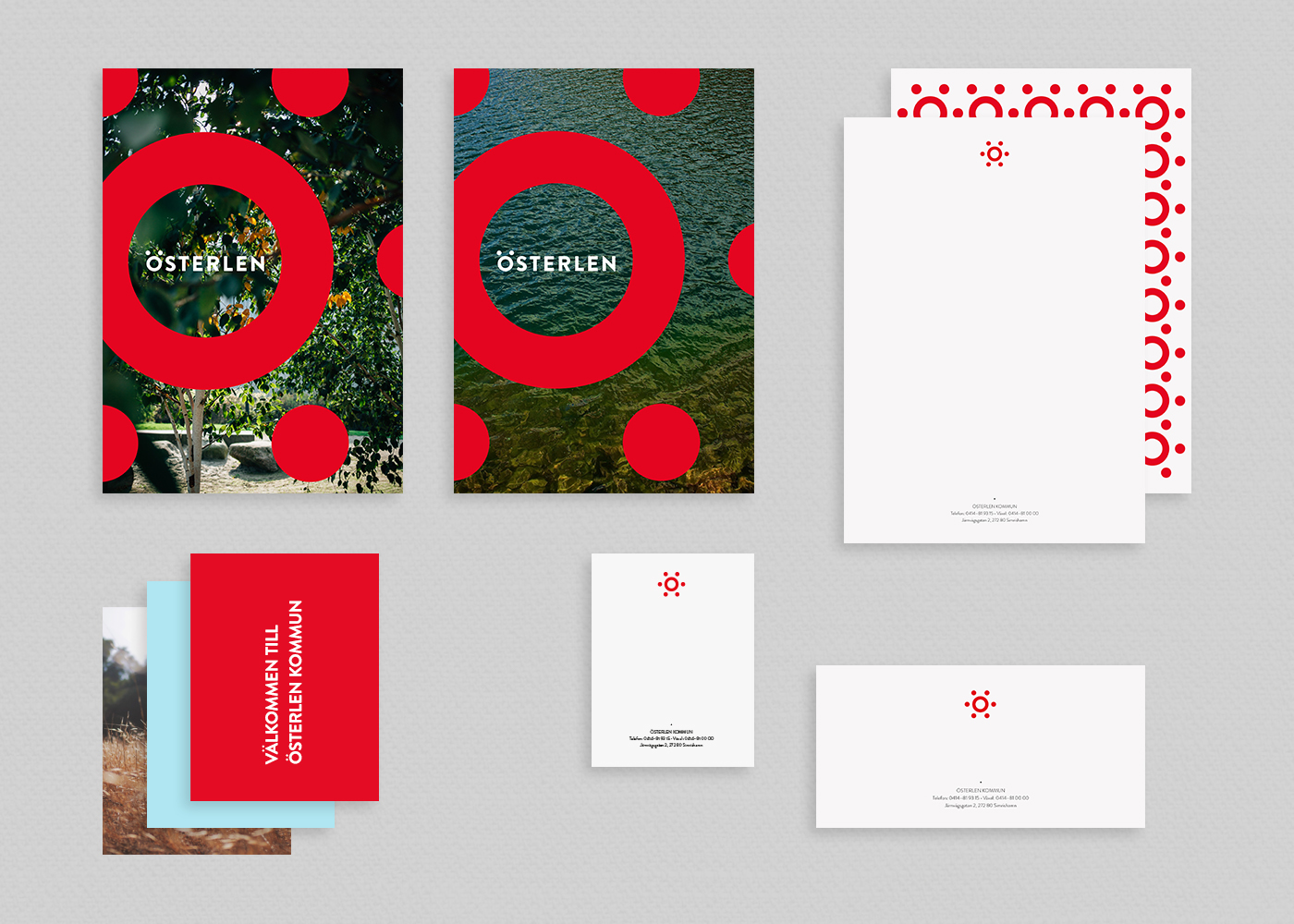
The logo is an ”Ö” with six dots representing the six counties – surrounding the circle as a unity. The six dots around the circle create a sun symbol – a source of power and life. It’s an iconic mark that can be used in a lot of different ways to create a more versatile and expressive design.