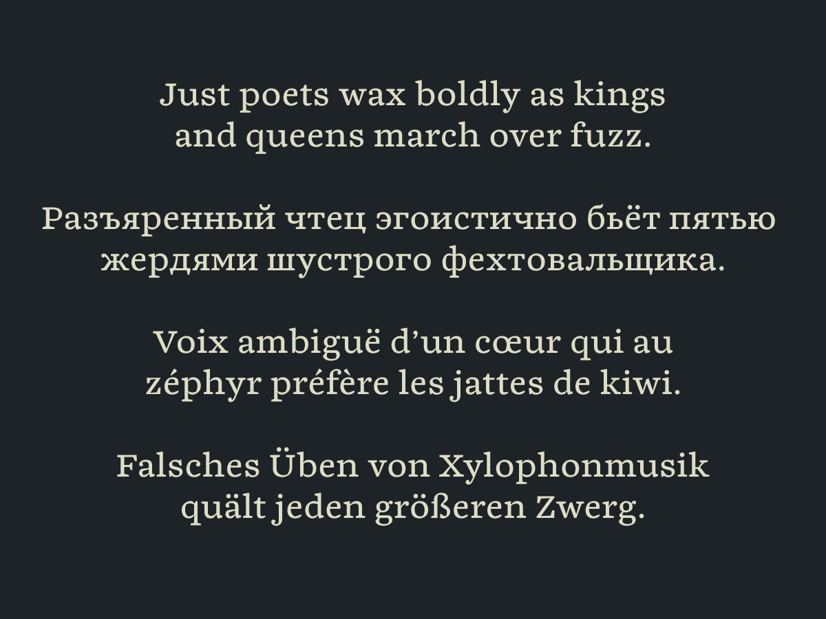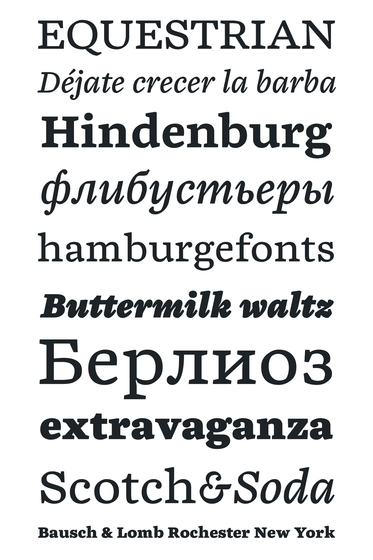
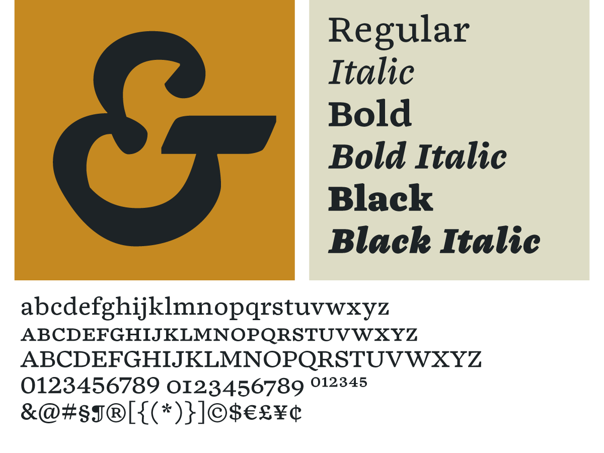
Chiavettieri draws inspiration from Humanist types, marked by low contrast between thick and thin strokes and the angle of stress in the bowls of letters. On the other hand, generous x-height, clean angled serifs and sharp cuts in the ball terminals suggest a more contemporary look. All these characteristics make it a robust, well balanced, legible typeface ideally suited for book text, editorial and publishing, as well as web and screen text.
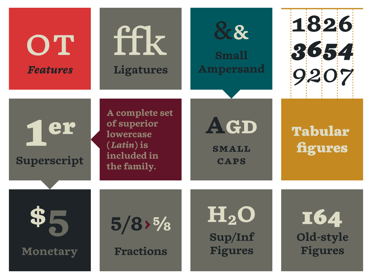
With distinct Italics, small capitals, complete set of superior lowercase (Latin), oldstyle and lining figures (each in tabular and proportional widths), ligatures, fractions, superior and inferior characters – Chiavettieri is equipped for proper typography.