

Liverpool Biennial: Sachiko Abe
Cut Papers
Cut Papers
The aim of this brief was to visit the Liverpool Biennial 2010, and choose an artist or exhibtion which was inspiring and from this, to create a set of promotional work to advertise the event.
I chose to promote the work of Schiko Abe in her "Cut Papers" exhibit. My idea was based around a clean, simplistic aesthetic which resembled the elegance and purity of Sachiko Abe’s work and performance. A very simple idea whic emphasized her working methods.
Sachiko Abe's performance involved her sitting alone quietly cutting paper up in straight lines as she was dressed in white. I used the laser cutter to portray the cutting of paper within my design. As well as showing information of the event, it also gives the viewer a clear indication of the work they will expect at the exhibition. The laser cut into paper represents Abe's working menthods in her installation.
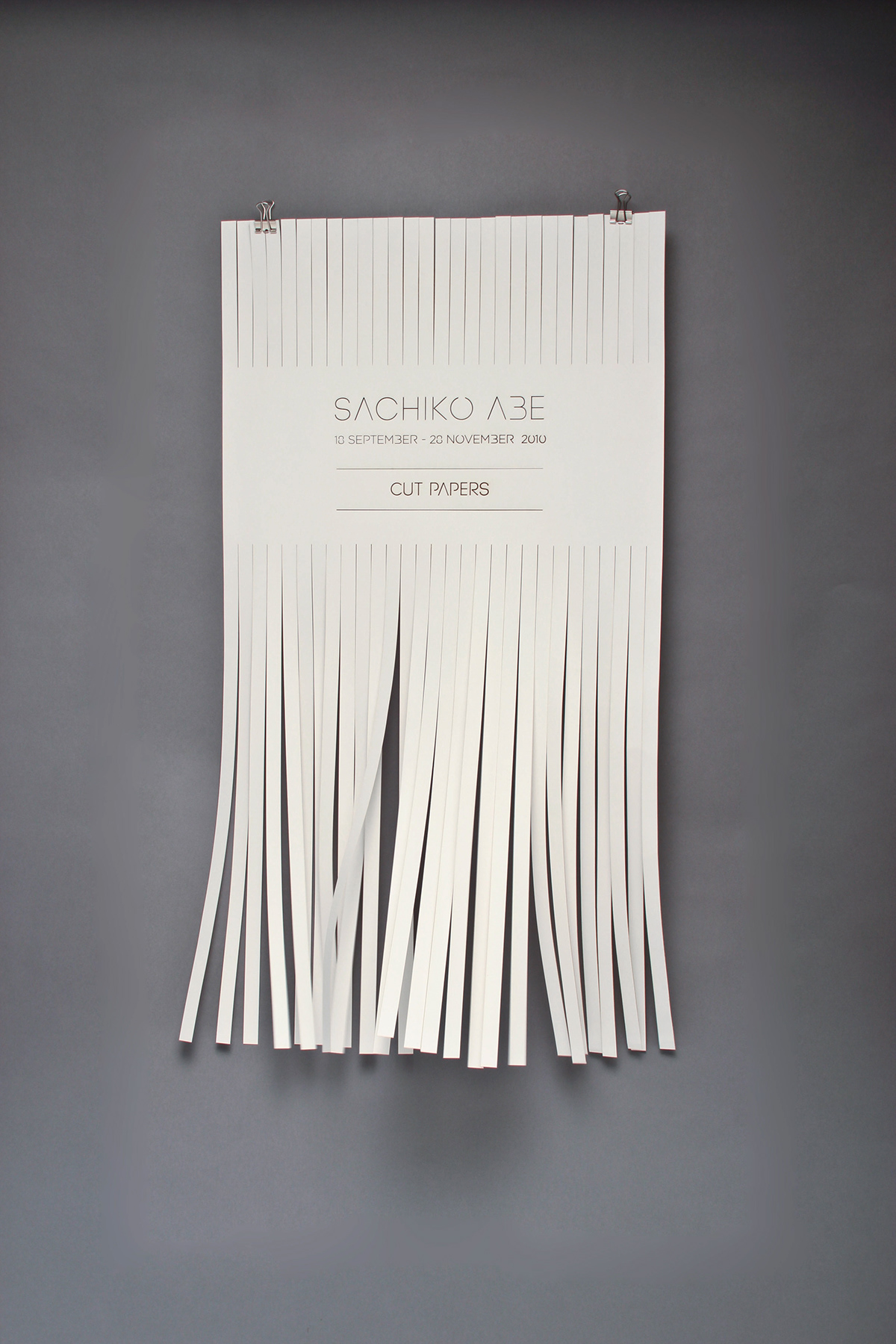

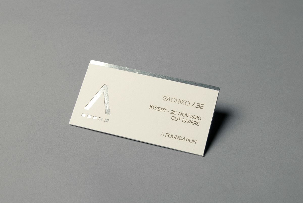
My collection consists of a laser cut banner, postcards, business cards, information booklet, and flyer. All of which can be sent through the post, if need be. I also created a typeface which suited the concept of ‘cutting away’ and also suited the laser cutter. The way I designed the typeface allowed for counter pieces in letters such as ‘a’, ‘o’, ‘b’ to stay in tact.
I used this stencil look for her unique logo specifically for the event as well as adjusting the original A Foundation logo to show how Abe's performance has been involved. I removed the crossbar from the 'A' and changed the underline into a perforated line - emphasizing her cutting techniques and representing scissors in the 'A'.


Images below show the laser-cutting process of my poster. This took some time to master. My typeface is based on a stencil aesthetic to ensure the letter structure stays intact, so experiementing with the laser cutter and the size of my type took some time to achieve to the precision I desired.
As the images below show the first few attempts, you can see how the counter pieces have fell through.
As the images below show the first few attempts, you can see how the counter pieces have fell through.


I will be exhibiting my designs at the Liverpool School of Art and Design: Degree Show 2011 as part of my final year work for university.


