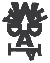
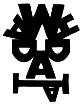
The Identity for "Wah-da-dah" dance school was inspired by african folk tales that would often be accompanied by interpretive dances that saw the performers wearing masks to become the characters in the stories being told.
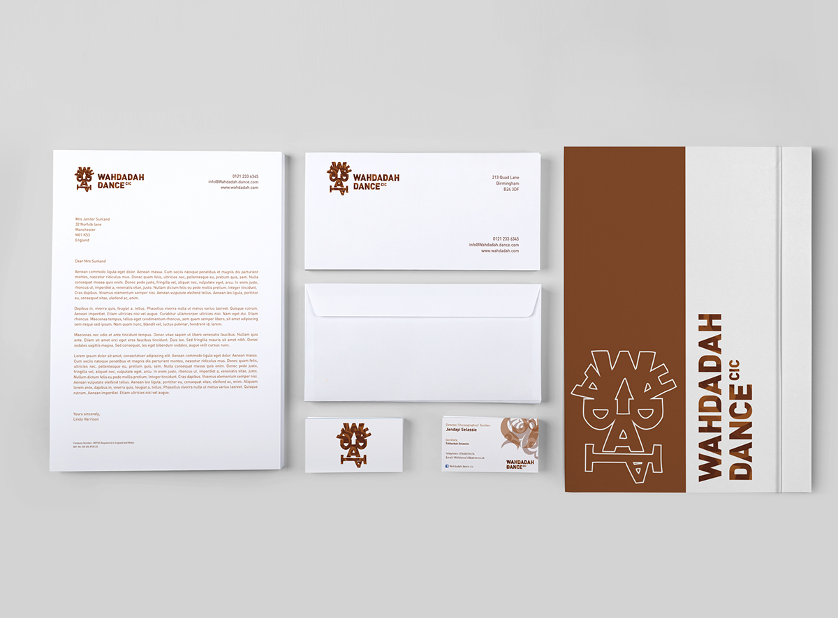
The wooden curl textures were inspired by the idea of adding movement into the marque and identity, I wanted to incorporate a sense of fluidity, depth and improvisation and wanted to represent this though the addition of the layered patterning.
This patterning also allowed us to create tertiary design elements that could be used to expand the identity in other media and add presence without the need for the full logo present at all times.
The typographic mask concept had to speak to a younger audience, and though exploration in a few of the earlier concepts, The concept was liked but potentially "too serious" and required it required a more playful and expressive execution.