


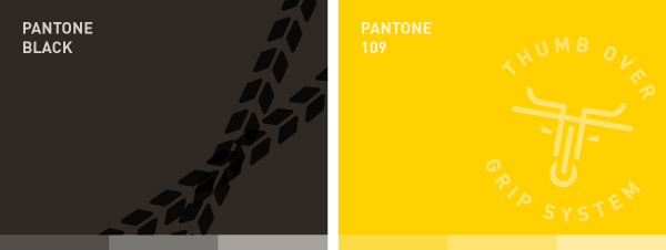
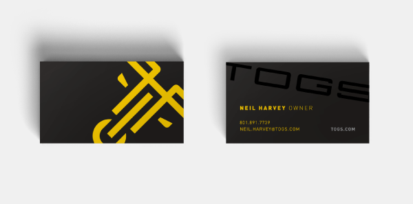
TOGS are lightweight handlebar accessories developed by local cyclists as a superior alternative to traditional bar-ends. As a new concept in the crowded bike accessory space, TOGS needed a brand that
would help the company stand out. Borrowing from the product's horn-like form, the logo is an
abstraction of a bike and an angry bull.
would help the company stand out. Borrowing from the product's horn-like form, the logo is an
abstraction of a bike and an angry bull.
__


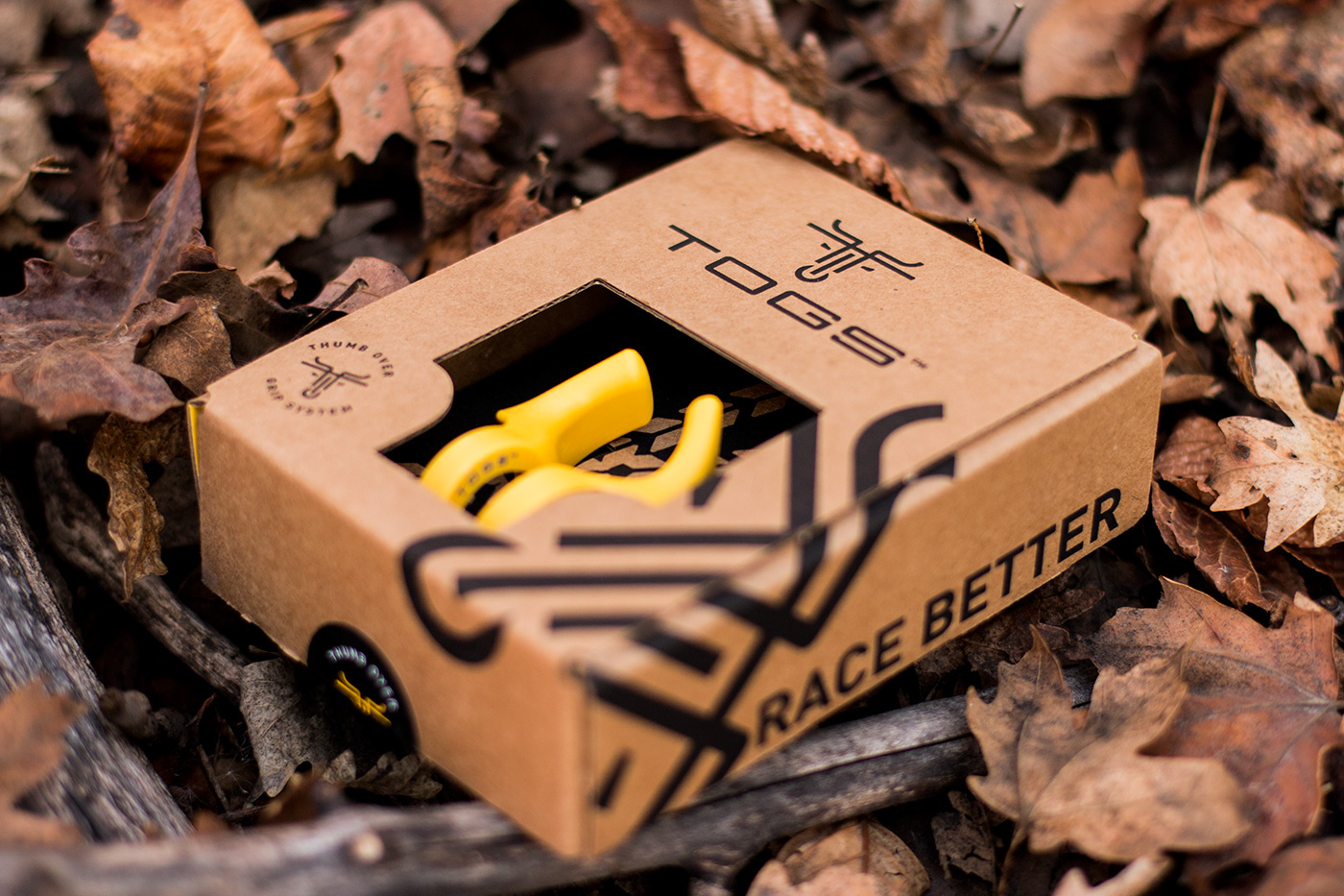
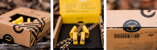
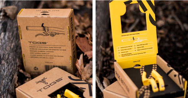
The packaging showcases the product front and center with no cellophane.
The natural craft paper box, bold black ink, and bright product colors work together to stand out
from other accessory brands on the shelf.
__


––
Credits:
Sam DeMastrie : Art Direction
Elise Bowen : Logo Design, Branding, Packaging
Sam DeMastrie : Art Direction
Elise Bowen : Logo Design, Branding, Packaging
Joel Farr : Photography


