

Freshco hypermarket.
Brand identity
Client
Freshco is a hypermarket store.
Project goals
To develop a logo/brand identity which would reflect the company’s business goals as a hypermarket store and to establish the ‘fresh’ difference in their products by concentrating on key elements that communicate the uniqueness of the brand: 100% fresh products are available at the store.
Creative Solution
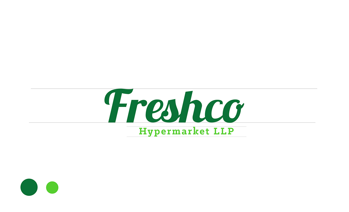
The logo has been designed in a way that it signifies a brand that sells fresh, exotic products in their store. The idea was introduce the element of “freshness” which is also the USP of the brand. The theme is brought out through various visual elements (explained below) and colour combinations
that match.
that match.
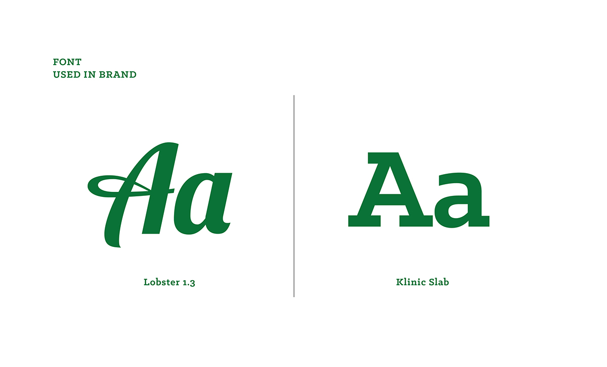
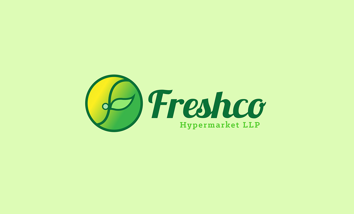
Logo Explanation
Idea :
They say a lot of things about the courage of a seed; how it endures its life as a seed and then splits apart to grow into something entirely different, something that exudes freshness, growth and life more than any other thing on this earth.
Symbolism/Meaning :
A “sprouting seed” signifies a new hope and beginning. It symbolises life and growth in its purest and freshest form, which is also what the brand stands for. There is an instant connect with nature and eco-friendly-ness which goes back to emphasise on the freshness aspect of the products.
Colour:
Colour green symbolises growth, harmony and purity. It also represents cleanliness and freshness. Each of the four colours used in the logo are variations of colour green over stages of a seedling’s growth. Thus, these colours also create an amalgamation of all the freshness aspects, instantly conveying as a brand that is fresh, new and unadulterated.


Contact Me: akhiljacob2014@gmail.com Follow Me: https://www.facebook.com/ajpicz


