
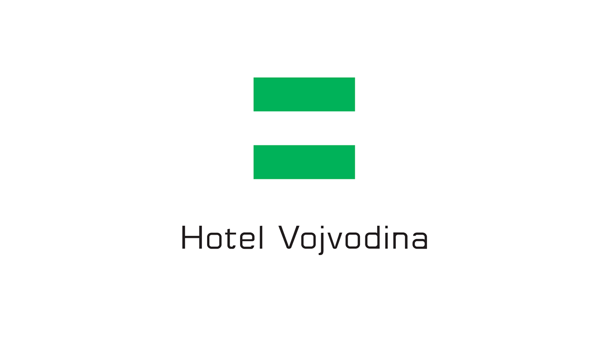
This logo and brand is designed to have social aspect. In region "Vojvodina" this logo have positive propaganda mission to stimulate peace and prosperity in settlement areas where "Chain of this Hotel brand" should be built.
It calming down tensions between people and establishing peace and calmness which are first needful things for gaining prosperity and progress.
It's designed like a logo and a Flag of Vojvodina for use for positive propaganda.
The logo is designed like an upgrade of architecture project done by Živan Ješić, with synergic idea of logo and architecture project, to upgrade and develop local areas and improve quality of living of local population.
Idea of Živan Ješić: Eco friendly architecture, wood and glass.

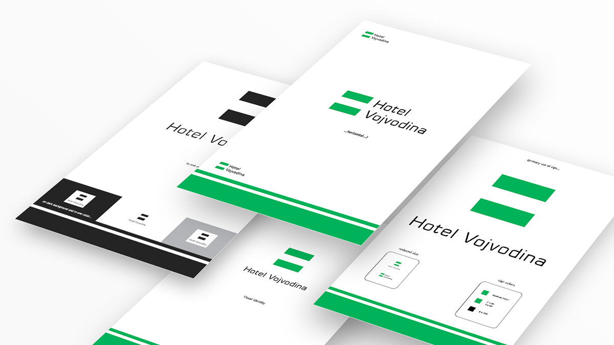
The picture of some pages of Book of Standards of "Hotel Vojvodina" project:
It's done complete Visual Identity and branding with Astor font designed like "Corporate font":
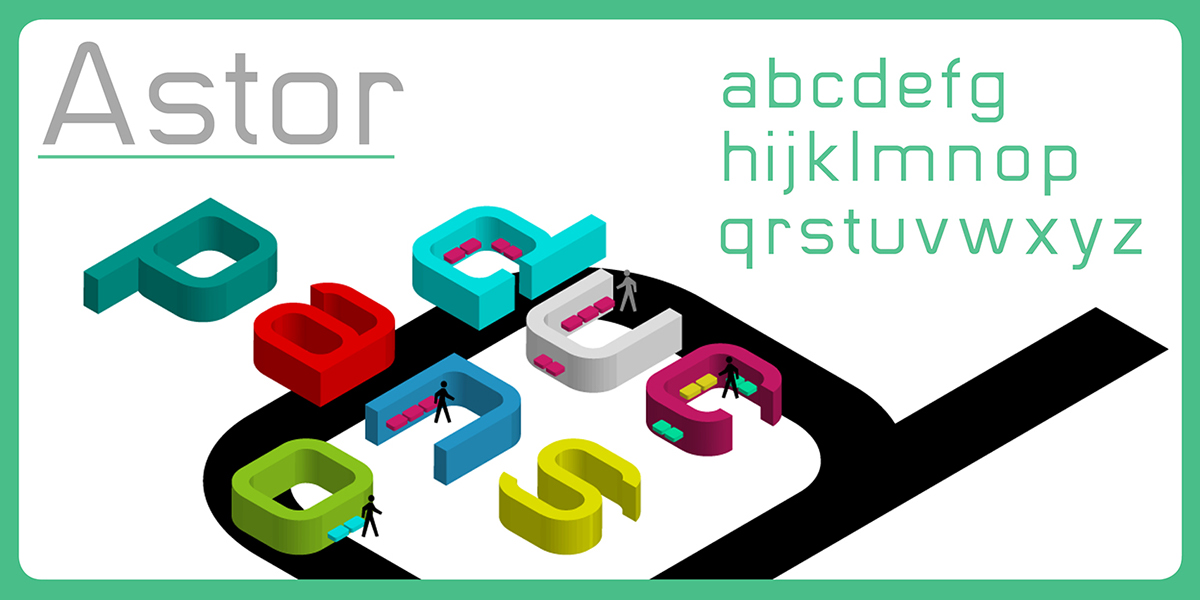
To buy font: http://www.myfonts.com/fonts/labdot/astor/
© Copyright 2006.
For Peace and Growth.


