


For my KPCB design challenge I decided to redesign the interface of Mango Health’s mobile app. The Mango Health app provides users with a lot of valuable information, but I found that it lacked the hierarchy needed to help users find the most important information first. The home screen is a bit cluttered and getting information required a lot of swiping and tapping rather than providing a general overview.
I redesigned the home screen to focus on the app's most important features, providing valuable information at a glance without clutter or overload.
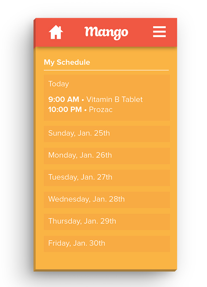
When building an app that manages a user’s medications, the most important information is their schedule, and more specifically when they should take their next dose. The largest “module” shows the user’s partial medication schedule, in large text the next dose that needs to be taken, followed by the most immediate upcoming doses.
Gamification is an important aspect of Mango Health, so the user’s points are highlighted at the top in the form of a progress bar.
A list of medications can be easily viewed and swiped through at the bottom of the screen.
To allow for more space I removed the bottom tabs and replaced them with a navigation drawer.
Lastly I replaced the app’s gray interface with a more vibrant and distinguished color scheme. I reasoned that they gray interface may exist in the current app design to account for accessibility issues associated with color blindness. Taking this into account, the app could have accessibility options including larger font size and an alternative gray color scheme.


Interactions/Motion


