

Branding & Packaging
Owl Coffe
How can a homegrown local coffee brand with over 50 years of brewing experience stay true to its roots while winning new audiences?

Brand Positioning (Above): Starting from the top, we developed a style that was proud and knowledgeable.
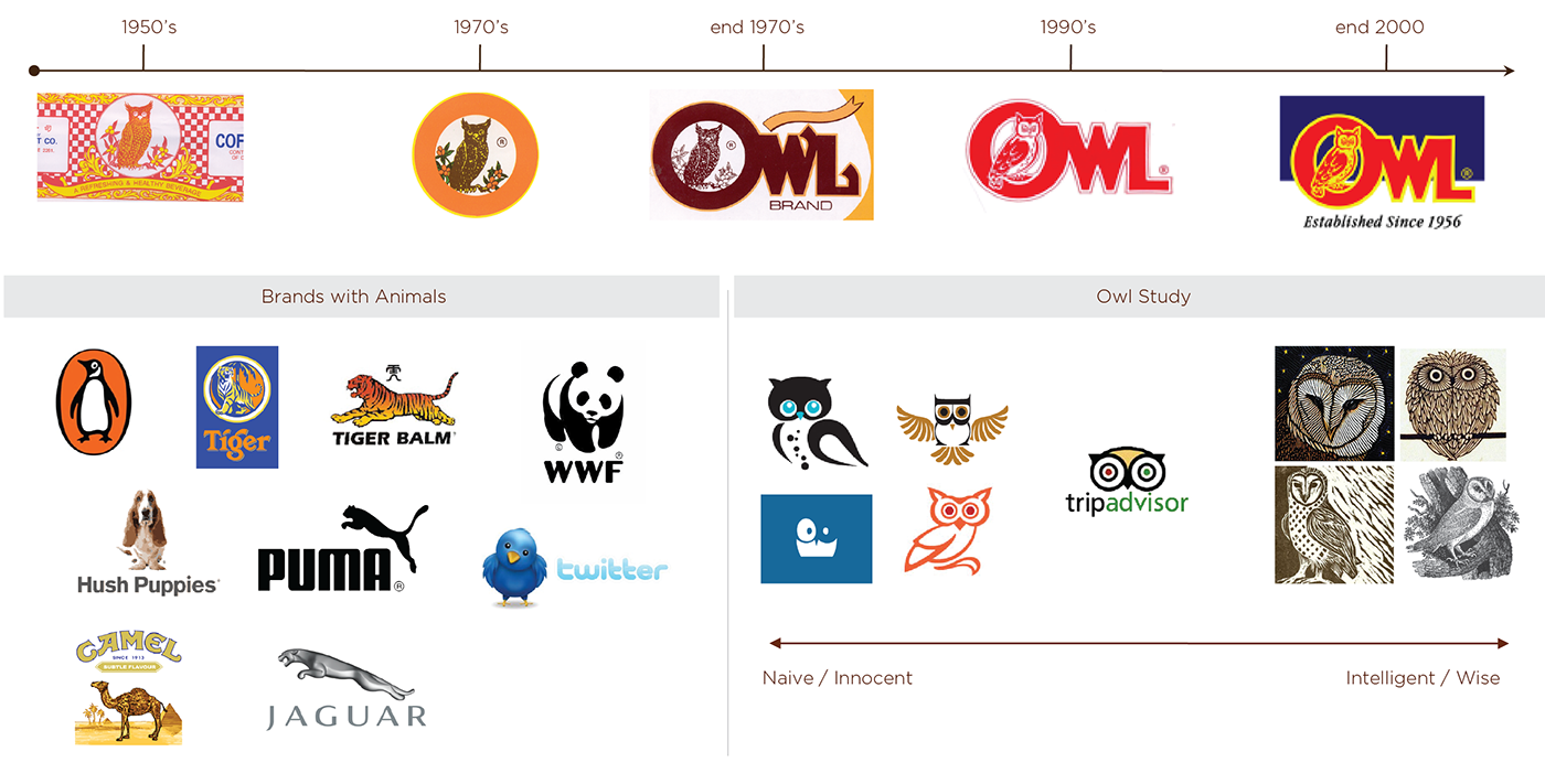
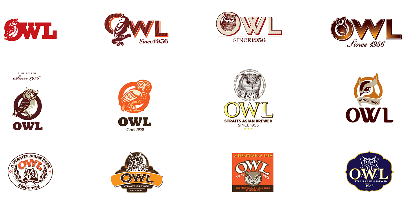
Logo Explorations (Above): The evolution of the Owl was obvious. But how do we depict him in the way the new brand communicates?

Above: Portfolio, before

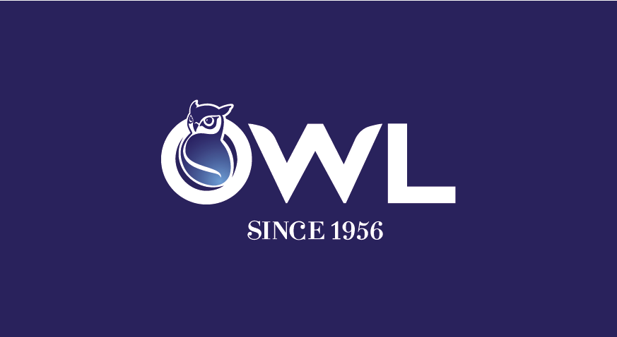
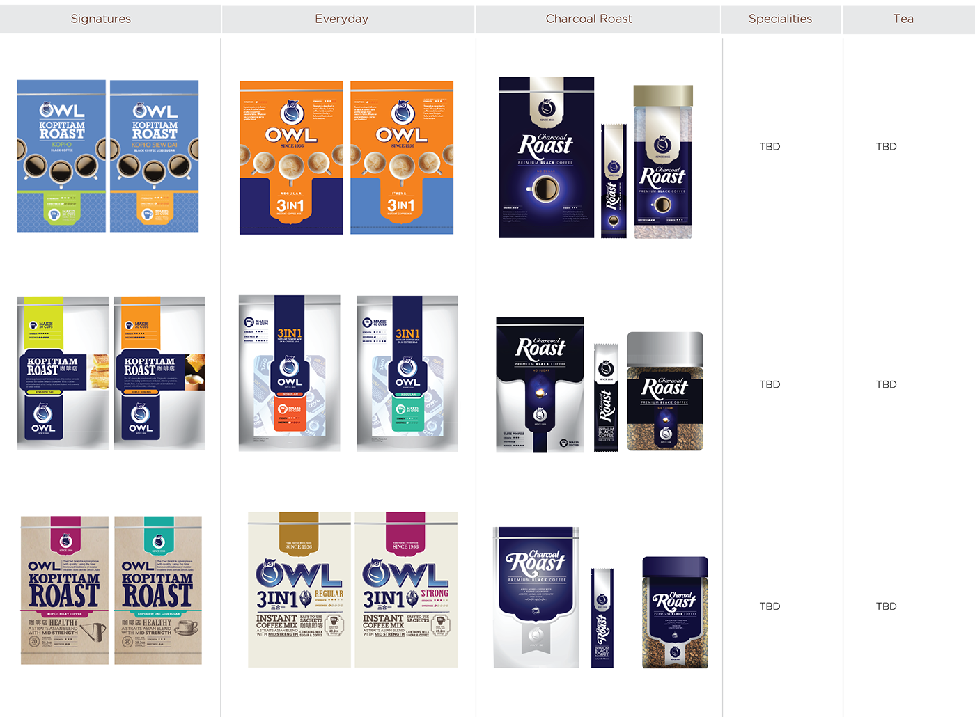
Portfolio, After

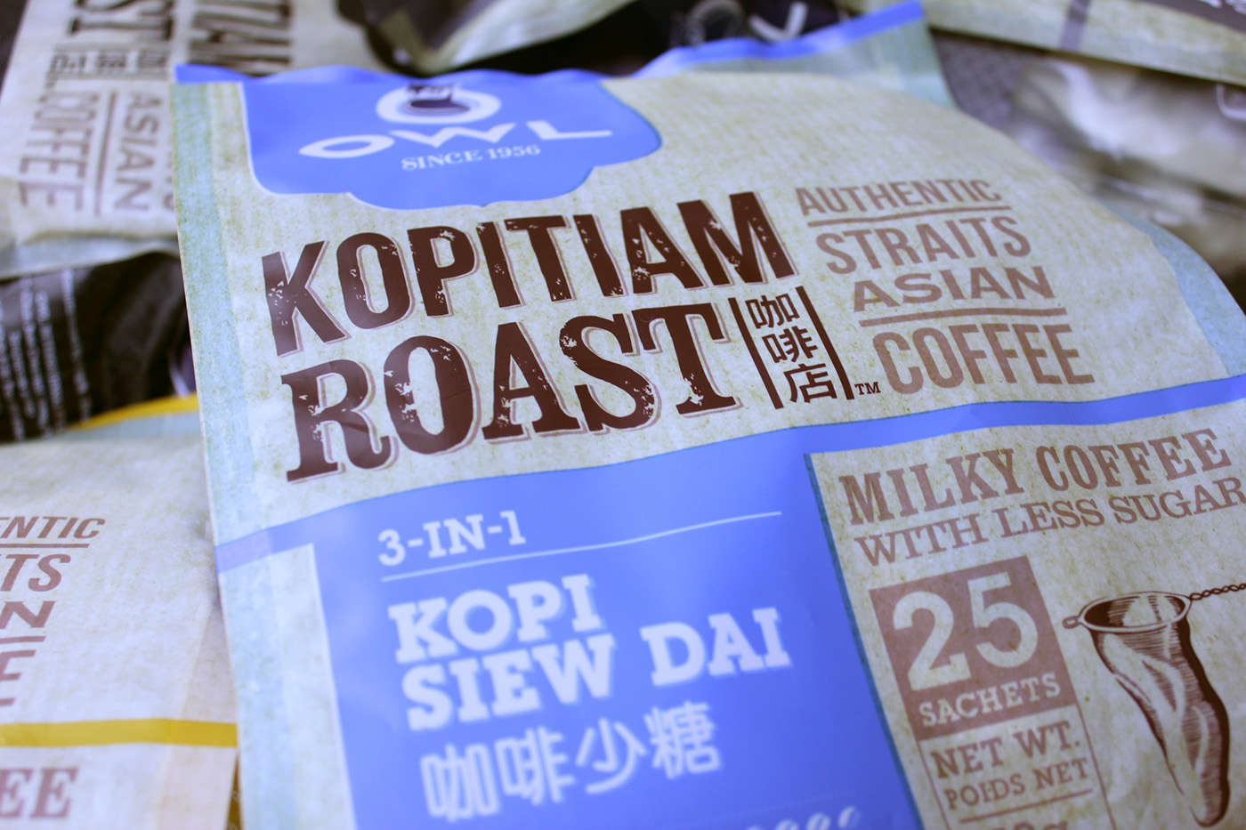
Good brands tend to colour block, owning a visual space on shelf. Nescafe has her red cup, Boncafe has black and Pringles owns green. We wanted Owl to own a colour and to build on that. We also explored other elements which they could 'own'.
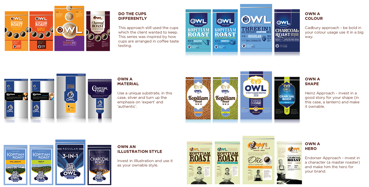
The lineup was presented on the 3 ranges they would launch first. They decided they wanted to keep their cups. They also wanted to own a material but wasn't sure that silver was feasible. They crashed together approaches which slowly gave rise to our final design solution:
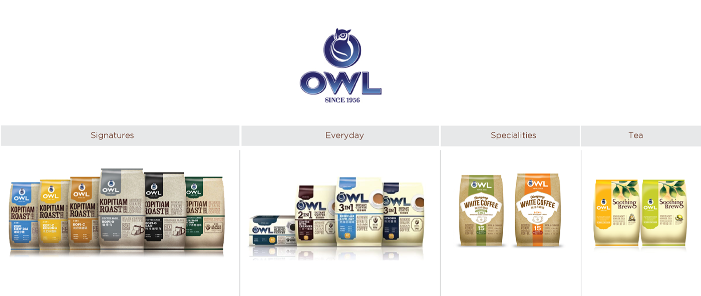
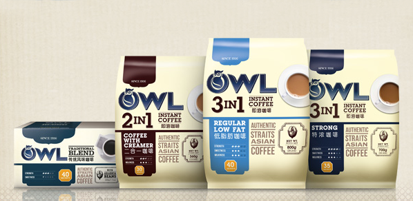
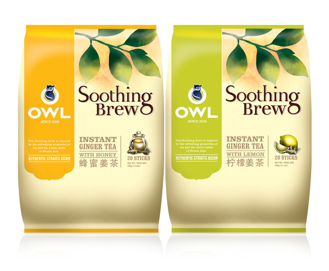
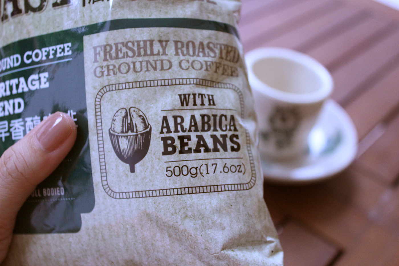
The Final Line up :


Done while at Tangible Design, Singapore


