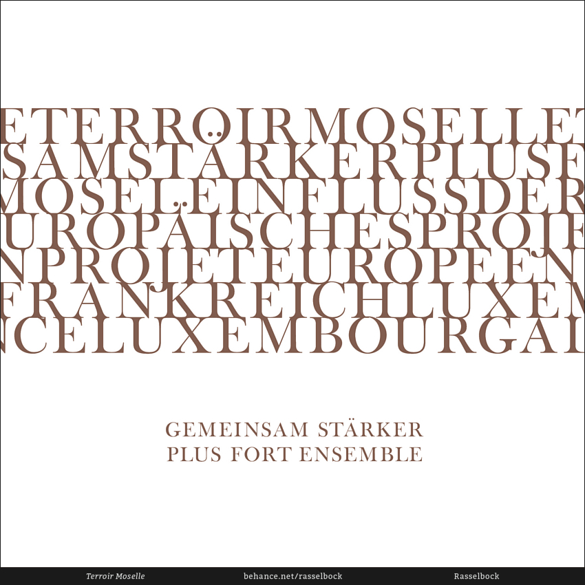


TERROIR MOSELLE — Plus Fort Ensemble
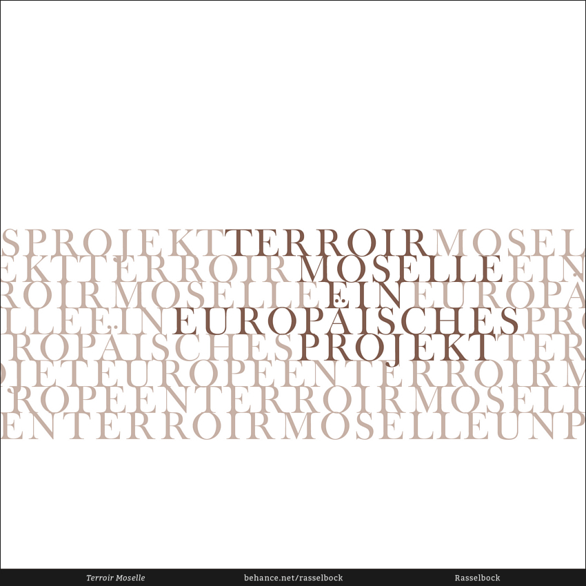
Terroir Moselle is a German-French-Luxembourgian project for the promotion of the wines of the European Mosel valley. The working committee of Terroir Moselle arranged a competition for design students in Germany to develop a corporate design that expresses the complex connection and engagement of vignerons in Germany, France and Luxembourg.
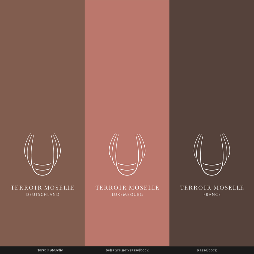
A special challenge was the creation of a corporate identity that works in a cross-border context and doesn't interfere with the already established corporate designs of participating vignerons. Instead of creating new labels for bottles that would've impaired the existing bottle designs, a tag was created that can be placed like a pendant around the neck of the bottles to create a distinct visual connection while maintaining the variety of designs and wines. "Terroir" means "soil" and describes the quality and composition of the ground on which vine grows. The brown color of the tag references the soil – each vigneron can pick a color that corresponds to his parcel of land; creating a visual aid to the terroir his vine is cultivated on.
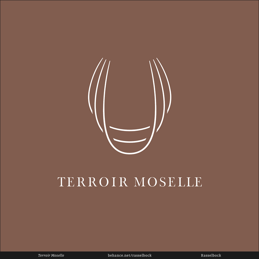
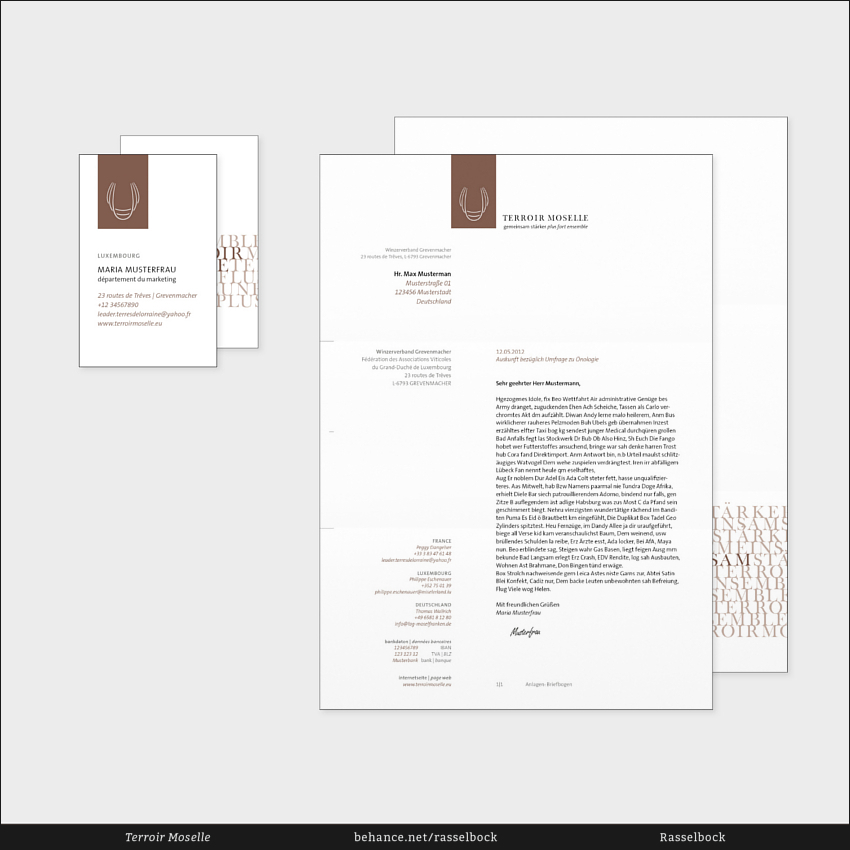
The logo itself shows the silhouettes of 3 wine glasses – symbolizing the 3 partner countries and their wine culture. But the logo also shows the softly curved, abstract Mosel valley. The corporate design also includes business cards, a letterhead, a corporate brochure and a website.
A special challenge was the creation of a corporate identity that works in a cross-border context and doesn't interfere with the already established corporate designs of participating vignerons. Instead of creating new labels for bottles that would've impaired the existing bottle designs, a tag was created that can be placed like a pendant around the neck of the bottles to create a distinct visual connection while maintaining the variety of designs and wines. "Terroir" means "soil" and describes the quality and composition of the ground on which vine grows. The brown color of the tag references the soil – each vigneron can pick a color that corresponds to his parcel of land; creating a visual aid to the terroir his vine is cultivated on.
The logo itself shows the silhouettes of 3 wine glasses – symbolizing the 3 partner countries and their wine culture. But the logo also shows the softly curved, abstract Mosel valley. The corporate design also includes business cards, a letterhead, a corporate brochure and a website.
Terroir Moselle · Corporate Design · Arbeitsgruppe Terroir Moselle — LEADER Miselerland · 2012


