
The following is a blow-by-blow breakdown of a little game built in a few weeks under the Bite Size umbrella of Outplay Entertainment. I was blessed to be fully in charge of the visuals, character design and UI and animation. I loved this one, and since I have a (long battered) belief that things made with love will be a success, was delighted to see it do really well, featured on both Apple and Google storefronts.
Coffee and chocolate.
Banjo and Kazooie.
Peanut Butter and Jelly.
Great alone: amazing together.

Resonance.
Two singers harmonise: overlapping one another with differing notes, keys, lyrics and tune -- and yet together make a sweeter song than either could manage alone.
Resonance. It’s what we’re after.
See, art in games can be a funny thing. Art is the literal ‘face’ of any game, able to entice or repulse a potential player before any game is even experienced.
But during the dev process, art should be secondary to the play.
(Across the land, a hundred thousand wacom pens are thrown down in disbelieving disgust.)
Yes, secondary. The art should enhance, clarify and enrich the play space and play verbs -- but never overwhelm them. It needs to sing its own harmony in perfect sync with the others to create a greater whole.
Ideally, the theme of the game (it’s look, world, tone and mood) and the actual game (play actions) well, they intertwine, overlap and strengthen one another. By explaining the theme you explain the game itself, and vice versa.
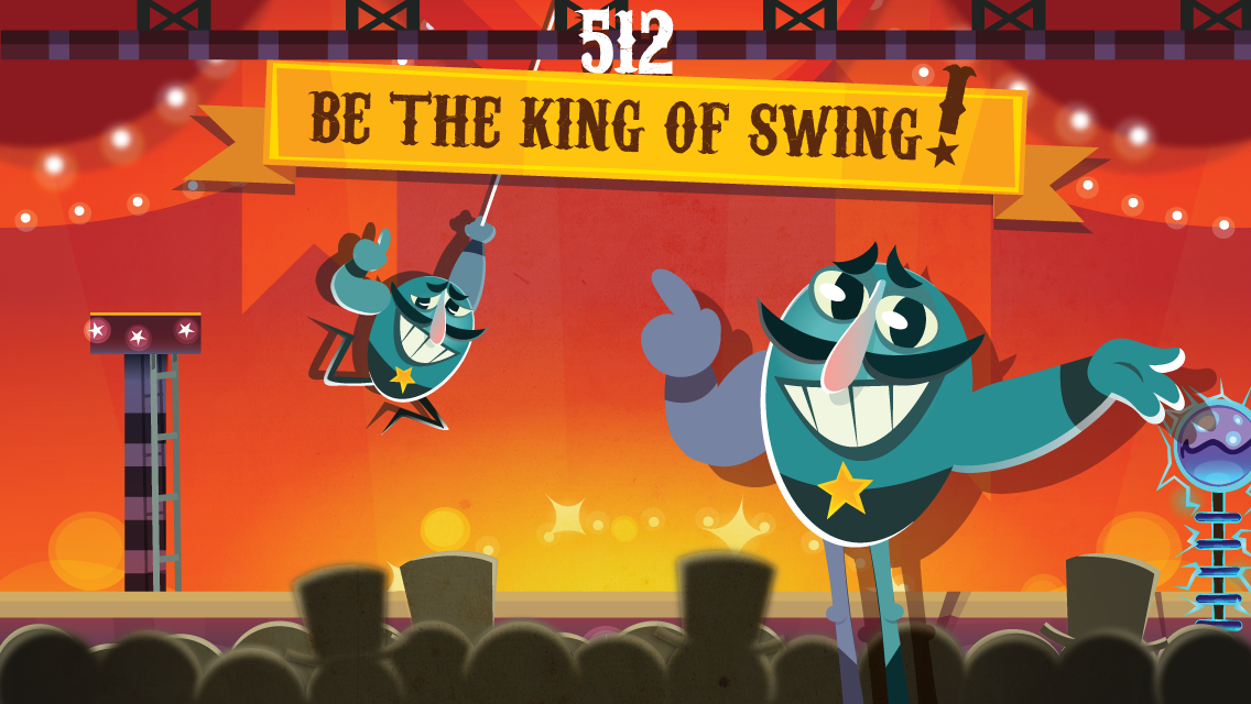
So what has this got to do with a moustachioed, egg-shaped Italian circus performer?
Everything, my friend.
Everything.
The Prototype
When I first saw Stupendo, it was called 'Grapplr' and it looked like this:
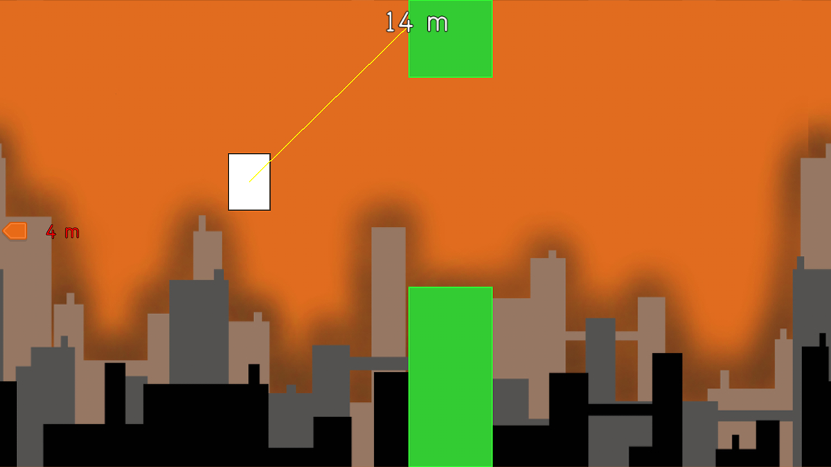
A fun (if brutal) swinging game of boxes and green lines. My job, as art always does, was to bring this to life in a way that clarified and enriched that game. This isn't always how the process works -- often concept art is illustrating play ideas, rather than re-dressing actual play -- but I find having play first is best.
I played the prototype. I died. Died again. I made it through 2 hoops, then 4, then 8! Yes! One thing stood out immediately: here was a game about showing off.
It was a performance. It demanded an audience: be they in-game or the players.
So: what theme fits (and explains, and resonants with) a swinging hero, showing off for an audience?
A circus trapeze artist!
And on the heels of that thought came: Stupendo, name and personality and all -- like a complete package, blue-egg, lightning-bolt from the sky.
I just had to draw it.
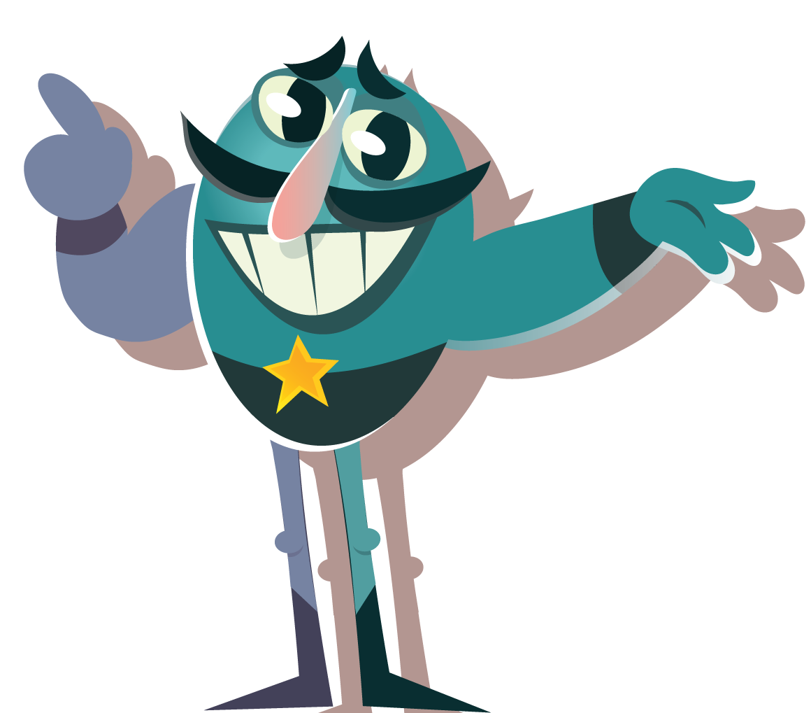
Here’s the very first Stupendo. Check out that chest hair.

And the very first concept art:

Watch me fly: Showmanship and Showing off
It was essential to the 'showing off' aspect of the game -- something we all felt was a key to the whole thing -- was that an audience presence was felt throughout. As such we immediately stuck in reactive audio: gasps, ooohs and aaaahhs from an (then) unseen audience.
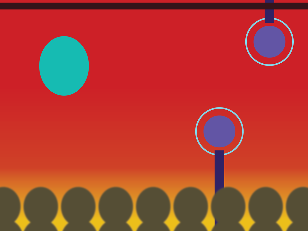
Eventually we added in a visible top-hatted crowd to the game proper.
This crowd (who react visibly and audibly to your actions and failures) do double duty: they enhance theme and enhance play through that singular, resonant thread of YOU feeling like you are performing.
And here's a screenie from an early version:

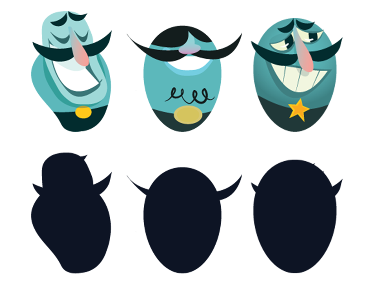
As the vision for Stupendo solidified, we spent a little time exploring some alternative heroes, such as:

Terrified Elephant

Terrified Elephant -- in Technicolor!
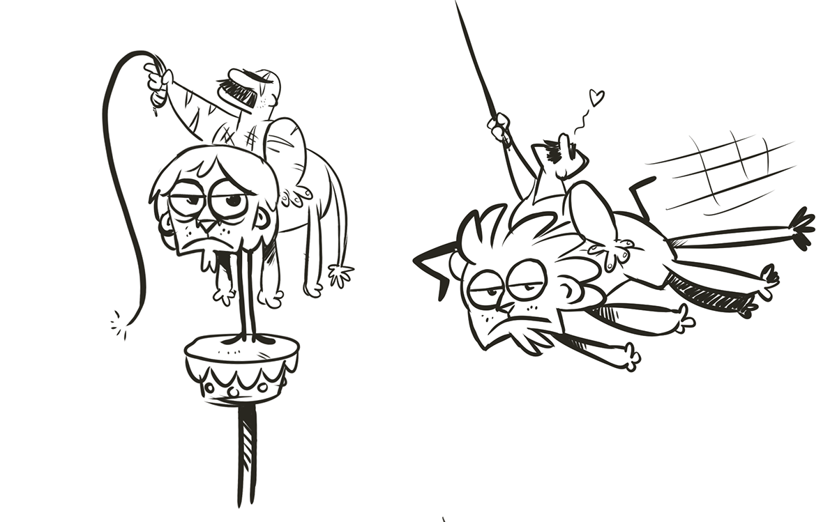
Bored Lion (and scarred Trainer)

Super Monkey Brothers

Super Monkey Brothers -- in Technicolor!
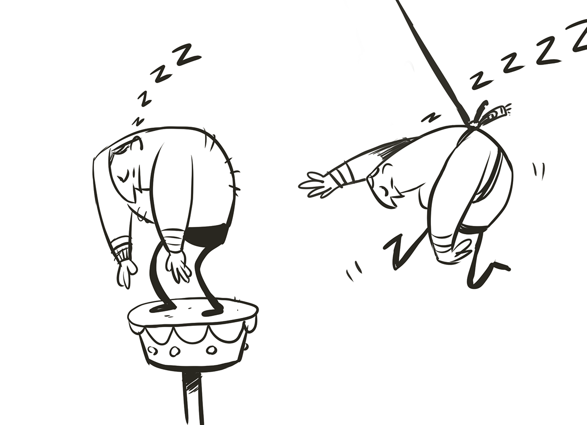
Sleeping Stupendo
And even an alternate Pixel style:

Before returning to some further development on the man himself: adding, crucially, some eyes!

Arriving at a final look:
Of course, Stupendo wasn't designed in isolation, but rather as part of a wider process.
CLARIFYING PLAY
Stupendo's primary colour was deliberately chosen to stand out against a backdrop of classic Circus Red. His unique turquoise blue colour isn't present anywhere else on screen -- not in environment, obstacle or UI.
Other elements were just as carefully designed.
The crowd is a blurred foreground object, felt but not necessarily seen. The only other blurred art is in the uppermost corners, creating a subtle vignette and forcing your eyes to the action.
The obstacles are purple (a colour mix of hero and background) and have a unique animation to highlight their danger. We tried a lot of other types and colours here too: fire rings, green lightbulbs, but electricity worked best.
Stupendo's rope is a crucial gameplay piece, and as such got a (largely) unique colour too.
We never could get that spotlight to work :(
Each one of these was tested not just in concept art, but more importantly, in the actual game -- and if they interfered with play, were streamlined or cut.
Function over form: Egghead
Another important decision was Stupendo's collision: in the final game, his limbs can touch the obstacles without injury, but if his main body touches it -- game over, man.
To make this as clear as possible, his body is a single, solid shape.
Giving him a more complicated torso shape also needlessly complicated the play and made death feel less predictable and thus far less fair.
Whilst this initially made my inner artist auteur balk in disgust, having to keep to such a simple shape produced a much funnier and iconic character.
Obstacles: diffusing the fail state
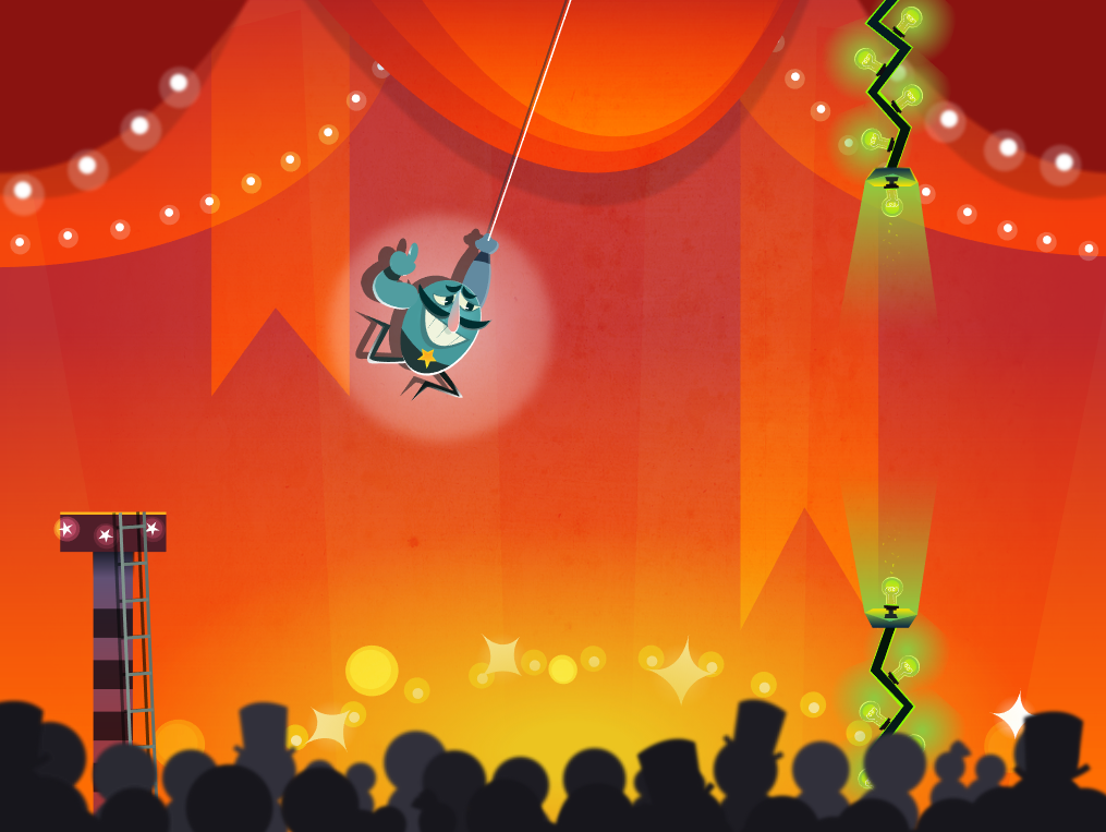
One of the key successes of Stupendo occurs at the 'fail state' or the point where the player loses the game. Whilst we would have ideally had the obstacles be more circus themed (like fire hoops, which we tried) electricity seemed both the least barbaric and most importantly, hilarious, solution.
I stress the importance of humour here because it is precisely that fact that diffuses the sting and frustration of losing: it's funny.
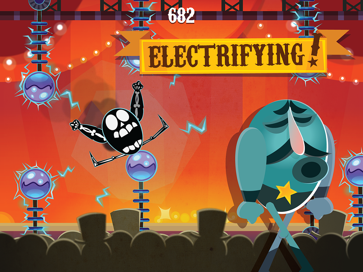
Stupendo's Looney Tunes-style over-exaggerated deaths trigger a delighted snigger precisely at a time when the player is potentially feeling the most annoyed.
The actual framing of these deaths were carefully crafted. There's a camera zoom, a full screen flash, a slow down, spark particle effects, smoke, custom zapped Stupendo frames, custom rag-dolling and a crowd cheer animation. Whew!
But when Stupendo ends a run by ricocheting between three seperate zap nodes before sliding slowly off into a braying crowd...well. It was worth it.
That moment of hilarious game over is also always captured as a thumbnail you can share: adding to that fundamental, resonant theme of showing off, even when failing.
Personality
The games I love best have personality: deft touches of detail or life that just make the world seem vibrant and alive. We tried our best to get aspects of this into Stupendo.
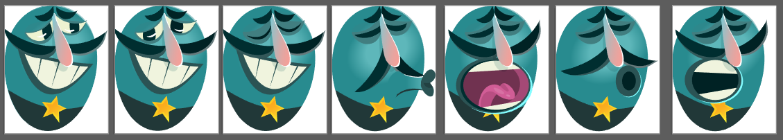
For example: every time you tap on Stupendo, he adopts a new facial expression:
Or better still, our resident code genius Val programmed Stupendo to grab the rope with the closest two limbs: which, depending on his orientation, might be a leg and an arm, or even both feet and no arms at all!
Or when you switch game modes from daily to random, the main colour of all the UI completely changes!
Or when you first launch the app, Stupendo is announced by theatre curtains, a custom poster and takes a theatrical bow before you start swinging!
Or the fact the game tracks and displays which performance you're undertaking (mine is something like 'Your 700th!' now.)
These little things -- happy accidents, near misses, details you missed first time -- all have an additive effect of feeling like you have an understanding or ownership of the game. A unique story within it, even if it's a simple left-to-right grappler.
Success: Featuring and Promotion
As I type this, Stupendo is banner featured on the App Store. It feels unreal, but wonderful.

So why did it find success? Resonance, I fully believe.
With Stupendo, what the game is about, is what the game is.
A show off trapeze performer, showing off his trapeze performances.
Thematic resonance, art that clarifies and supports the play. Personality and energy across play and imagery.
This game's greatest gift to me is that I can play it and enjoy it without getting sucked into that 'creator/super scrutiny-can-see-nothing-but-errors' mode.
It's simply wonderful to miss an obstacle by mere inches whilst Stupendo gives you a knowing wink...and equally wonderful to simply watch him get zapped in the nuts.
I haven't touched on many aspects: any of the UI design, or how we added numerous visual fixes and clarity once it actually launched, but perhaps another day.
I'm very proud of this little game, and the small team who made it. To Wolf and Val, heroes in the trenches, heart and soul of the game: I salute you. To the wider folk who massaged elements and offered advice, I thank you! And to our parent company, Outplay, who let us swing away: my sincerest thanks.
For now, thanks so much for reading, and I hope some of this helped any game artists out there.
Go get yourself a PBJ sandwich!
-- James


