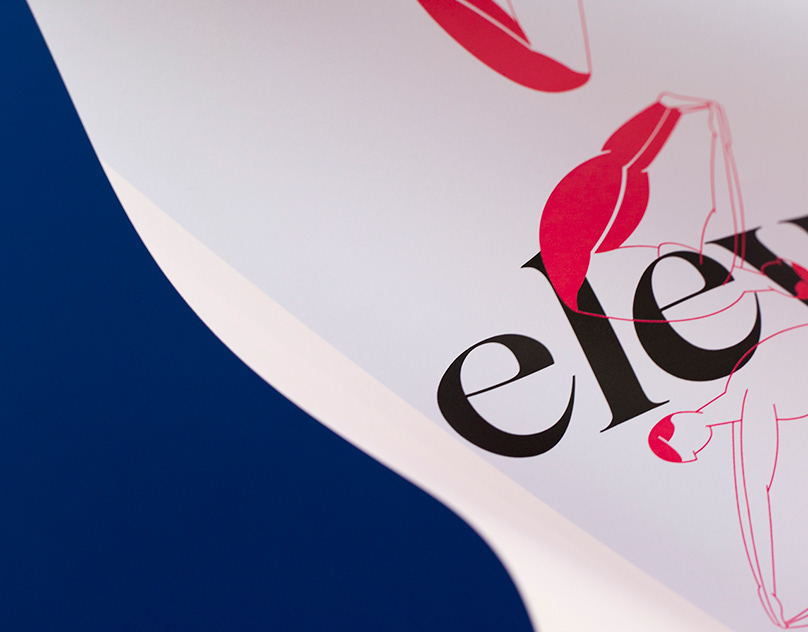
Typography
This video is a result of the first steps in motion graphics/digital animation. The main concept of this animated infographics is the typography.
We begin by distinguishing a font family/typeface from a font - these names are often misused. Afterwards, we show the most common classifications which organize the families in different groups, followed by a basic anatomy of type, which names the specific parts of some letters. According to our research, the three best-seller families are Helvetica, Frutiger and Univers, so we took advantage of that and decided to show some interesting facts about them. We close the animation by illustrating some statistics and curiosities about the main theme.
The illustrations, kept clean and simple, were made in Adobe Illustrator and later animated in Adobe After Effects.

Academic project | Escola Superior de Artes e Design
Projecto Multimédia | Teachers Marta Varzim & Alexandre Jacinto
2015
Projecto Multimédia | Teachers Marta Varzim & Alexandre Jacinto
2015


