Blue box
Grundig | D'art Design Gruppe | IFA Berlin, Germany 2009 | 1000 sqm
Grundig | D'art Design Gruppe | IFA Berlin, Germany 2009 | 1000 sqm

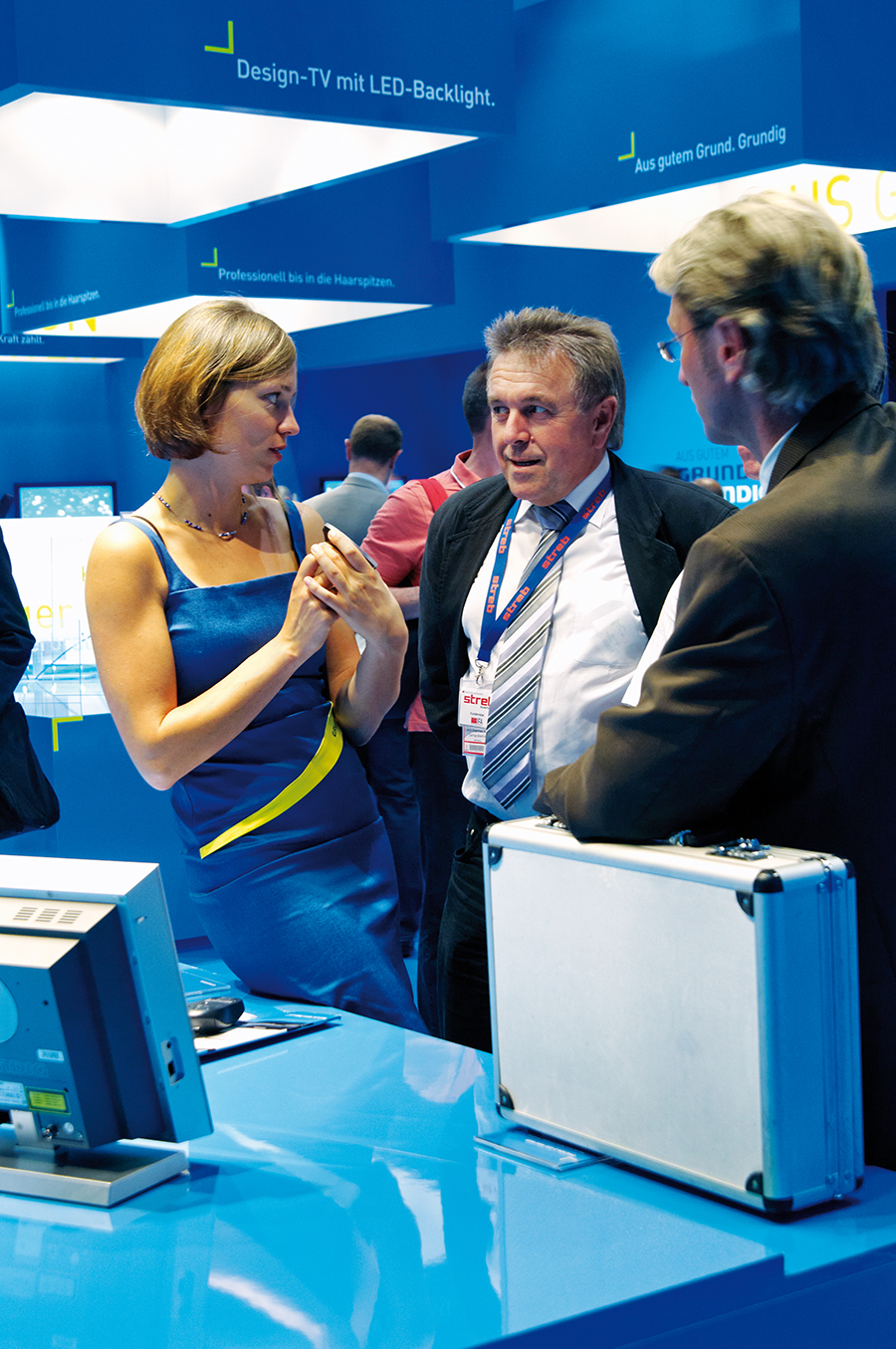
Excellent quality, goodprice-performance ratio and high user-friendliness – these key values of thebrand Grundig are presented with the broadly arranged fair design for Grundigat the IFA 2009: It mirrors quality in the perfect realisation and completionof the spatial brand appearance, the price-performance ratio is reflected inthe unpresumptuous architecture that puts the product in the spotlight. High user-friendliness is shown inthis design by lots of direct references to everyday life.
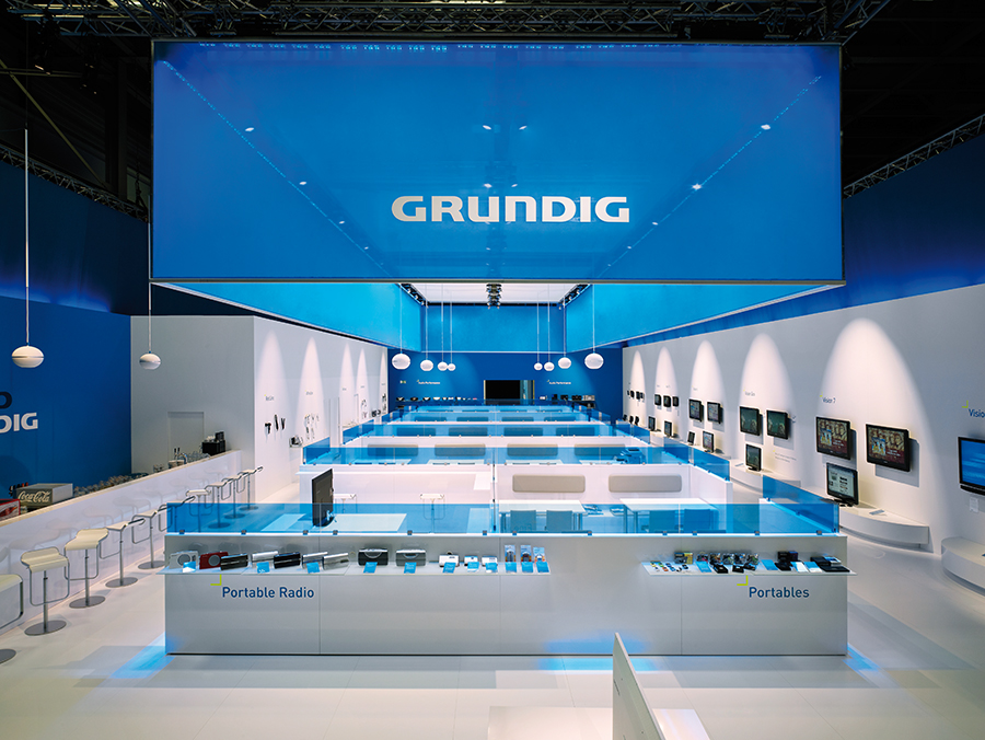
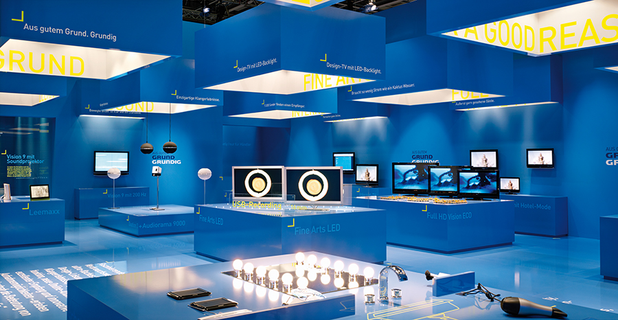
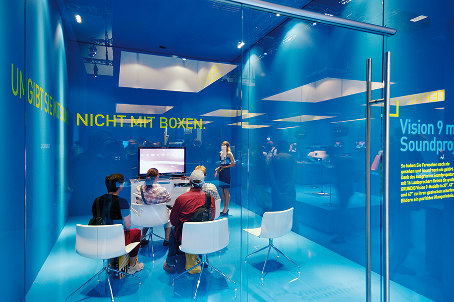
The concept is therefore the idealform of exhibition to highlight the clear and well-considered functions of theproducts, because the museum-like look concentrates the attention on the mostessential aspects: On the basis of Grundig’s new brand orientation theelegantly designed products that are easy to operate are presented in theconsumer area with almost no exception in the blue shade that is characteristicfor Grundig. In the architectonically unpresumptuous looks of a blue box thefair design completely focuses all the attention on the classically designedGrundig products.
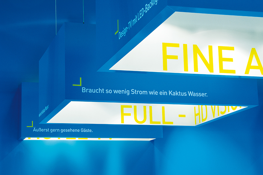
It’s the element of colour thatconnects all areas of the exhibition and thus creates an exhibition platform forthe products. Highlights are achieved thanks to the typographic design of theIFA appearance concept.
The concentrated design of thevisitor area dissolves the tridimensional design of the retailer area byreducing the use of the colour blue: The blue ceiling element completes theGrundig brand composition in the mainly white and strikingly spaciouslydesigned retailer area.
The concept is therefore the idealform of exhibition to highlight the clear and well-considered functions of theproducts, because the museum-like look concentrates the attention on the mostessential aspects: On the basis of Grundig’s new brand orientation theelegantly designed products that are easy to operate are presented in theconsumer area with almost no exception in the blue shade that is characteristicfor Grundig. In the architectonically unpresumptuous looks of a blue box thefair design completely focuses all the attention on the classically designedGrundig products.
It’s the element of colour thatconnects all areas of the exhibition and thus creates an exhibition platform forthe products. Highlights are achieved thanks to the typographic design of theIFA appearance concept.
The concentrated design of thevisitor area dissolves the tridimensional design of the retailer area byreducing the use of the colour blue: The blue ceiling element completes theGrundig brand composition in the mainly white and strikingly spaciouslydesigned retailer area.


Photography
Joerg Hempel
Joerg Hempel

