Matchwing is a design studio run by a friend of mine - Andrew Goh. Previously, he is more into game and illustration, flash animation business, but now, he is getting good business in web design and graphic as well. So he approached me to rebrand his old logo.
Matchwing, a weird name :P. As in last time his friend and him can't think of a good name, so they just simply get a name which they can get a domain registration. so it's quite hard for me at the start, as in i never get such weird brief before. Well, nothing is easy! But as you work hard, you will get what you want! Finally, i came out with a logo that both me and Andrew satisfied with. Logo using a simplified matches graphic to form the initial "M". the joining also represent the web linking circuit. As for the "wing", i have twisted the side of the "M" as an open wing.
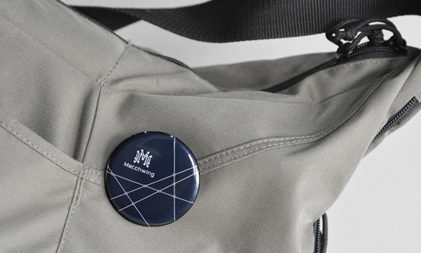
After the logo design, i have also designed the stationary items set, which using the logo element to play as main graphic.

Inspiration for logo