TAU TAU is a project made for the Exploring Design class in partnership with a laminate panels major manufacturer. The goal was to create a graphic design for the panels that could be appreciated both by adults and young people.

TAU TAU logotype
CONCEPT: "From skin to the surface"
In order to do accomplish the goal, my work group and I thought about extracting the iconographic elements of tattoos and re-think them in decorative patterns. In this way we could've both attract young people, who could recognize them at first sight, and also adults, who could make up their mind about tattoo visual style by just seeing it in an unusual place: surfaces.
CHOOSING THE ELEMENTS
When it came to decide which elements in the tattoo culture were the most representative, and how could we transfer them onto a modular surface it became clear that a hard work of cultural
and historical research had to be done first.
At the end of this research we were able to make some categorization into the wide world of tattoos, and we decided to focus on three main (and more recognizable) styles:
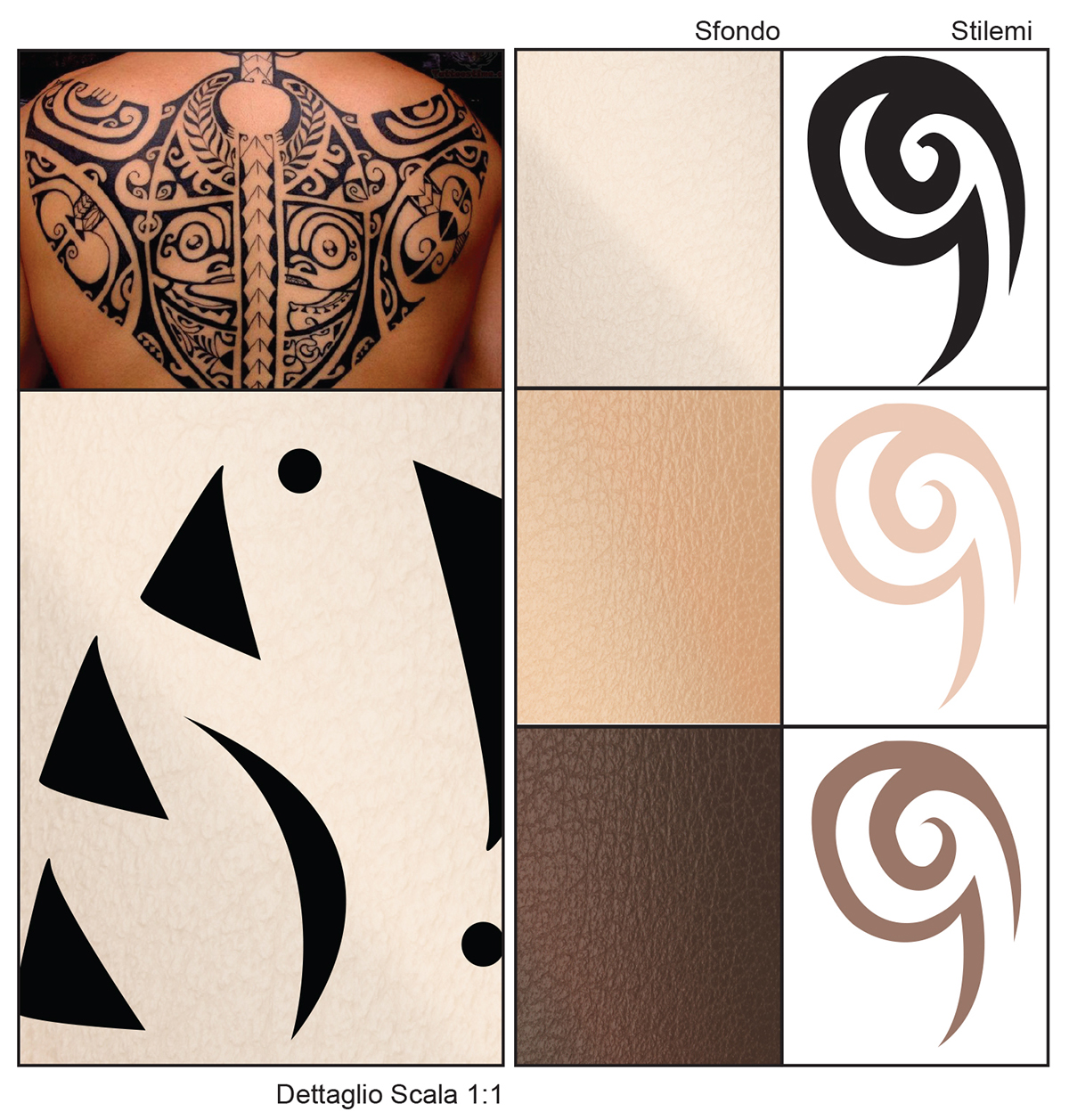
a tribal style, grouping maori, polinesian, and african features, colors and lines;
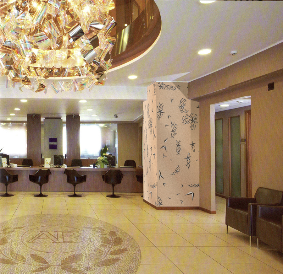
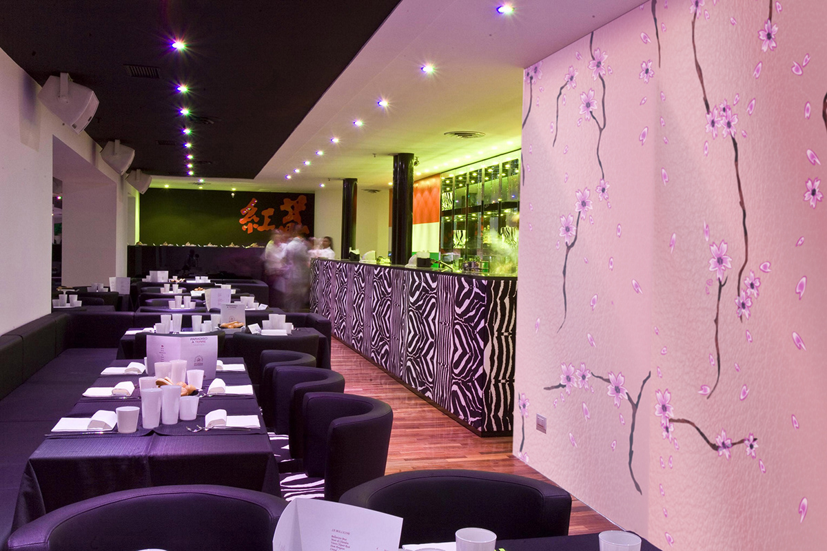
an oriental style, mostly inspired by the japanese tattoo elements;
an old school style, with very classical features from the common conception of tattoo.
Graphic study and choice of the elements
MODULARITY
Once the elements were picked it was time to think how to put them into space.
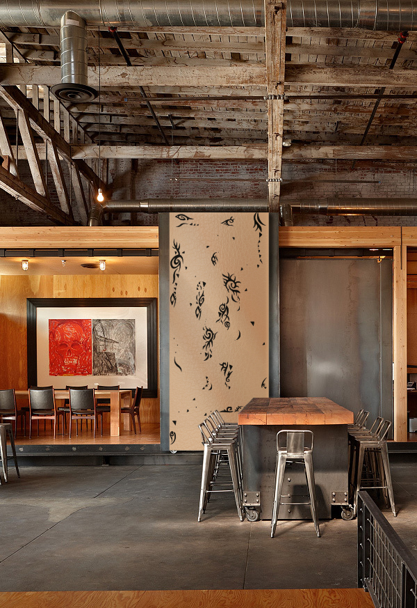
Since the panels were pretty large (130x305 cm - 51x120 in.) we though of a wide pattern that could work well on them. In order to push further the relation human/tattoo/surface we took three different human silhouettes and figured out that tattoos are often drawn on the same body areas, so we put the icons basically around those areas, trying to keep a reasonable ratio foreground/background.
By alligning the silhouettes and putting a little extra effort we got modularity.
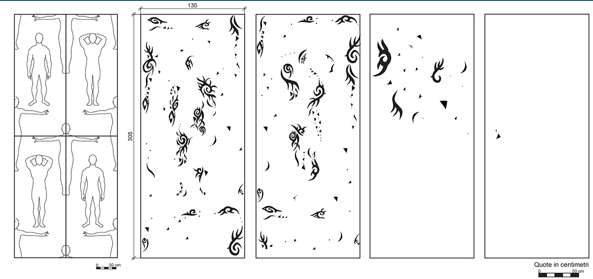
Scheme of the silhouettes disposition in space and panels modulation
The standard composition in made by two principal panels, each completing the other. They can be modulate both horizontally and vertically (for 2+ floors application surfaces, e.g. malls exteriors) ad infinitum.
We designed then two addictional panels (that could be produced on demand), with less concentrate decoration, thinking of smaller areas of application.
We designed then two addictional panels (that could be produced on demand), with less concentrate decoration, thinking of smaller areas of application.

STYLING
At this point all we had to do was create some stylistic options, first of all defining what would be the background of our motif. We chose to recreate a lightly shaded set of three neutral backgrounds inspired by actual skin, a lighter, a medium and a darker one.
In the second place we made three color alternatives for each graphic style, inspired by the range of colors used traditionally.
The only concern of the costumer is choosing the right match in order to fit the destination environment.

Graphic details and style options
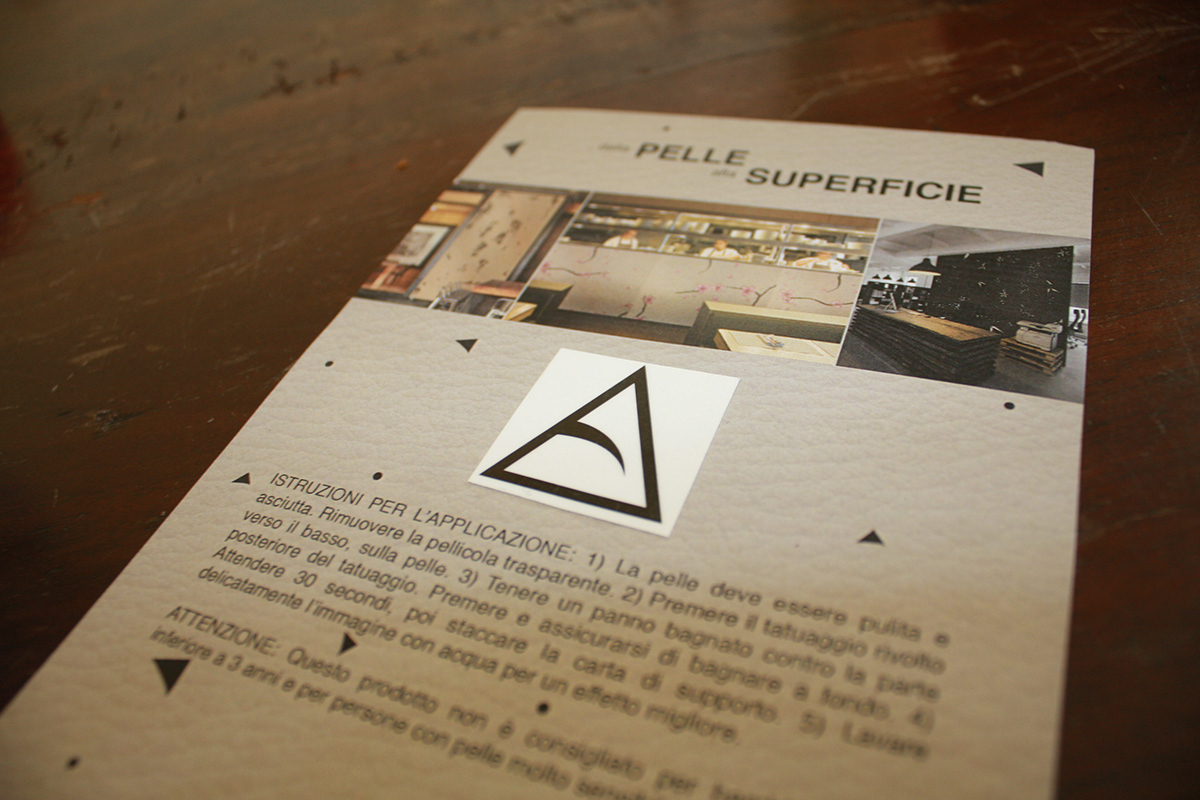
THE APPLICATION TAPE PROJECT
While we were designing the panels it came to our mind to extend our project to a less permanent dimension; we got back to the study we made and we found some other tattoo categories to explore: semi-permanent tattoos.
The idea we had was to mantain the same human shapes and ratios, but print them on application tape, making possible for the custumer to cut and (re)place them wherever desired.
For the application tape project we took inspiration from three more types of skin decoration, this time all non-permanent: henna tattoo, skin jewels and body painting.
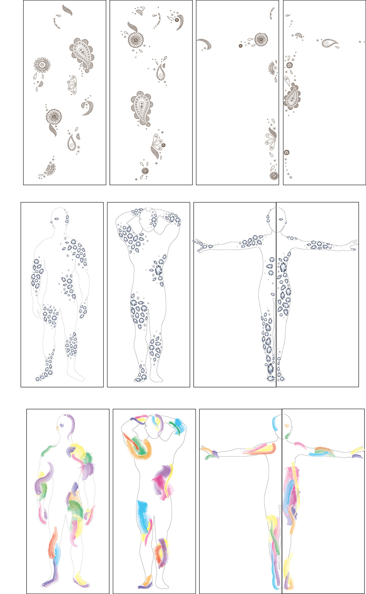
Designs for the application tape

TAUTAU logo
PROMOTION & MERCHANDISING
As mentioned before, the main purpose of the project was to attract to the laminate panels market a new target, young people. Due to the nature of the product it soon became pretty clear that aside from an appealing pattern it took a new market strategy to do that.
Our project includes as promotion means: a catalogue that collects every style, colour and backgrounds available for the panels, along with some mock up; a swatch collection to test the foreground/background matching and a brochure for the application tape that illustrates how to apply it.
They are all made with bright, stylish colors and modern shapes.

TAU TAU's catalogue front cover


Along with the promotional material we designed two promotional images, both communicating the strong relation skin/panel. They are meant to be printed in poster and flyer size.
Speaking of the flyer, our last promotional gimmick: we applied on the back of it a removable tattoo (the kids' type) with the TAU TAU logo on it, that can be distribuited at showrooms and exibits (and not just to kids).

One of the TAU TAU's promotional images
Back of the flyer with the adhesive tattoo

From the bottom: the two set of flyers (front/back), the panel catalogue, switches, application tape brochure, posters and application tape packaging.
On the top right corner: project book


