
A week long exhibition celebrating foreign cinema and their remakes. How the same film's story can be interpreted differently through culture and perception, and how this can be understood and communicated.
Concept
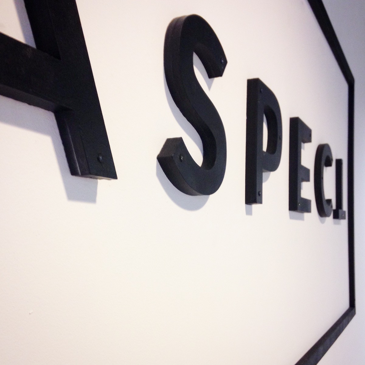
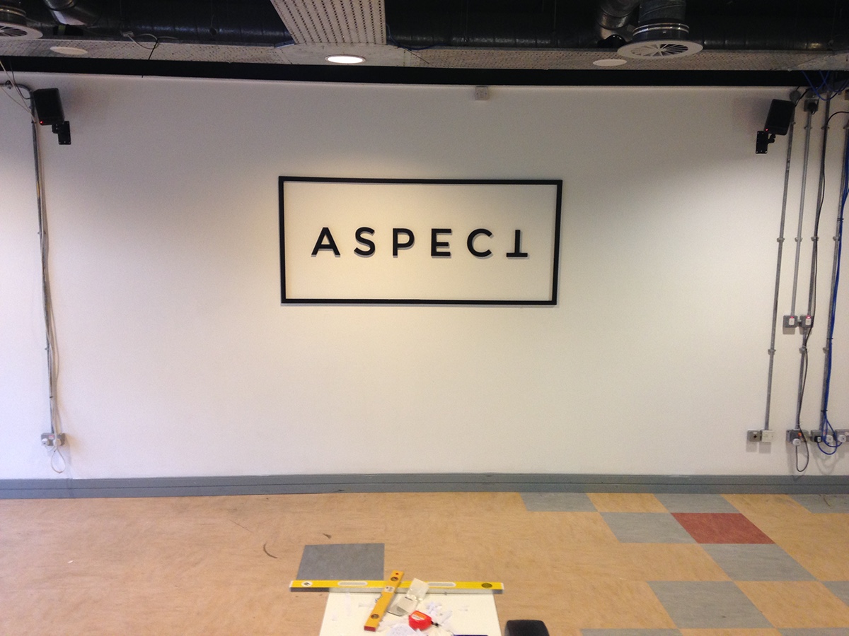
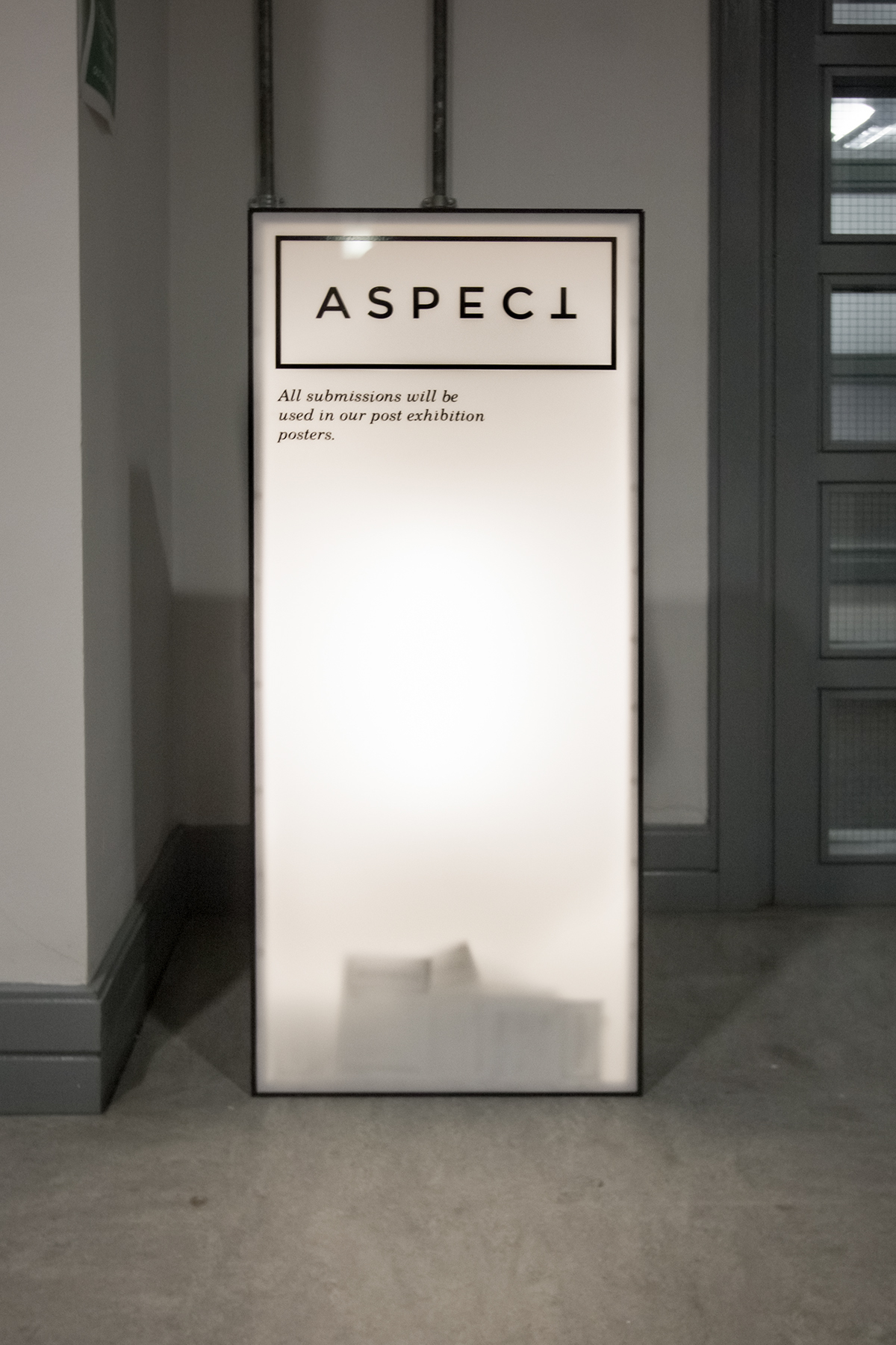
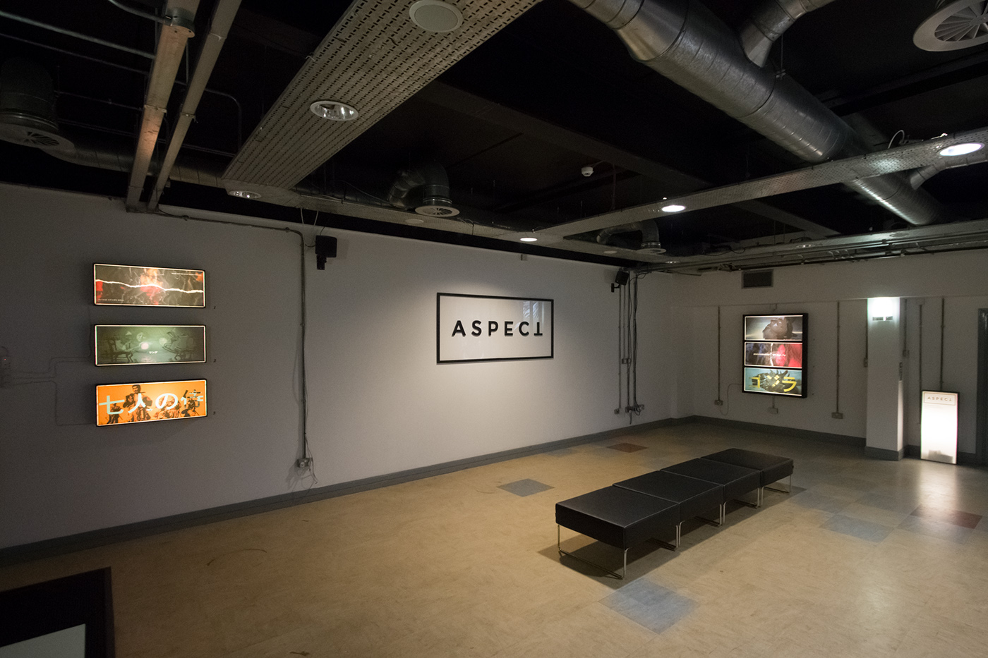
The name, ASPECT was chosen because of its direct correlation to the aspect ratio that has been used as the industry standard throughout modern cinema across the world. The use of the ratio can be seen throughout the logo, the artworks and the dimensions for the light-boxes and the ballot box.
Similar to the way that foreign cinema expresses different perspectives from around the world, the 180 degree rotation of the ‘T’ in the logo aims to emphasise this, and at the same time give the name another dimension, point of view or aspect.

Promotion
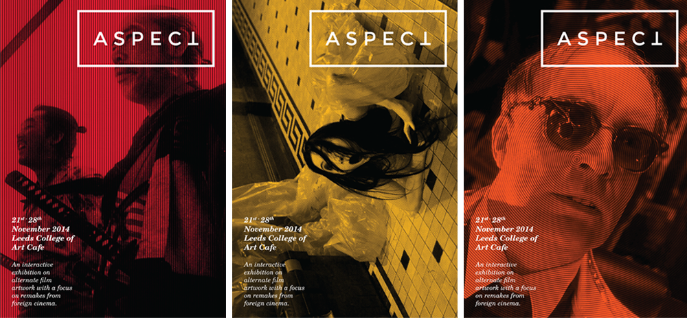
The promotional campaign consisted of printed A5 fylers, A3 posters and online graphics for social media and email purposes. There were 3 variations of each giving the campagin diversity and recognisability through the use of bold colours and halftone imagery.
The promotional campaign consisted of printed A5 fylers, A3 posters and online graphics for social media and email purposes. There were 3 variations of each giving the campagin diversity and recognisability through the use of bold colours and halftone imagery.
Both the fylers and posters where put up throughout the college and surrounding areas. The fylers were also used digitally as an e-invites when promoting the event online.
Flyers
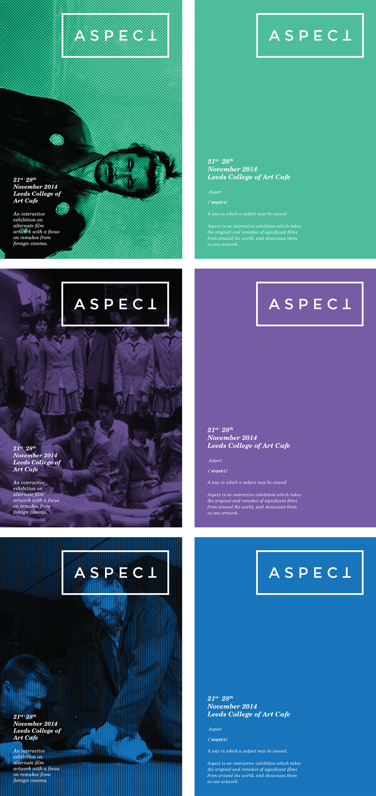
Posters

Artwork
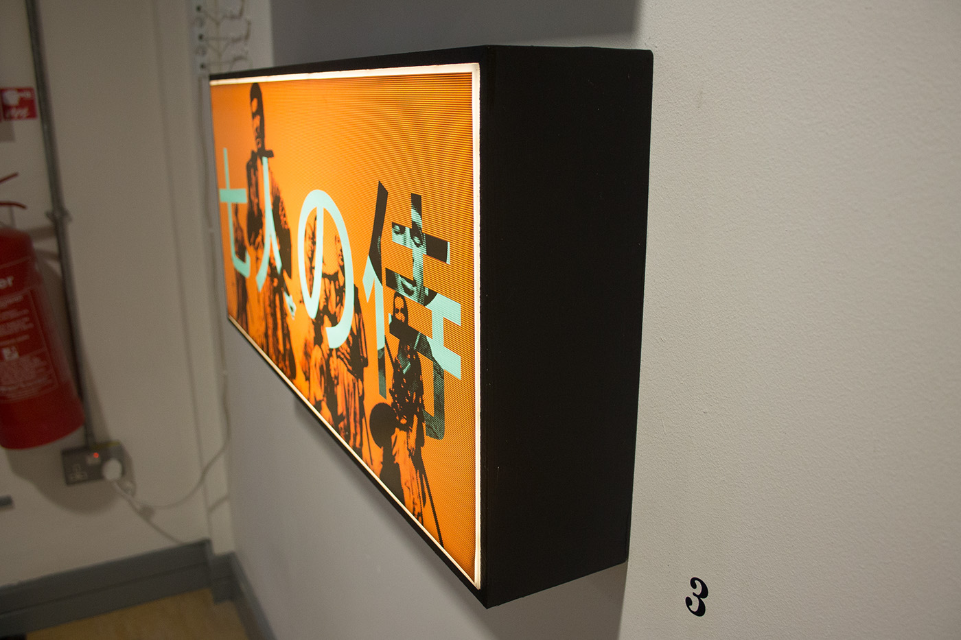
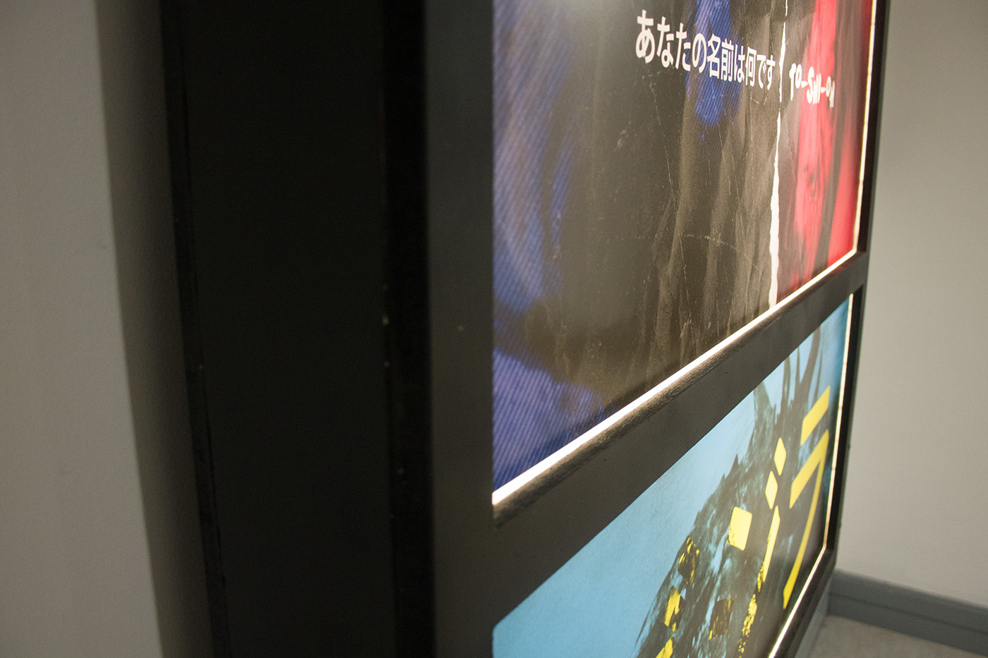
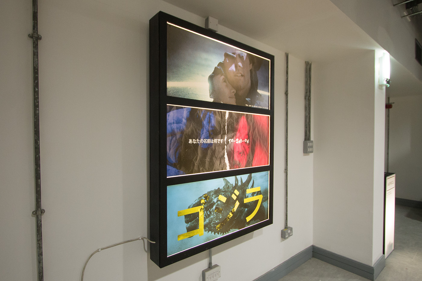
The artwork exhibited in ASPECT is composed of correspronding scenes from both the original film and the remake, using stills from these iconic moments further showcases why these films are well renowned globally.

1. Oldboy 2003 (Korea) / Oldboy 2013 (USA)
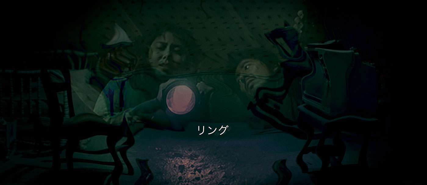
2. Ringu 1998 (Japan) / The Ring 2002 (USA)
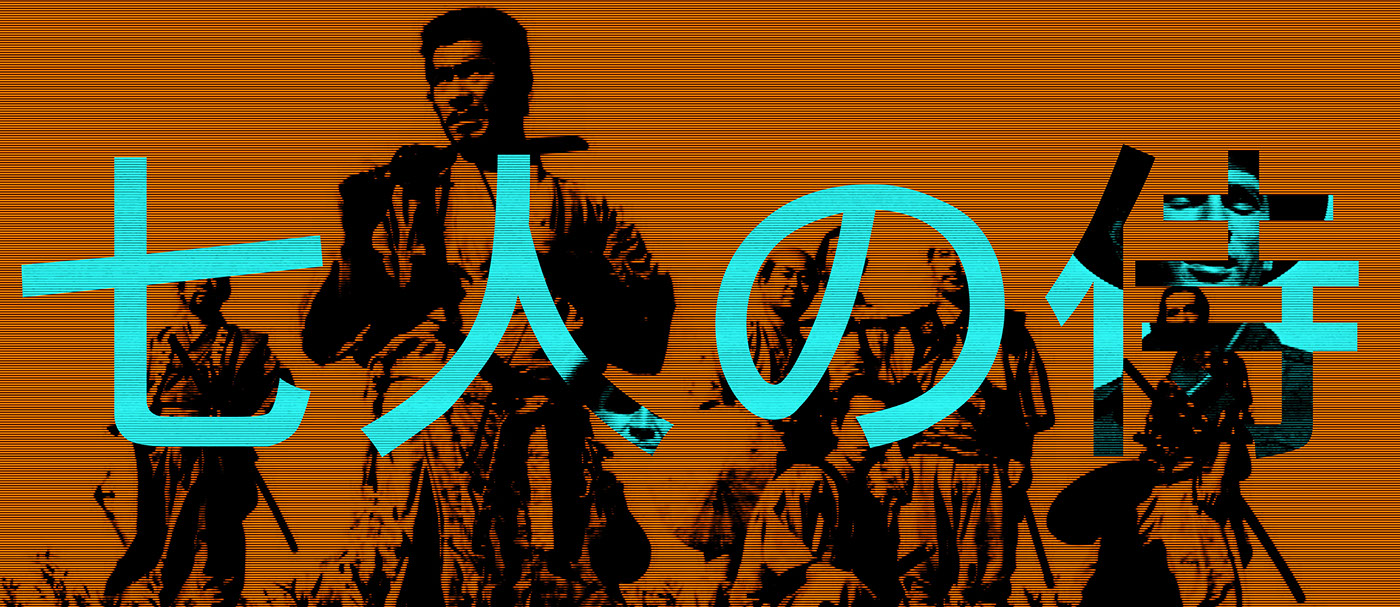
3. Seven Samurai 1954 (Japan) / Magnificent Seven 1960 (USA)

4. Open Your Eyes 1997 (Spain) / Vanilla Sky 2001 (USA)
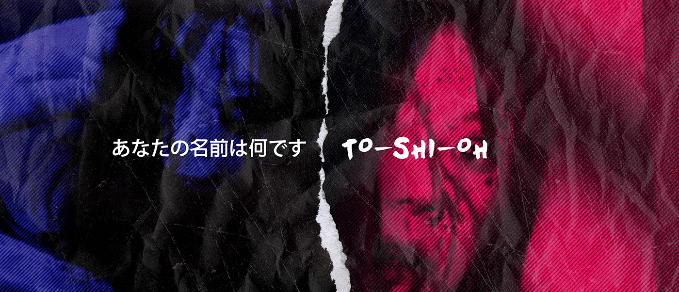
5. Ju-On 2002 (Japan) / The Grudge 2004 (USA)

6. Gorija 1954 (Japan) / Godzilla 1998 (USA)
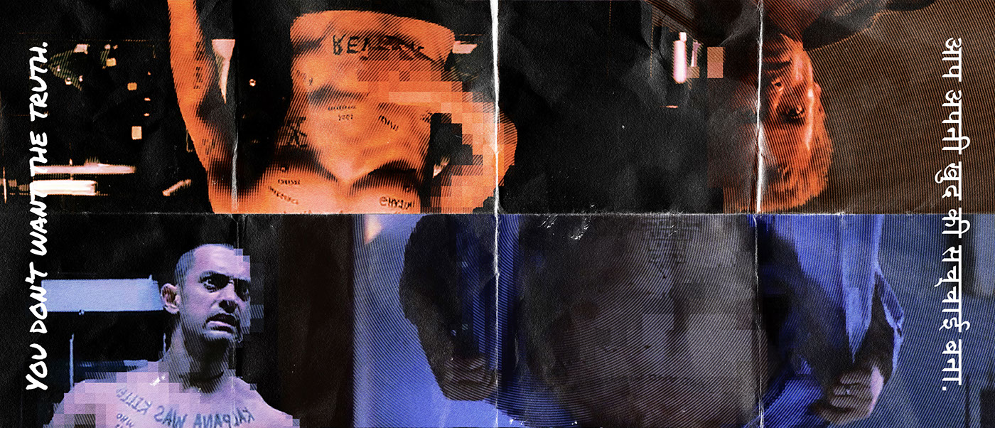
7. Memento 2000 (USA) / Ghajini 2008 (India)
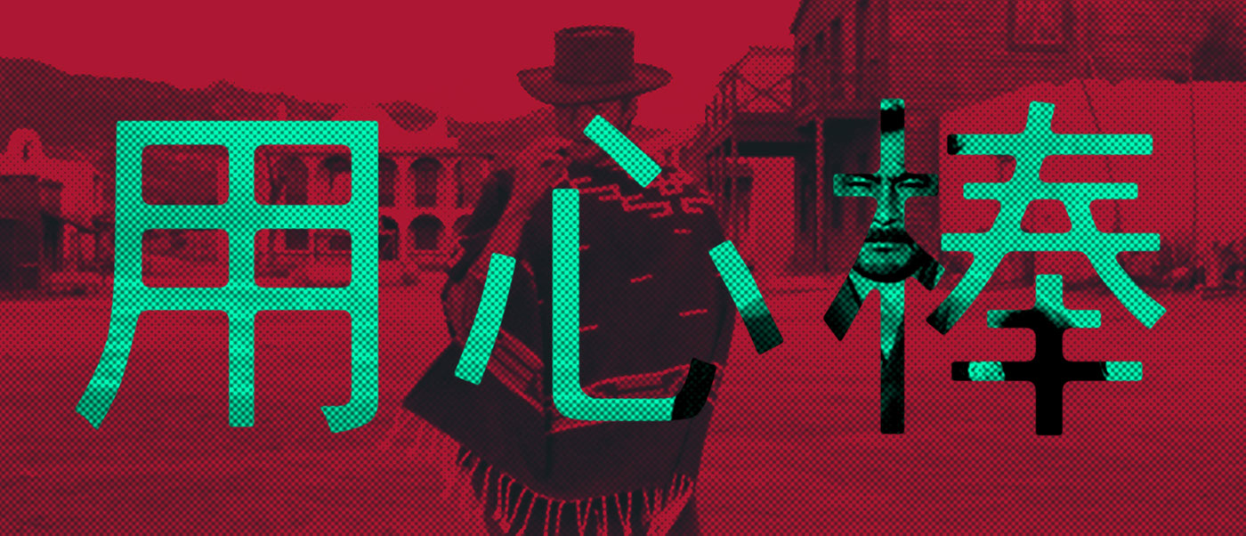
8. Yojimbo 1961 (Japan) / A Fistful of Dollars 1964 (USA)

9. Infernal Affairs 2002 (China) / The Departed 2006 (USA)
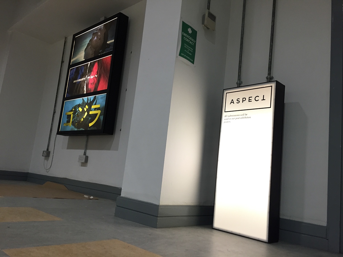
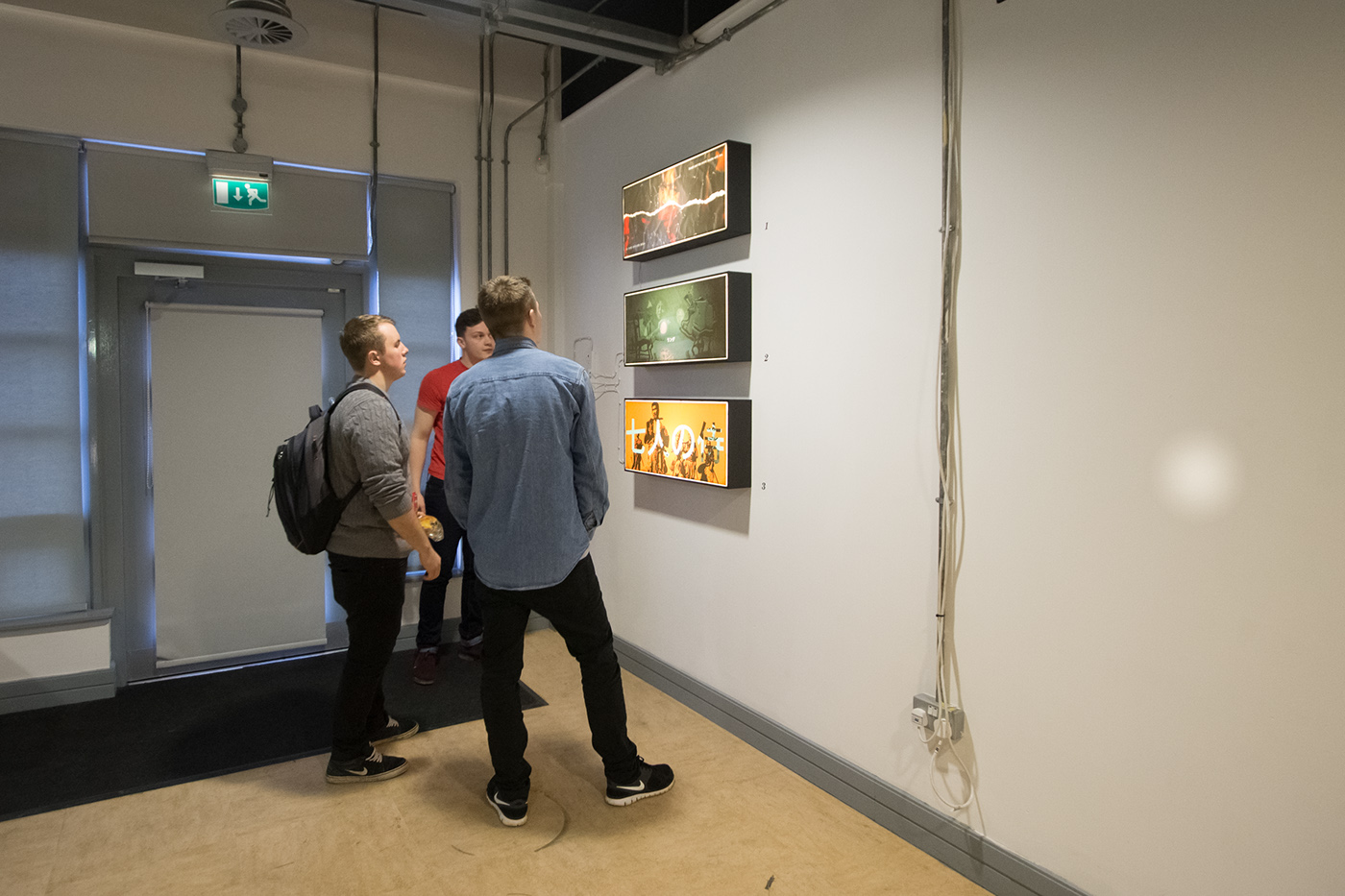
Light Boxes
The idea of using light boxes to display the artwork was something which came about when thinking of how to make the exhibition different from other similar artwork exhibitions along with thinking about how posters are displayed in commercial cinemas. The use of light boxes also gave the artwork a more depth look and gave the overall space more dynamic.
All light boxes where produced by hand due to the custom size to fit the aspect ratio.


Projection mapping
The use of projection mapping was something which we added to give the exhibition a cinematic atmosphere.
Using the logo as a frame to encapsulate the video and to have the type from the logo to be visible, it was cut out of the video so that the projection did not overlap and take away the impact from the logo.
The video used for the projection mapping was an hour long clip which consisted of 10 minute clips from 6 films which were used for the artworks.

Balllot box
The interactive aspect came through the use of ballot slips and the ballot box. The ballots were used to investigate whether the audience knew which films had been used in the artworks.
The amount of ballots slips completed and placed into the ballot box was very successful with over 100, most of the ballots getting over 40% of the answers correct.
Exhibition
The exhibition was a success with posititve feedback from the public, peers, Leeds College of Art alumini and visiting professionals.


Designed, Curated & Produced by
Tristan Currie, Bobby Jones and Rinesh Mistry.


